Leo Manage Widget Userguide
Build up a page easily with Leo Manage Widget that supports variety content types
- Created: 12/15/2014
- Latest update: 12/16/2014
- By: leotheme
First of all, we would like the thank you for using our work.
Leotheme - a website where you can find the best Joomla! Template, Prestashop theme and Extensions as well. We are proud of our professional themes, extensions. With years of experience working on Opensource, we have created number of great extensions for both Joomla and Prestashop like: Leo Prestashop Framework, Leo Prestashop Megamenu Module ...
Leotheme is also famous for custom work, if you have trouble or help with your website, coding, .... you can find us on Leotheme.com then we will support you or give you suggestions.
What is Leo Manage Widget
Leo Manage Widget is a must-have extension to build professional Prestashop site. The module allows you to build a page with widgets, the content of widget is very flexible.
In summary, a page includes multiple hooks, in each hook, you can create one or multiple group, in each group you can create one or many columns, assign column to specific widget. You can set size for the column, enable and disable it from specific layouts and pages ...
Download and Install
Download
Currently, the modules are only included in the pretashop theme that support the module by default. So you have to download the theme package then the modules will be there for you to use.
Install
You can install the module as any other pretashop module. If you are new to prestashop, you can check How To Install Prestashop Module Video Tutorial
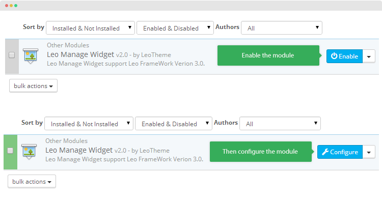
When install the module successfully, access Modules then search for Leo Manage Widget, enable it then open its setting panel.
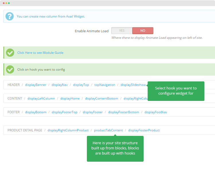
Know your site structure
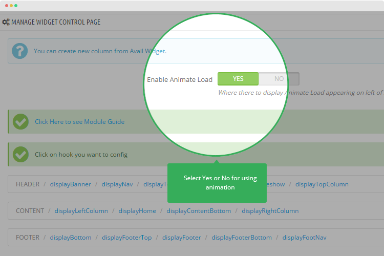
Before configuring, you should understand your site structure. In the configuration panel of Leo Manage Widget module, you see the blocks that build your site: header, content, footer ... In each block, it has multiple hooks. Select the hook you want configure widgets.
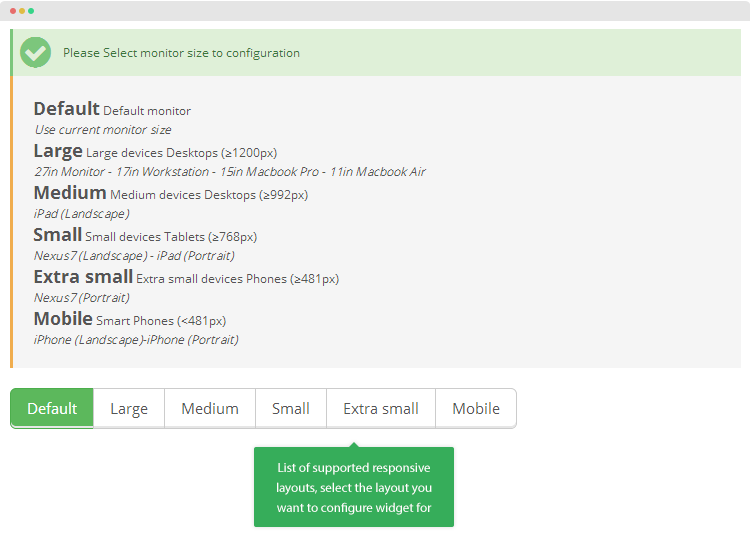
Supported responsive layouts
The supported responsive layouts includes: default, large, medium, small, extra small and mobile. The configuration of widget on those responsive layouts can be the same or different. Select the layout you want to configure.
Manage Widgets
Create widget
There are 2 ways to create new widget: From the configuration panel of Leo Manage Widget module or from the widget management panel
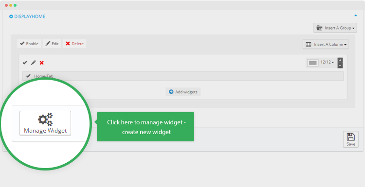
#1: From the configuration panel of Leo Manage Widget moduleTo create new widget, click on Manage Widget in any group setting.
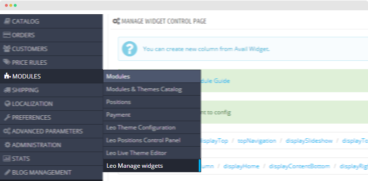
From the back-office of your site, access "Modules >> Leo Manage Widgets".
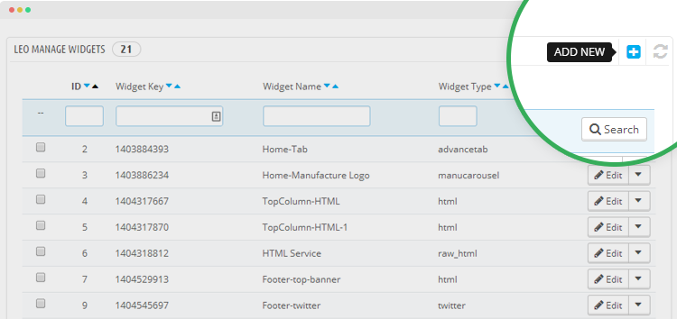
In the widget management panel, click the Add New widget icon on the top right corner.
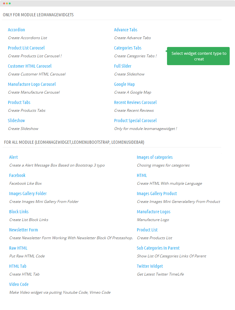
The module support multiple content types, select the content types you want to create.
With the variety of supported content types, you may not need to use other extensions.
Base on select content types, add corresponding info for the widget then save.
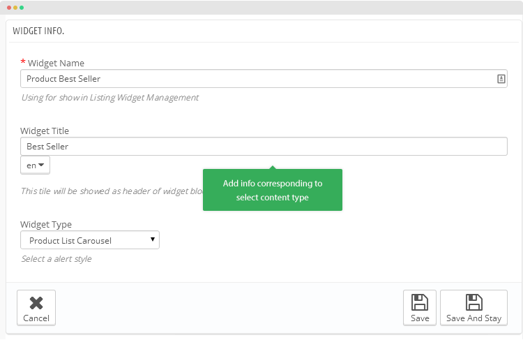
Supported widget content types
The module supports many widget content types, here is the list of supported widget content types
1. Only for module Leo Manage Widgets- Accordion: create Accordions List
- Product List Carousel: create Products List Carousel
- Categories Tabs: create Categories Tabs
- Customer HTML Carousel: create Customer HTML Carousel
- Manufacture Logo Carousel: create Manufacture Carousel
- Google Map: create A Google Map
- Product Tabs: create Products Tabs
- Product Special Carousel: only for module leomanagewidget
- HTML Tab: create HTML Tab
- Recent Reviews Carousel: Create Recent Reviews
- Slideshow: Create Slideshow
- Full Slider: Create Slideshow
2. For all modules: Leo Manage widget, Leo Menu Bootstrap, Leo Sidebar
- Alert: create a Alert Message Box Based on Bootstrap 3 typos
- Facebook: facebook Like Box
- HTML: create HTML With multiple Language
- Images Gallery Folder: create Images Mini Gallery From Folder
- Images Gallery Product: create Images Mini Generalallery From Product
- Block Links: create List Block Links
- Manufacture Logos: manufacture Logo
- Newsletter Form: create Newsletter Form Working With Newsletter Block Of Prestashop.
- Product List: create Products List
- Raw HTML: put Raw HTML Code
- Sub Categories In Parent: show List Of Categories Links Of Parent
- Twitter Widget: get Latest Twitter TimeLife
- Video Code: make Video widget via putting Youtube Code, Vimeo Code
- HTML Tab: Create HTML Tab
- Images of categories: Chosing images for categories
Group settings
After create widgets, now it's time to get it published in front-page.
Create new group
In each hook, you can create one or many groups. Hit the "Insert A Group" to create new group.
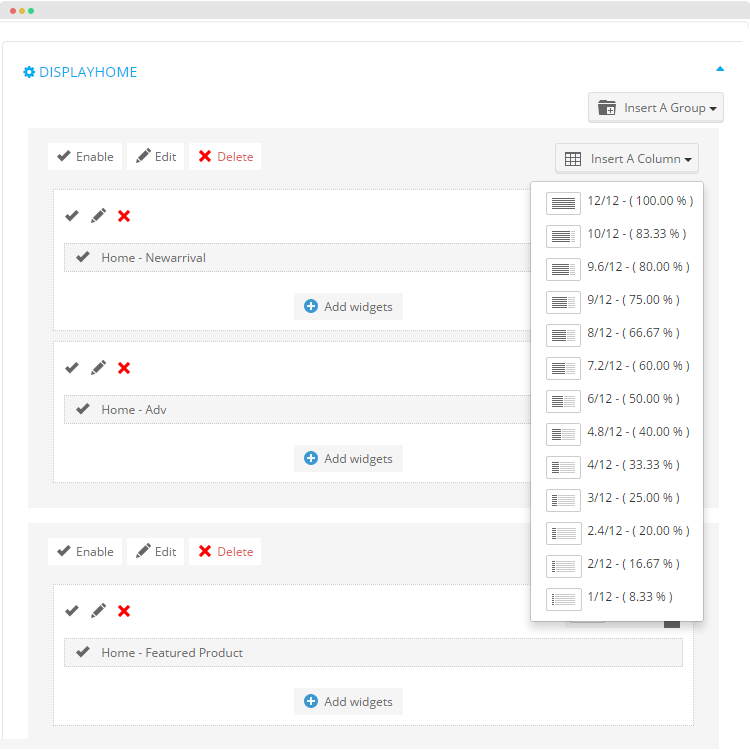
The available group types:
- Empty Group: group with no column
- 1 Column: group with 1 column
- 2 Columns: group with 2 columns
- 3 Columns: group with 3 columns
- 4 Columns: group with 4 columns
- 5 Columns: group with 5 columns
- 6 Columns: group with 6 columns
Configure group
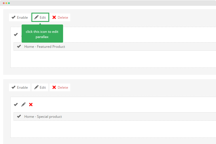
You can enable, disable, edit or delete any group using the quick option buttons on the top of each group.
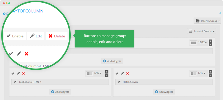
When edit the group, you can add title, background color, class to style for the group.
Parameter explanation
- Title: add group title
- Class: add class to style for the group
- Background color: set color for the group background
- Active: select Yes to enable the group.
Column settings
Create new column
In each group, you can add multiple columns. To create new column, hit the "Insert A Column" button on the top right corner of each group then select the column size.
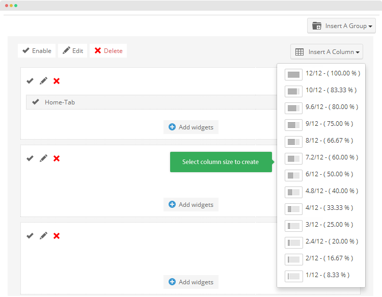
The size setting can be re-configured latter on using the column size configuration feature.
Assign widget for column
By default, when you create new column, it's empty column, to add content for column, please add widgets for the column.
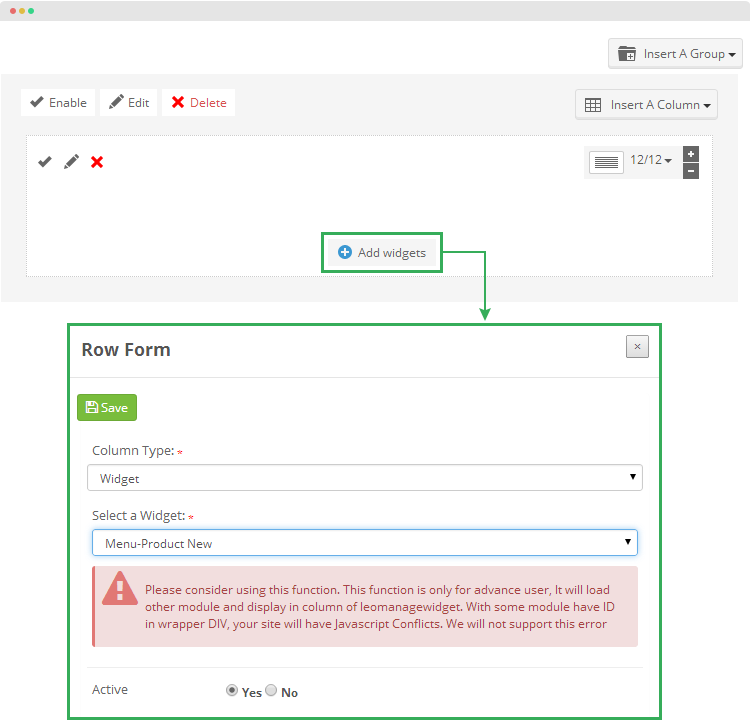
You can use default modules of Prestashop in Leo Manage Widget, by choosing column, these default modules move through hook which support these modules
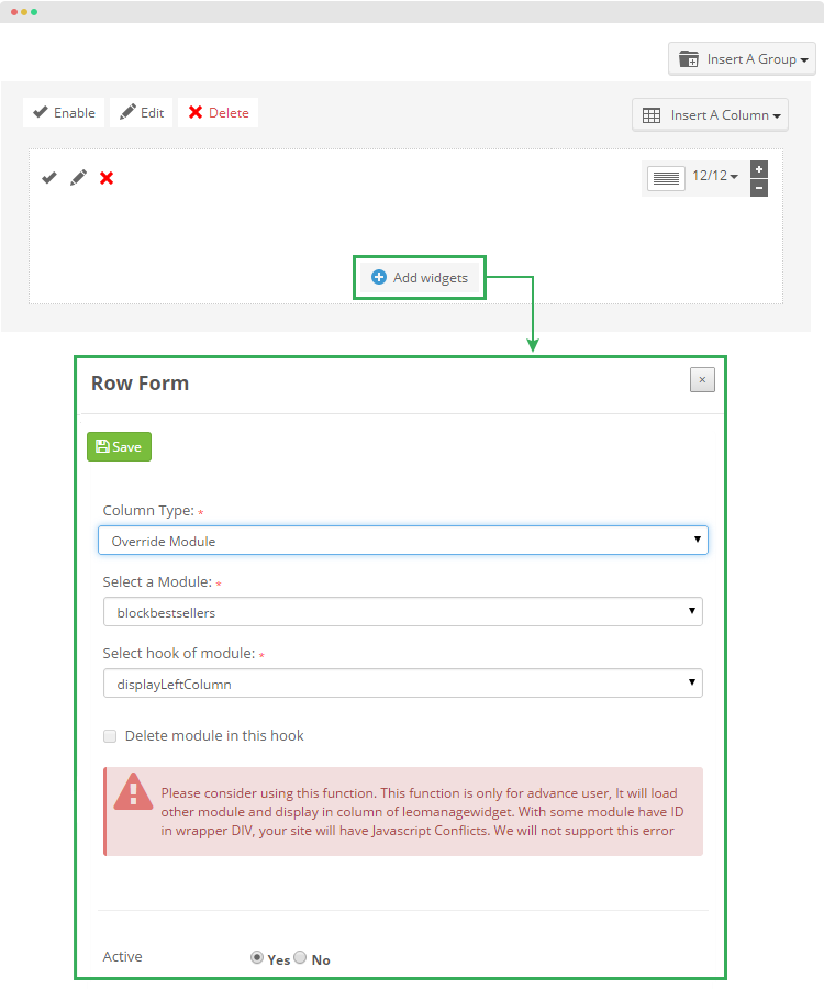
In each column, you can add one or many widgets. Each widget is a row in the column.
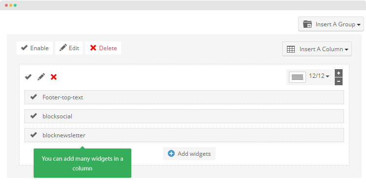
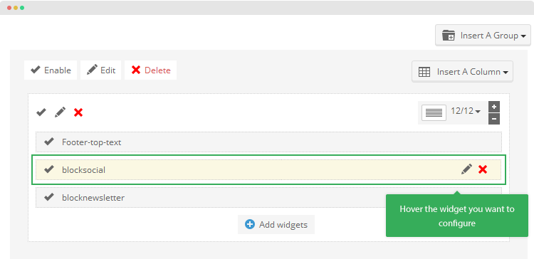
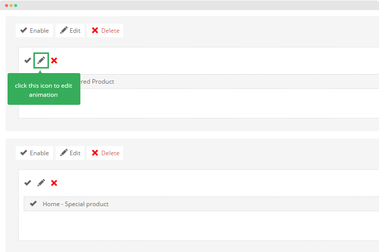
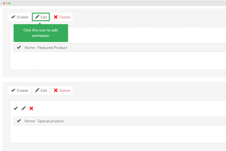
You can change setting for any widget added to column or delete any widget in a column. Hovering widget and you will see the Edit and Delete buttons.
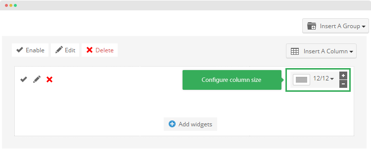
Configure column
After creating columns, it's time to configure the column. You can enable or disable, edit or delete any column.
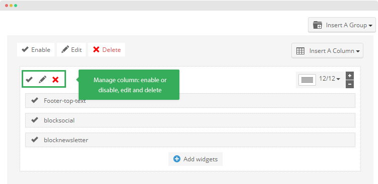
To edit/configure a column, hit the edit icon in the column. Here is the configuration panel of a column.
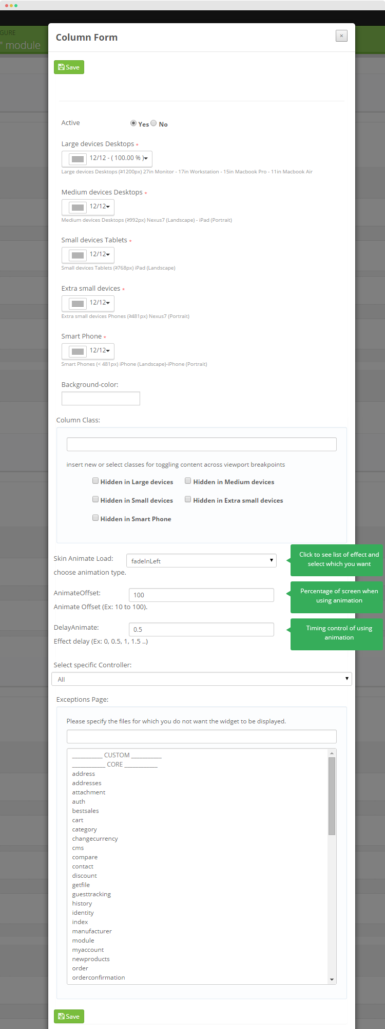
The column configuration allows you to:
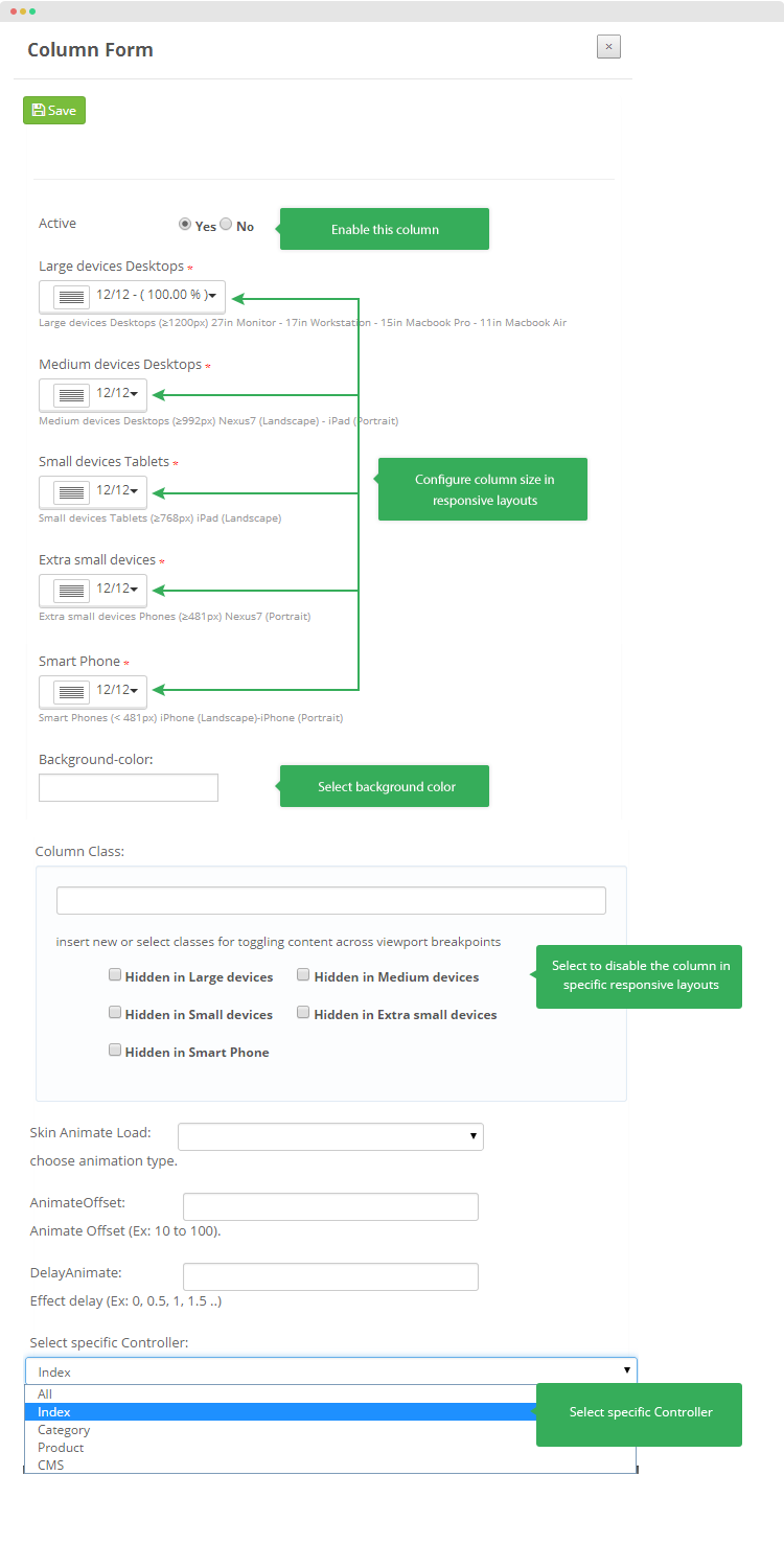
- Enable/disable the column
- Configure column size in responsive layouts: Desktop, tablet, phone
- Set background color for the column
- Disable the column in specific responsive layouts
- Select pages that you don't want to display the column in
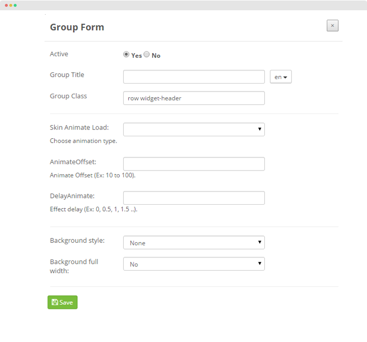
Animation & Parallax
You can create custom builds Animation and Parallax
Animation
You can save animation, just click enabale animation
you can fix effect in a column
After click edit, you start fixxing with effect which you want
You can choose effect for group
and you also fix or change effect in a group
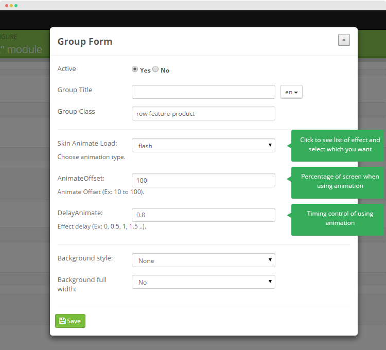
These effects included
- Skin Animate Load:choose animation type.
- AnimateOffset:Animate Offset (Ex: 10 to 100), Notice: when you insert 10 to 100 is full screen
- DelayAnimate:Effect delay (Ex: 0, 0.5, 1, 1.5 ..).
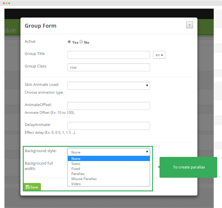
Parallax
Parallax theme is a combination of two cool trends - parallax scrolling and single-page design. It is designed to help you to build a stunning parallax scrolling site with ease. Showcase your work and services responsively on a single page
To fix parallax
In the stylesheet of your choice, copy and paste the css below and make sure the selector is the same as the class you gave to your:
- Static : This section has a background that moves slightly slower than the user scrolls. This is achieved by changing the top position of the background for every pixel the page is scrolled.
- Fixed: The fixed background is moved slightly by scrolling up or down
- Parallax
- Mouse Parallax
- Video
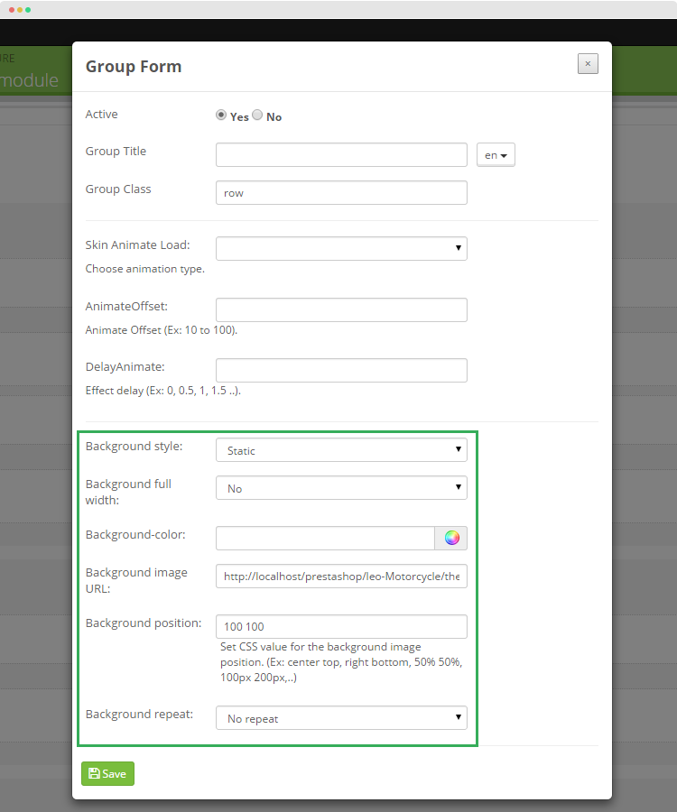
Background style: Static, Fixed
- Background full width:You can choose Yes or No to select full width or not
- Background color: You can select color for your background
- Background images URL: Copy absolute path
- Background position
- Background repeat
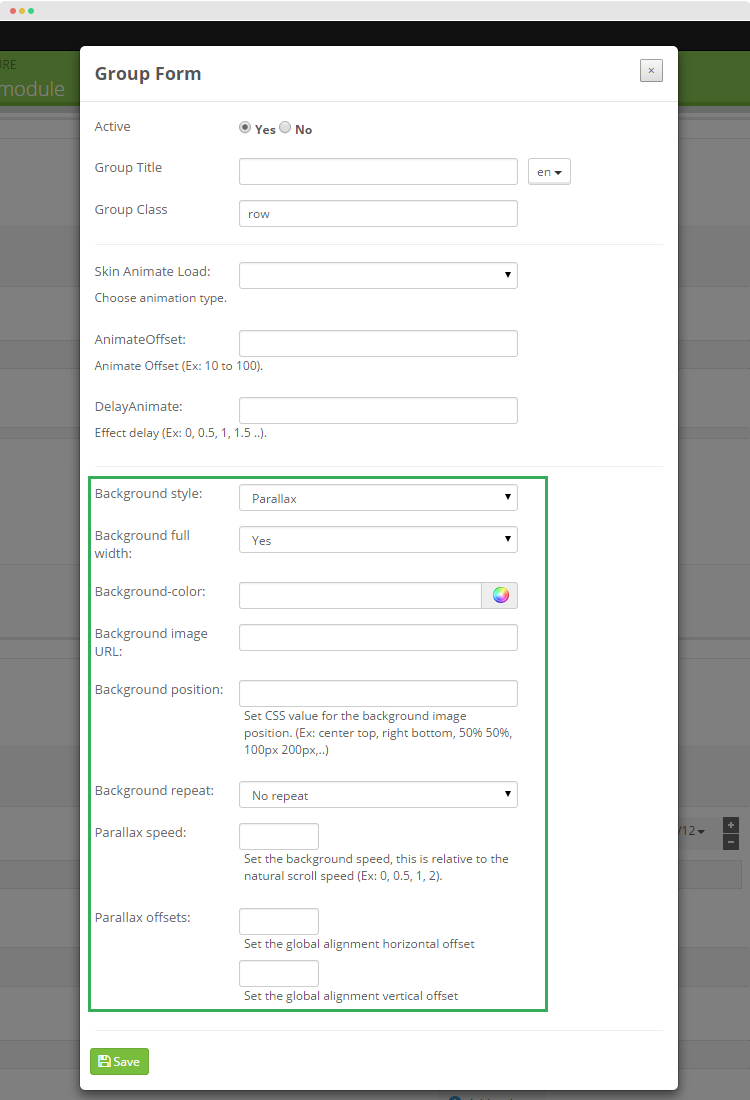
Background style: Parallax
- Background full width:You can choose Yes or No to select full width or not
- Background color: You can select color for your background
- Background images URL: Copy absolute path
- Background position
- Background repeat
- Parallax speed
- Background offsets
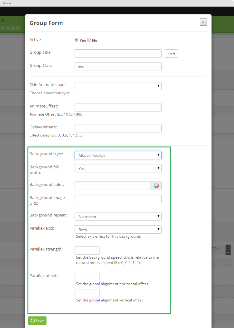
Background style; Mouse
- Background full width:You can choose Yes or No to select full width or not
- Background color: You can select color for your background
- Background images URL: Copy absolute path
- Background repeat:
- Parallax asix
- Parallax Strength
- Parallax Offsets
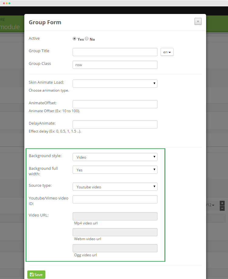
Background style: Video
- Background style
- Background full width
- Souce type:
- Youtube/Vimeo Video ID:
- Video URL