Leo Slideshow
Prestashop module to build professional slideshow
- Created: 23/01/2017
- latest Update: 23/02/2017
- By: Leotheme
- Email: leotheme@gmail.com
First of all, we would like the thank you for using our work.
Leotheme - a website where you can find the best Joomla! Template, Prestashop theme and Extensions as well. We are proud of our professional themes, extensions. With years of experience working on Opensource, we have created number of great extensions for both Joomla and Prestashop like: Leo Prestashop Framework, Leo Prestashop Megamenu Module ...
Leotheme is also famous for custom work, if you have trouble or help with your website, coding, .... you can find us on Leotheme.com then we will support you or give you suggestions.
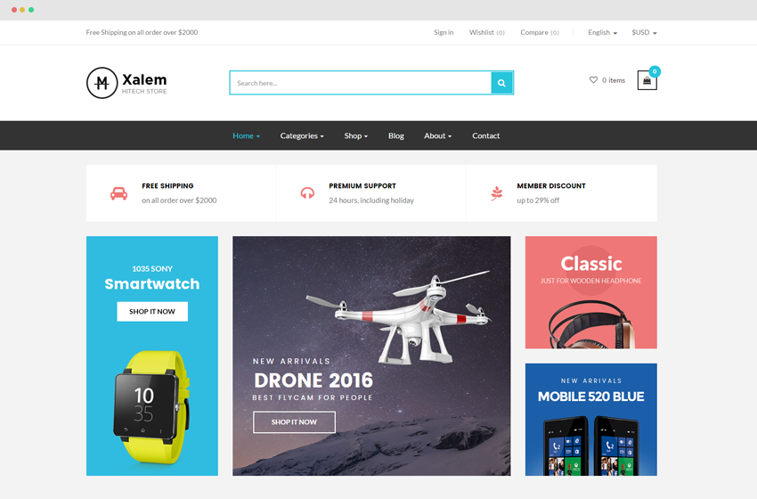
Slideshow sample
Slideshow Width Mode: Box

Slideshow Width Mode: Box Right

Slideshow Width Mode: Box Center
Slideshow Width Mode: Full width

Download and Install
Download
Currently, the module will only be included in the pretashop theme that support the module by default. So you have to download the theme package then the module will be there for you to use.
Install
You can install the module as any other pretashop module. If you are new to prestashop, you can check How To Install Prestashop Module Video Tutorial
Module configuration
If you want to configure module Leo Slidershow, you access into your backend and choose Modules on the left hand side.
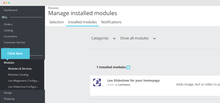
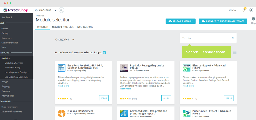
You search "Leo Slideshow" on installed module.
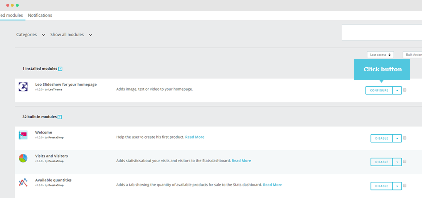
Open the configuration panel of Leo Slideshow to configure.
I. General Setting
- Add new group: you can create unlimited groups, each group includes multiple sliders items.
- Manage slider: Manage information of sliders.
- Import: you can browse an back-up file to import
- Override group or not: when you import a group, if the group duplicate with any group, you can select to override or not.
II. Group List
To add new group, user click button "Add New Group".
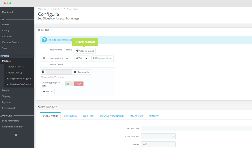
After that, you look down and there is a table "Add New Group".
1. General Setting
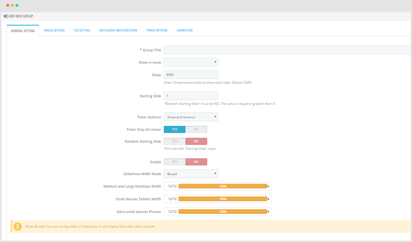
Group Title: To display name of group (This is compulsory field you need to set.)
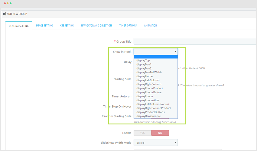
- Show in Hook: To show the postion of Slider in page.
- Delay: Enter Time(mini seconds) to show each slide. Default 5000
- Starting Slide: Which slider should be started.
- Timer Autorun: Tool to calculate time.
- Show and Autorun: Display tool and run automatically.
- Hide and Autorun: Not display tool and run automatically.
- Hide and no Autorun: Not display tool and Not run automatically to next slider.
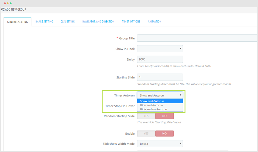
- Timer Stop On Hover: When you hover into slider the timer tool will stop.
- Random Starting Slide: When you refresh your site, slider will be random to display. The position of slider which display is unchanged.
- Enable: Display group is active or inactive.
Slideshow Width Mode: Some mode to display slider for your site.
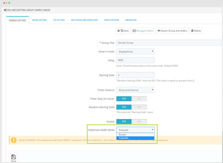
a)- Situation you choose Slideshow width Mode: Fullwidth
b)- Situation you choose Slideshow width Mode: Boxed
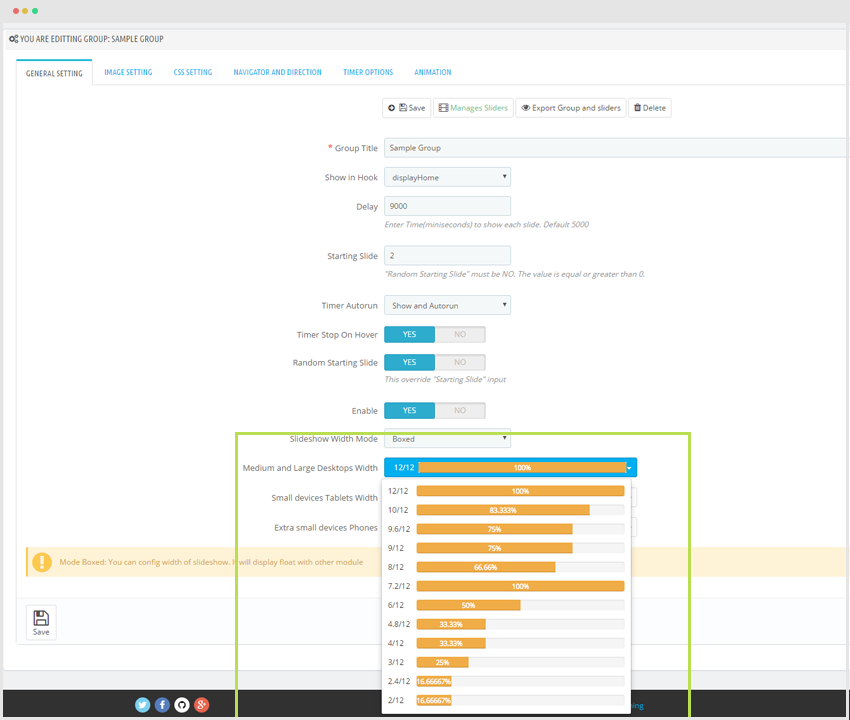
+ Medium and Large Desktops Width: Help customer configure width slide based on desktop standard.
Display on Front end screen:
+ Small devices Tablets Width: Help customer configure width slide based on Tablets standard.
Display on Front end screen:
+ Extra small devices Phones: Help customer Configure width slide based on Phones standard.
Display on Front end screen:
2. Image Setting
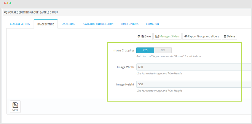
- Image Cropping: Auto turn off is you use mode "Boxed" for slideshow
- Image Width: Use for resize image and Max-Height
- Image Height: Use for resize image and Max-Height
Display in Front end.
Click "Save" to keep the changes.
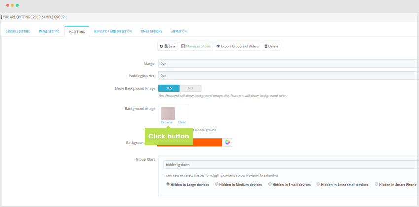
3. CSS Setting
- Margin: This is the distance between cards.
- Padding(border): This is the distance from content to border.
- Show Background Image: Yes, Front end will show background image. No, Front end will show background color.
- Background Image
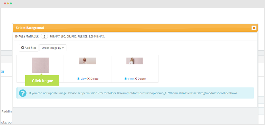
You click "Browse".
There is a pop up.
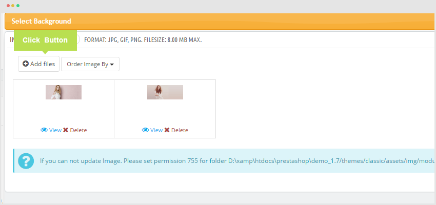
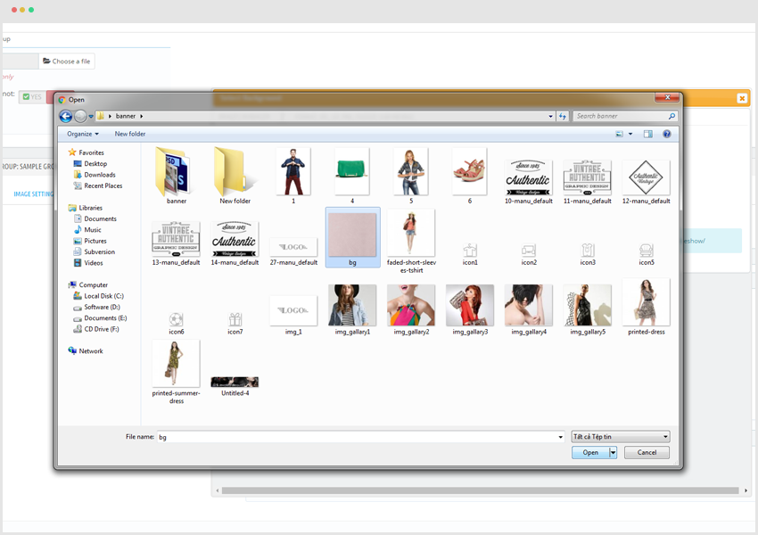
After that click "Add file" to choose image path.
When you decide which image will be shown please press "Upload".
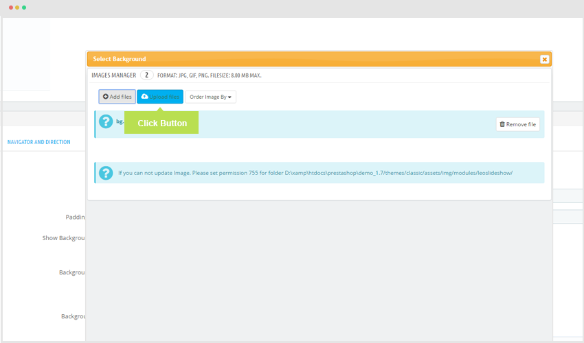
When upload process is finished, you choose image to display.
- Background Color: The color of background slide.
- Group Class: User can add more class with this tool.
Press "Save" to keep the changes.
4. Navigator and Direction
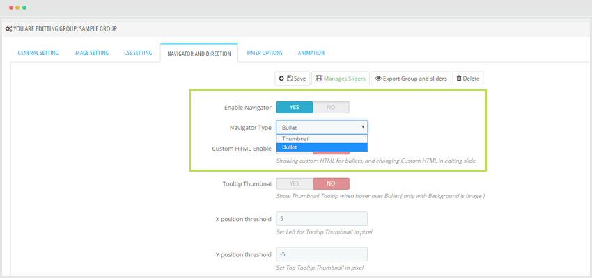
- Enable Navigator: Turn On or OFF navigator function.
- Navigator Type: There are two types: Bullet and Thumbnail.
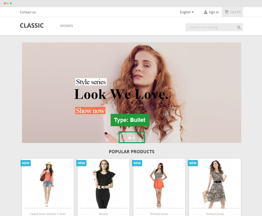
4.1. Situation Navigator Type: Bullet:
+ Custom HTML Enable: Showing custom HTML for bullets, and changing Custom HTML in editing slide.
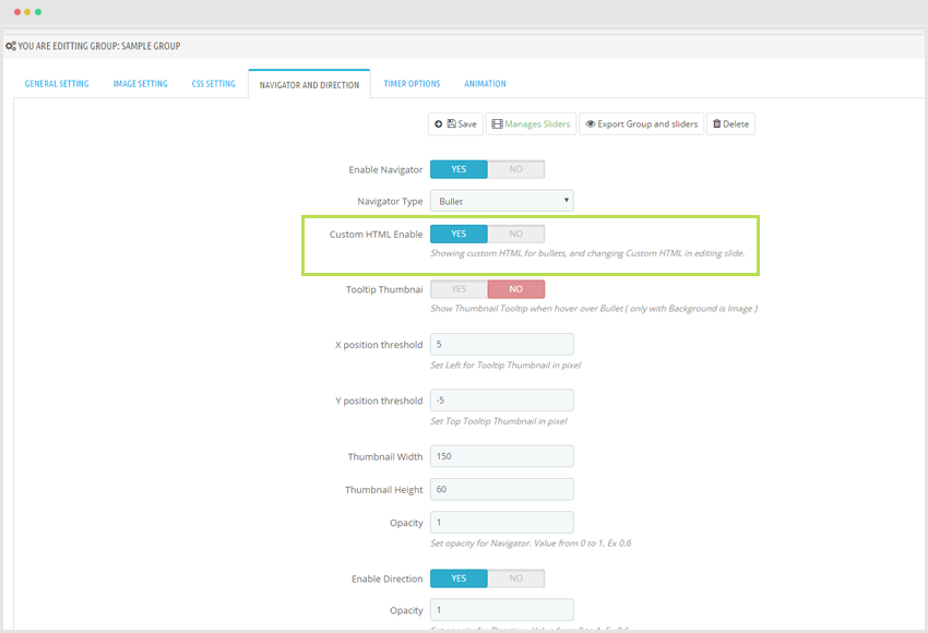
+ Tool tip Thumbnail: Show Thumbnail Tool tip when hover over Bullet ( only with Background is Image ).
+ X position threshold: To display X axis.
+ Y position threshold: To display Y axis.
Display on Front end follow Bullet standard.
4.2. Situation Navigator Type : Thumbnail
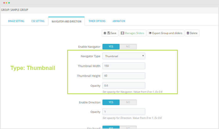
- Thumbnail Width: Display width of thumbnail image.
- Thumbnail Height: Display height of Thumbnail image.
- Opacity: Reduce the opacity of Thumbnail image.
- Enable Direction
- Opacity: Set opacity for Direction. Value from 0 to 1. Ex 0.6
- Key board
Remember "Save" button to keep the configuration.
5. Timer Options
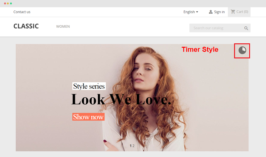
- Timer Style: There are some mode for timer to display.
+ Timer Style: Pie
+ Timer Style: 360 ar
+ Timer Style: Bar
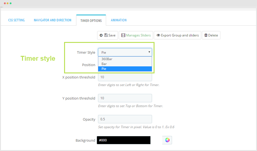
To display in front end.
- Position: The position to display Timer in slider.
- X position threshold: Display X axis.
- Y position threshold: Display Y axis.
- Opacity: To Reduce the opactiy of timer.
- Background: Image background for timer.
- Timer Color: The color of timer when it is loading.
- Timer Diameter: Length of Running Line. Ex 360Bar is 30, Bar is 120, Pie 30.
- Timer Padding: the distance of timer.
- Timer Stroke: The border of timer.
Click "Save" to keep your changes.
6. Animation
- Animation: The movement of slider.
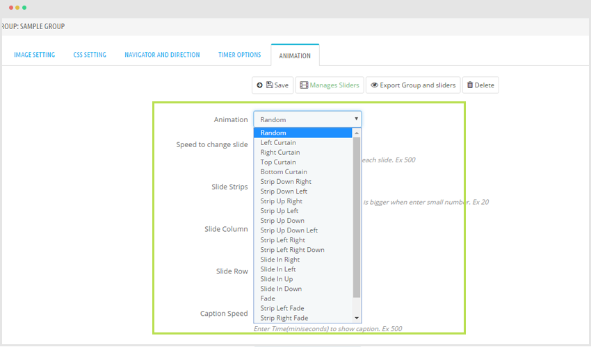
- Speed to change slide: Enter Time(miniseconds) to change each slide. Ex 500
- Slide Strips: Total number of strips in slide. Strip is bigger when enter small number. Ex 20
- Slide Column
- Slide Row
- Caption Opacity
Press "Save" to keep changes.
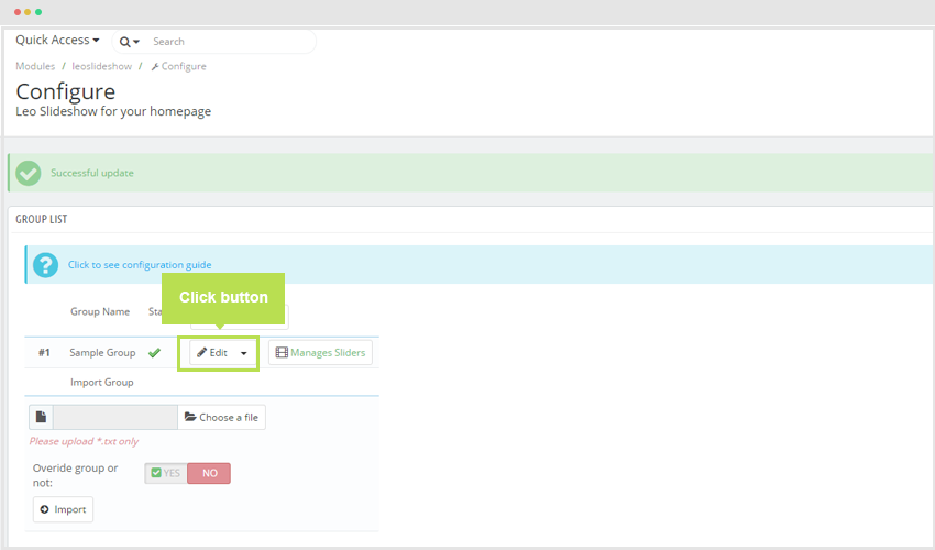
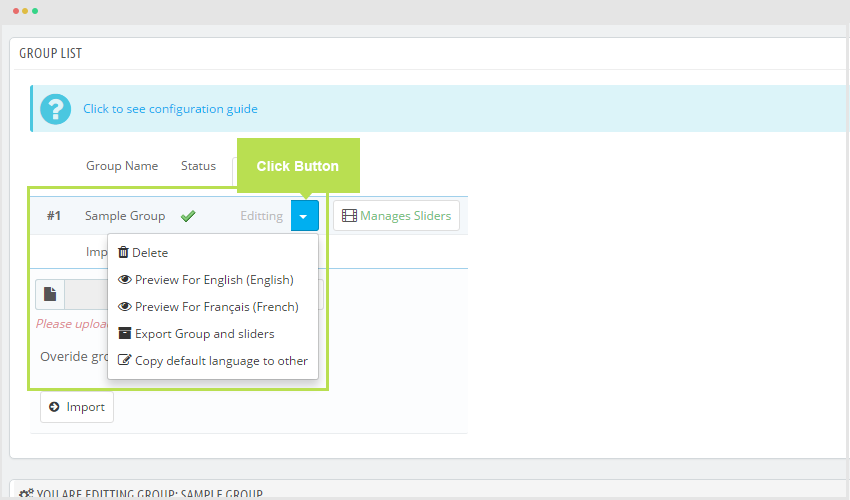
7. Edit Group
To configure Group, user press "Edit" to set up information of Slider.
8. Preview
Press preview to see in front end.
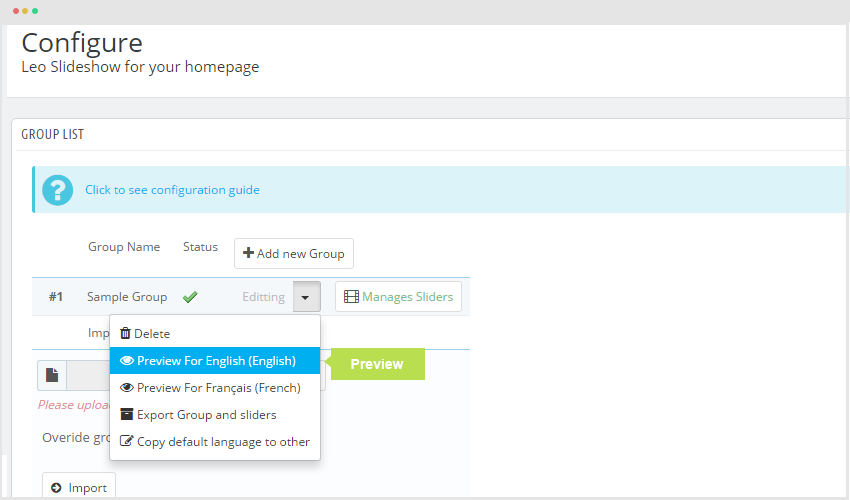
9. Delete
- To remove Group Slider you choose "Select" button after that you choose "Delete".
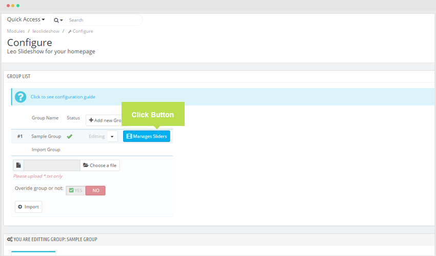
III. Manage Slide
To access into Slider Management. Press "Manages Sliders" button.
1. Add New Sample
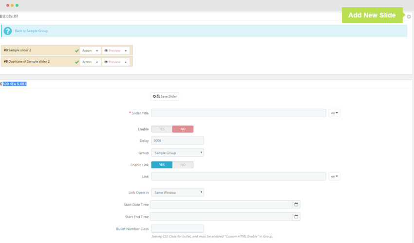
2. Add New Slide
You can see the image below:
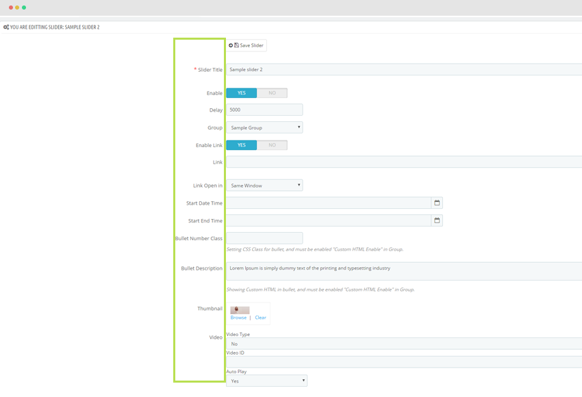
+ Slider Title: Name of slider.
+ Enable: To turn on or off to show Slider.
+ Delay:
+ Group
+ Enable Link: Turn on or off link function.
+ Link: Insert link to slider.
+ Link Open in: Which page should be inserted links.
+ Start Date Time: Set the starting time for slider.
+ Start End Time: Set the ending time for slider.
+ Bullet Number Class: Setting CSS Class for bullet, and must be enabled Custom HTML Enable in Group.
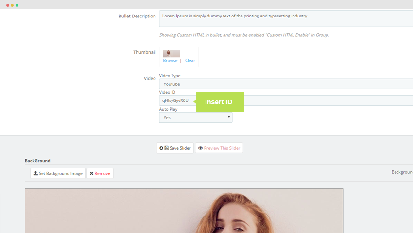
+ Bullet Description: Insert description for slide(Showing Custom HTML in bullet, and must be enabled "Custom HTML Enable" in Group.)
Display in Front end:
+ Thumbnail: Small image to display slider, you click "browse" after that follow stepBackground img
+ Video: Default configuration is "No".
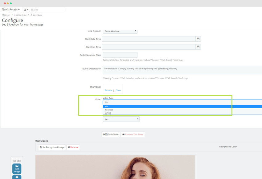
If you insert "Youtube" or "Vimeo"
- You should insert video based on id of video.
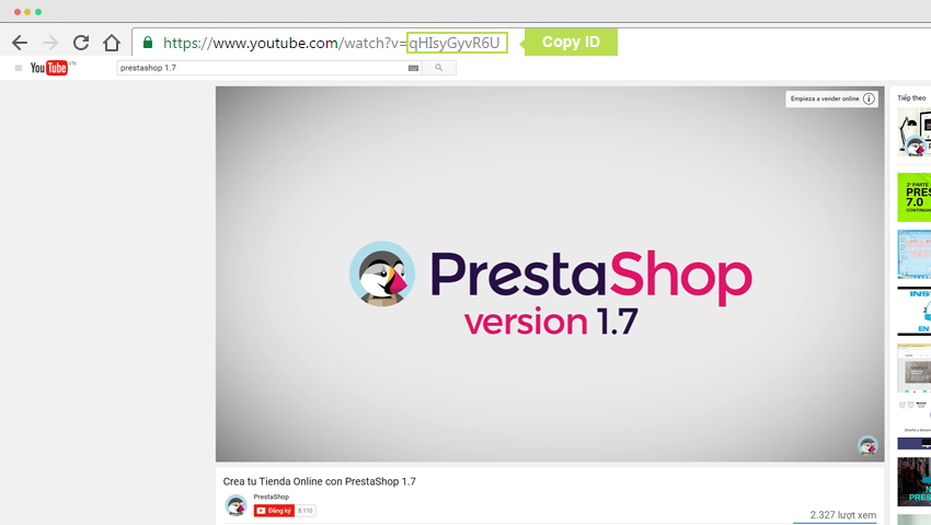
Copy ID code roi sau do page vao ID.
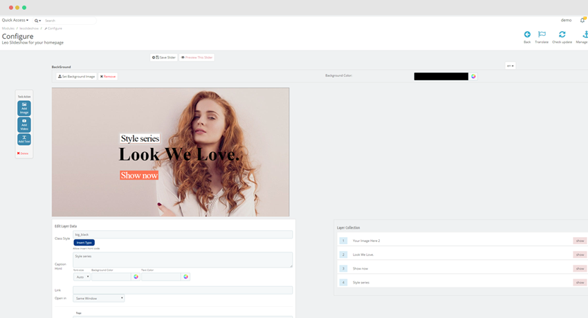
- Next step, you should configure Slider element/effect setting.
To display image. text and effections of slider.
+ Tools Active: Allow user add image, text, images and video.
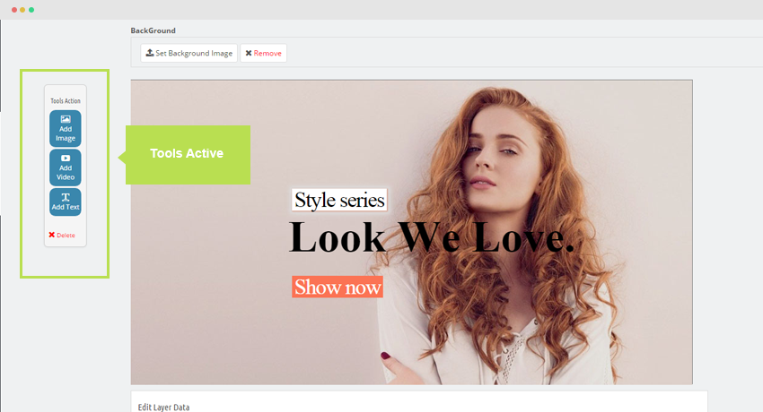
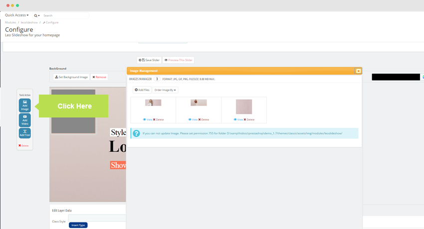
+ Add image : Add image for slide, click "Add Images" button, there is a pop up to show "Image".
+ Add video : Add video for slider, click "Add video" button . there is a pop up to show add video

+ Add text : Add text for slider.
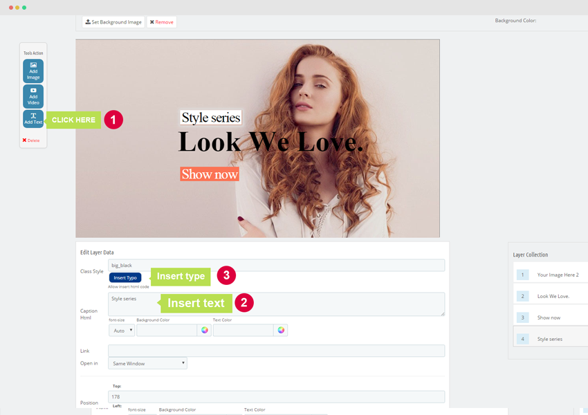
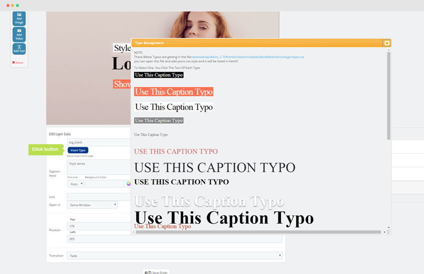
Step 1: Click "Add text" button.
Step 2: Insert text into Caption Html box.
Step 3: Click button "Insert Type" after Class will be automatically inserted.
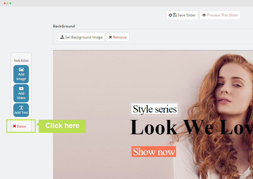
+ To remove you press "Delete" button.
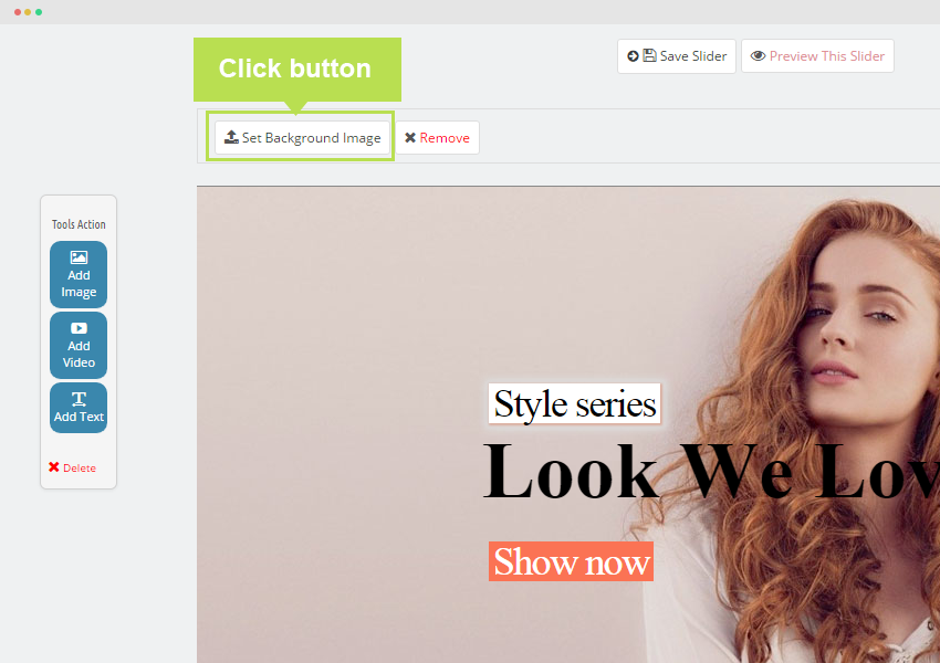
- Set Background Image : Add image for slider.
Press click button "Set background images".
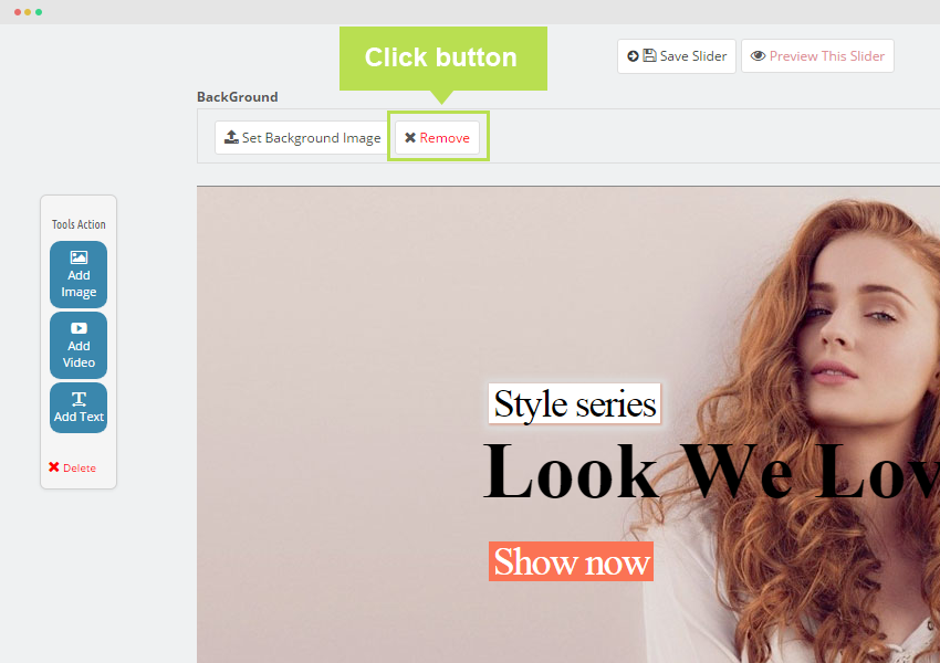
- Remove : you want to delete image which added, you choose "Remove" button.
- Edit Layer Data: This tool to configure font, size, text, transition, color, Link, Open in, Position.
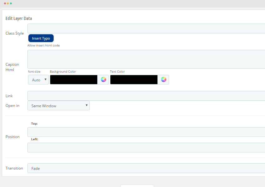
+ Class Style: To add more class style for text. User simply click "Insert type". There is a popup to show type of text.
+ Caption Html: To add text for Slide, font size, background, color.
+ Link: Insert link.
+ Open in Links to other pages.
+ PositionThe postion of element in Slider.
+ Transition: The movement of text.
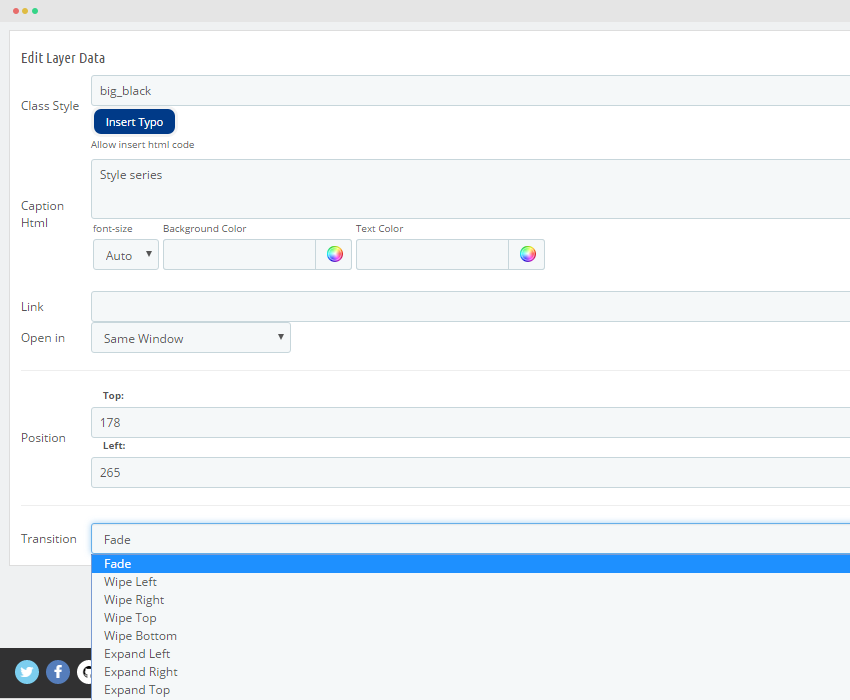
- - Fade: An hien
- - Wipe left:
- - Wipe right
- - Wipe Top
- - Wipe Bottom
- - Expand left
- - Expand right
- - Expand top
- - Expand bottom
- Edit slide
After that you reload page, Press "Click to edit" button and configure information below.
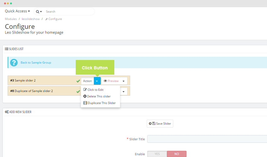
- Delete this Slide: Press "Delete" button.
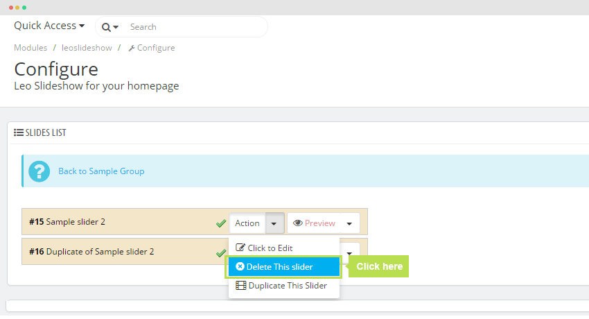
- Duplicate This Slider: Copy a slider same as initial slider.
- Preview: Test display Slider in front end.
IV. Export and Import
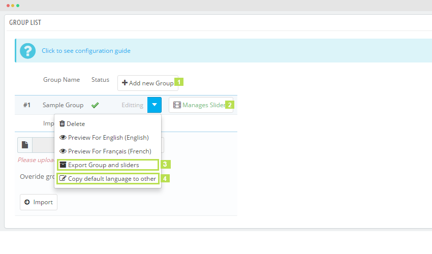
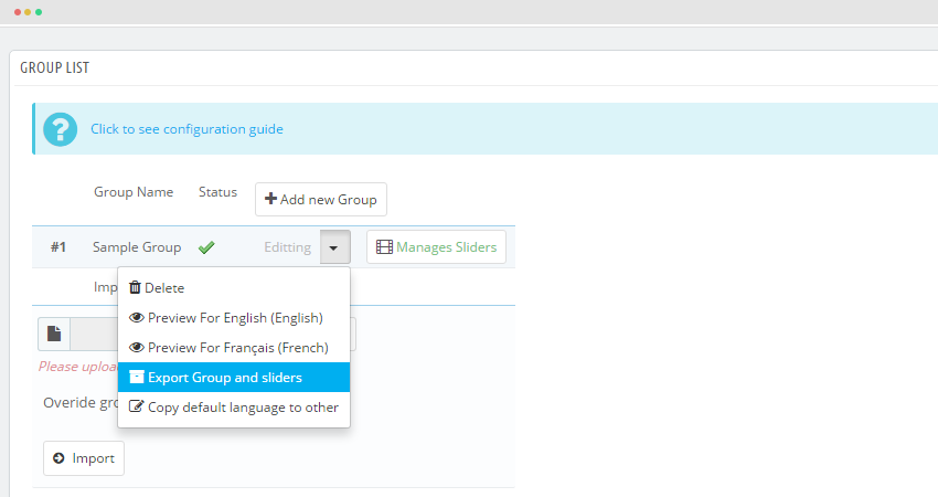
- If you want Export data, Press "Select" button and choose "Export Groups and Slides". After that, our module will export file ".txt".
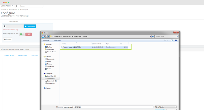
- If you want Import data press "Choose a file".
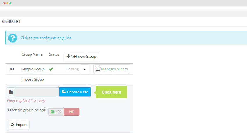
After that select the path for folder which contain file.
Press "Import" button.
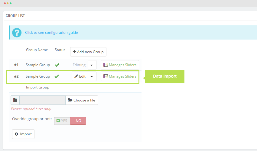
If you turn on "Overide group or not" button the information will override the original data.
V. Translate
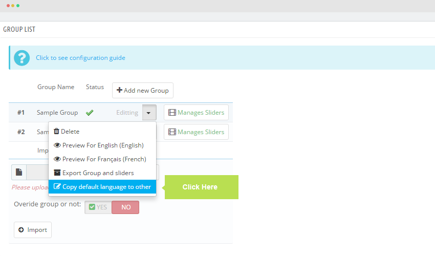
Cach 1: Copy default language to other
User can Translate, you should comeback "Group list", Click button and choose " Copy default language to other" to copy languages to others.
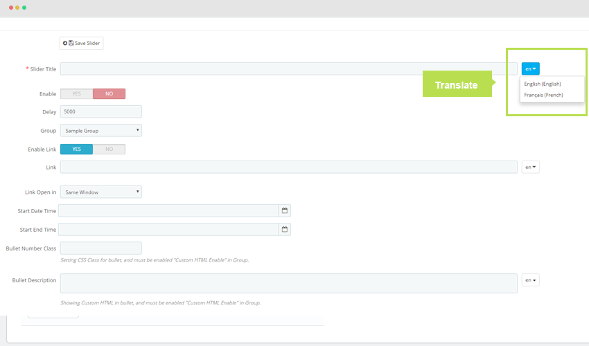
Cach 2: Translate languages for each element in Slider.
Recommendation
To get support, you can raise your issues in our Forum or send us email through the Contact Form or send directly to the following email. We will try to answer and solve problems for you as soon as possible (within 2 days)