AP Page Builder Userguide
Build up a page easily with AP Page Builder that supports various content types.
First of all, we would like the thank you for using our work.
Leotheme - a website where you can find the best Prestashop theme and Extensions as well. We are proud of our professional themes, extensions. With years of experience working on Opensource, we have created number of great extensions for Prestashop like: Leo Prestashop Framework, Leo Megamenu Prestashop Module ...
Leotheme is also famous for custom work, if you have trouble or help with your website, coding, .... you can find us then we will support you or give you suggestions.
What is AP Page Builder
Ap Page Builder is the powerful module followed Prestashop Standards which contained Necessary Features to build professional Prestashop site in minutes. Ap Page Builder has Four components as AP Profiles Manager, AP Position Manager, AP Product List Builder and AP Widget Manager. It shows that rationality in the administration and the clear purpose of this module. People use AP Widget Manager to create Products, it will be listed in each Position in your main profile.
Download and Install
Download
Ap Page Buider has been realeased, after buying this module you can download it at our official site or at other market as Prestashop Addon, Themeforest. In addition, Ap Page Builder is integrated in our prestashop themes. So you can buy our themes and experience the powerful Apollo Page Builder Module.
Install
You can install our modules as other modules extremely easily and quickly. After you buy the module, we will give you FREE installation and quick support if there are problems. Also we integrate the features installed demo data so you can quickly build sites. With powerful features but installation process is quite fast and easy. If customer faces with any problems please contact us. We will always beside you.
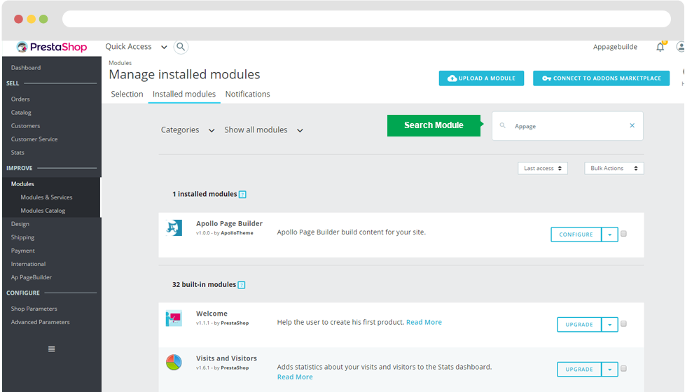
When install the module successfully, access Modules then search for AP Page Builder, enable it then open its setting panel.
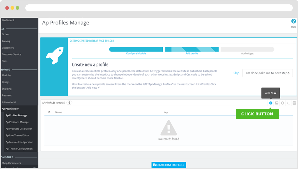
I. Ap Profile Manage
- This module also supply many widgets to build features for sales, intuitive user interface flexibility. Also integrate your existing modules in this module, you only need to build a site built just here and become faster page.
- How to create a new profile screen: From the menu on the left "Ap Manage Profiles" to the next screen lists Profile; click the button "View" in the list of profiles.
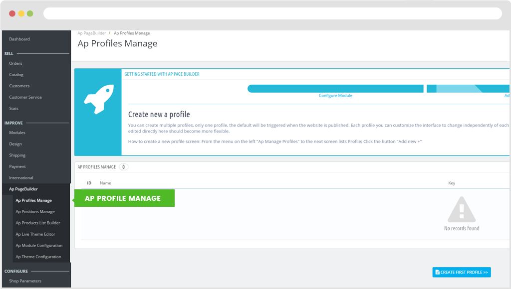
a) Creat Profile
Use click "Add new" button to create profile.
When you access "Add New" page, use need to fulfil information below:
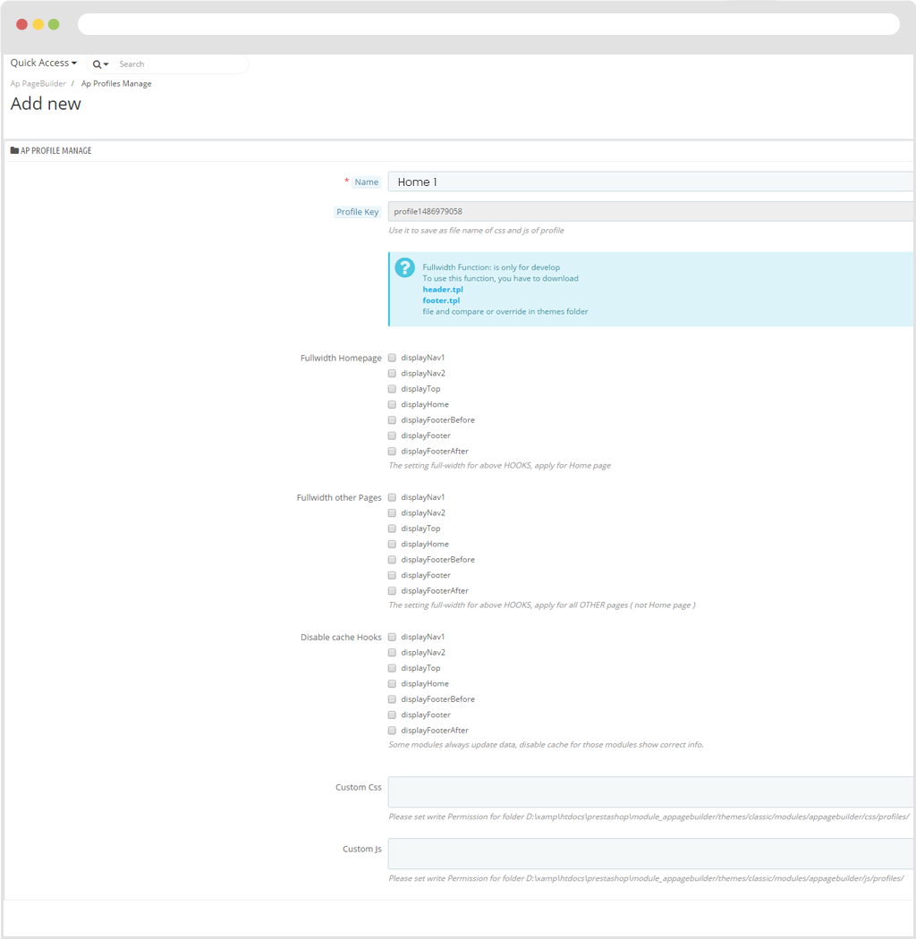
- Name: Name of profile.
- Profile Key: The Character string of profile.
- Fullwidth Homepage: The setting full-width for above HOOKS, apply for Home page
- Fullwidth other Pages: The setting full-width for above HOOKS, apply for all OTHER pages ( not Home page )
- Disable cache Hooks: Some modules always update data, disable cache for those modules show correct info.
- Custom Css: Please set write Permission for folder D:\xamp\htdocs\prestashop\module_appagebuilder/themes/classic/modules/appagebuilder/css/profiles/
- Custom Js: Please set write Permission for folder D:\xamp\htdocs\prestashop\module_appagebuilder/themes/classic/modules/appagebuilder/js/profiles/
- Click "Save" button when you finish the process.
b) Privew
- When you finish creating profile process. User click button "View" On the right hand side of the screen to press "Preview" to see display in Front end.
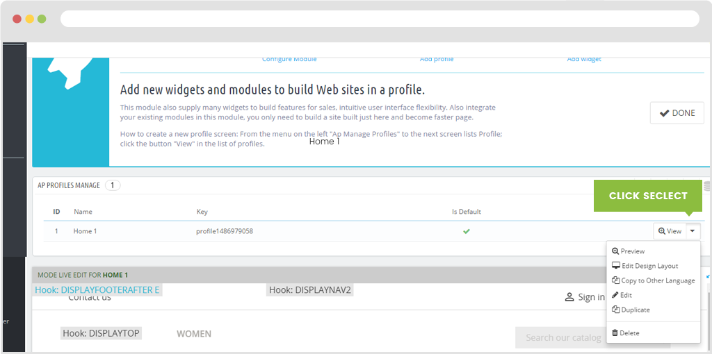
c) Edit Design Layout
- To edit the design position of the interface. user click "View" button and then press "Edit Design Layout".
- At that time the layout interface will be displayed. It is permitted customer to insert modules and blogs in homepage..
d) Copy to Other Language, Edit profile, Duplicate, Delete
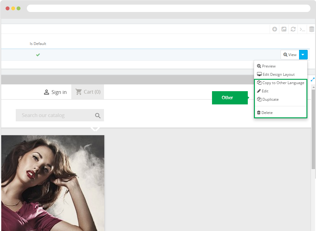
Copy to Other Language: Used to copy data to another language on the homepage.
- Edit Profile:Use to configure Profile information.
- Duplicate: Used to copy profiles.
- Delete: Use to remove profile.
e) Export, Refresh List, Show SQL Query, Export to SQL Manager
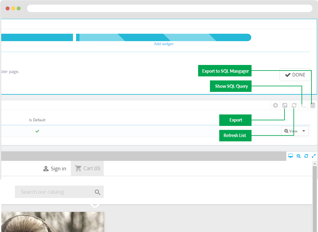
Export: Use export profile's data. When user click icon export. Your computer will export ".csv" file.
Refresh List : Used to refresh the list of profiles.
Show SQL Query
Export to SQL Mangager
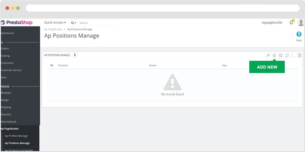
II. Ap Position Manage
Used to manage the location of blocks on the page. (Ap PageBuilder > Ap Positions Manage)
1. Add Position
To create a product list, simply click on the "+" button.
Then the screen loads into the "Add New" page.
Here you can fill in the following information.
Name: Enter a name (This field is required).
Position Key: Use it to save as file name of css and js of Position
Type: Location displayed on the page.
Custom Css: Please set write Permission for folder D:/xamp/htdocs/prestashop/module_appagebuilder/themes/classic/modules/appagebuilder/css/positions/
Custom Js: Please set write Permission for folder D:/xamp/htdocs/prestashop/module_appagebuilder/themes/classic/modules/appagebuilder/js/positions/
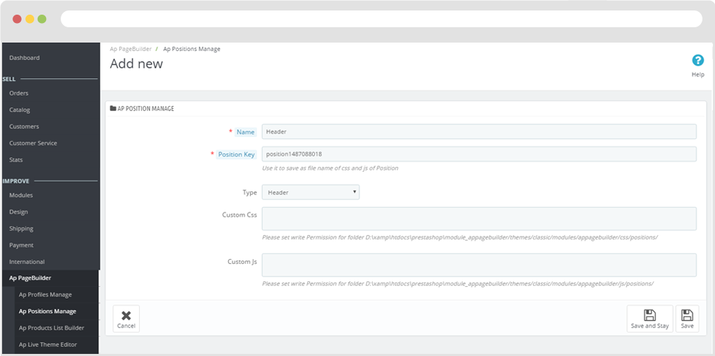
Click button "Save" On the right side to save data.
2. Edit
To configure the position user click "View"button.
Then choose "Edit", To edit the information of the location.
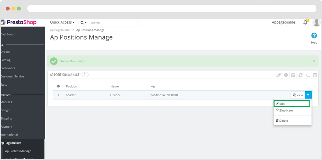
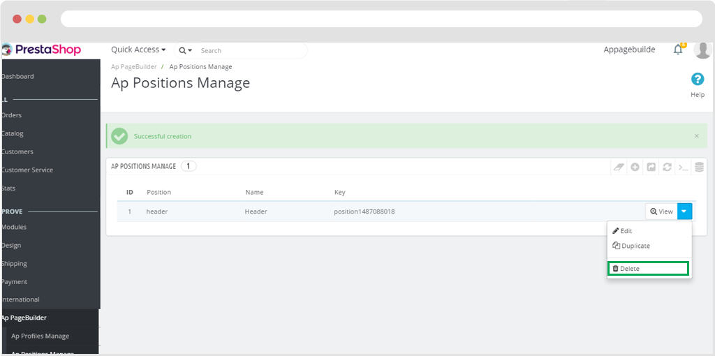
3. Delete
To remove the position, you click "View" button.
Then you press "Delete" , to remove position.
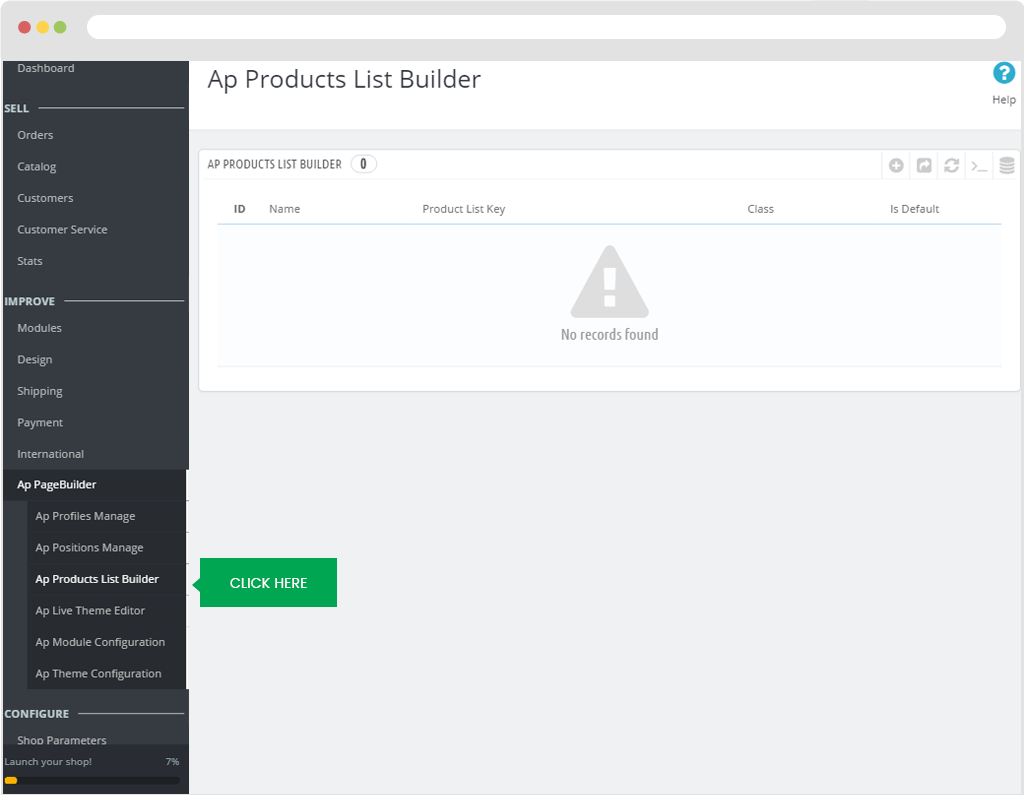
III. Ap Products List
User click "Ap Product List Builder" on the left hand side of the screen.
User click '+' button on right corner of the screen to create."Add new"
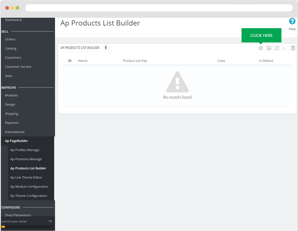
Next screen load on the page "Add New"
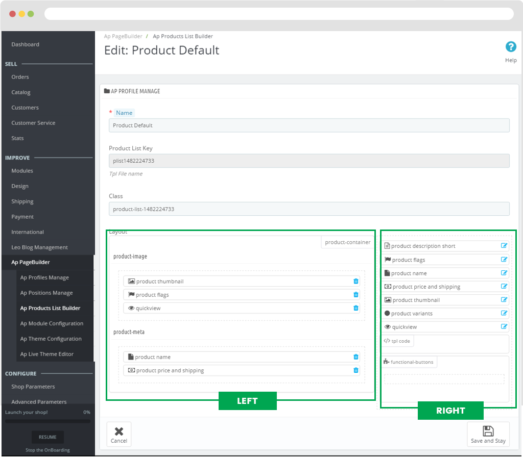
It will load into the Edit page : Product Default.
Here you can drag and drop items from the right-hand column to the left in the design of the product item.
- Name: Name of product item
- Product List Key: The character string of product key.
- Class: Class used to style the product.
- Layout: The frame contains elements.
- Product_description_short: Short description of the product.
- Product_flags: Display label on product.
- Product_name: Name of product.
- Product_price_and_shipping: Price and shipping.
- Product_thumbnail: Show small image of the product.
- Quickview: Used to view the product when user click on the product will display a popup describing the specific product.
- Tpl code: Used to add code to the frame "Tpl code".
- Functional-buttons: To Create group covers outside, we also create ".functional-buttons" class.
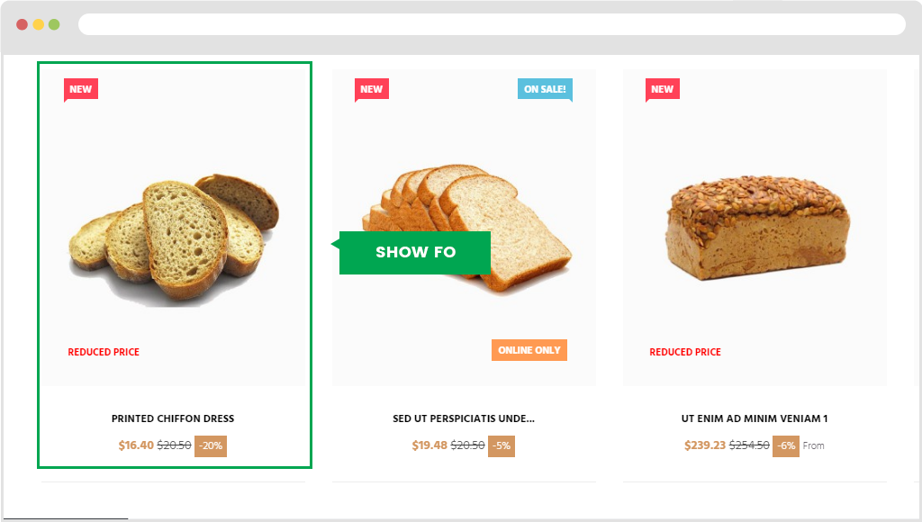
You can drag and drop elements from the right-hand frame to the left-hand side. To create product followed design.
For example, you can drag and drop elements from the layout as image below:
Display in front end:
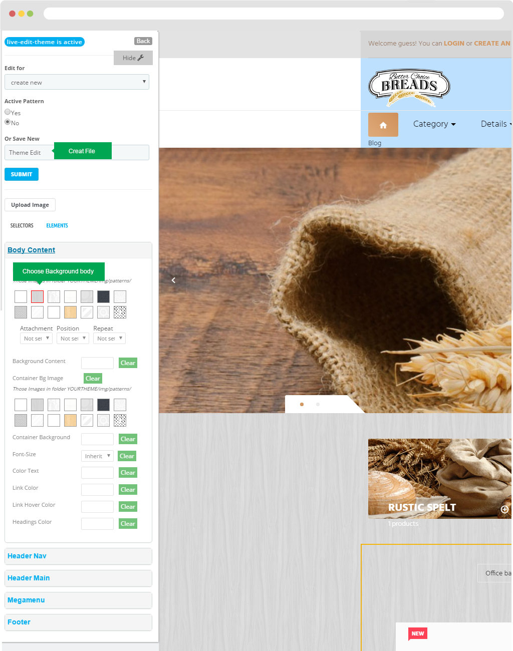
V. Ap Live Theme Editor
Step 1: Create file.
Step 2:You configure the changes on the blocks as Body content, header main, megamenu and so on.
User also can change font size, color text, Link color, Link Hover Color, Bg Outside Color, Bg Color.
V. Ap Module Configuration
1. Documentation: Appagebuilder tutorial.
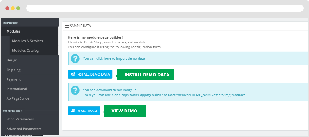
2. Sample Data: Data Information.
You can click here to import demo data
You can download demo image in Then you can unzip and copy folder appagebuilder to Root/themes/THEME_NAME/assets/img/modules
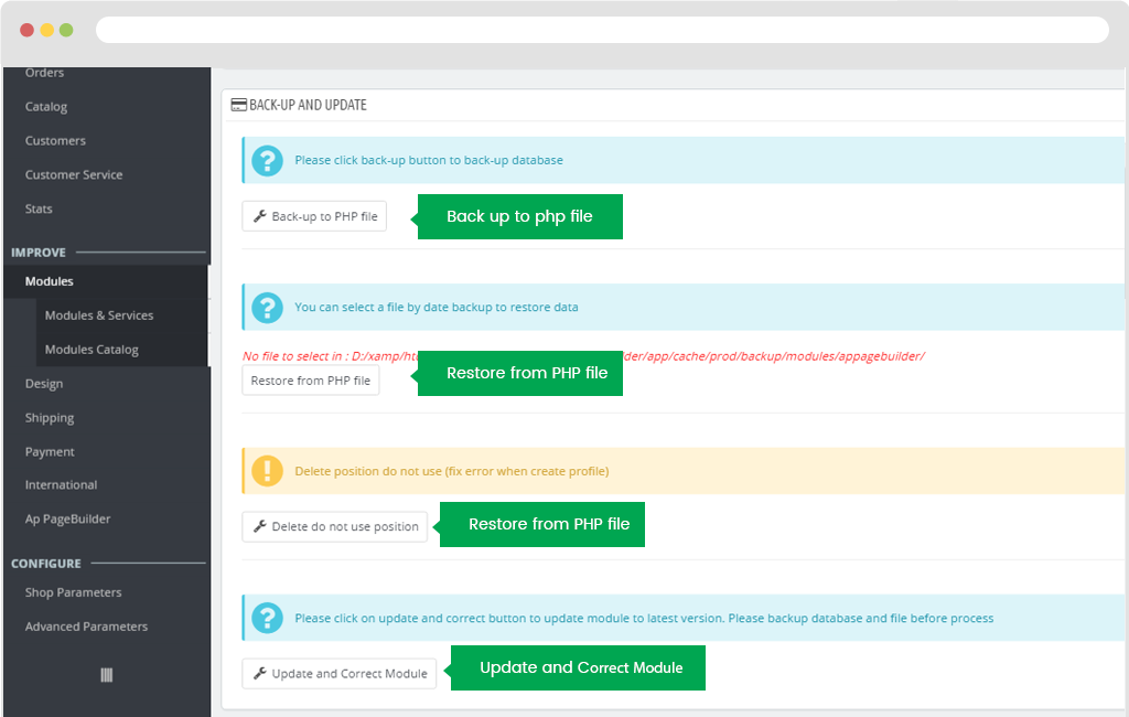
3. Back-up and Update: To back-up data and update
4. General Setting
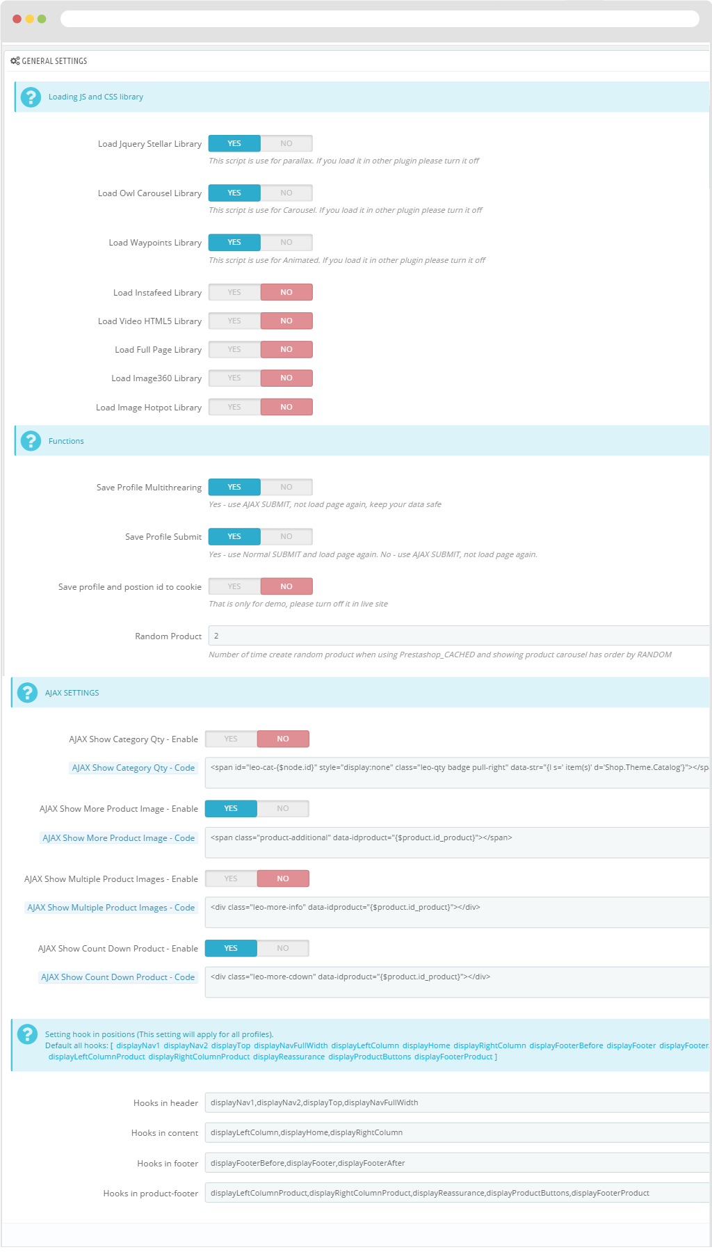
- - Loading JS and CSS library
- + Load Jquery Stellar Library>: This script is use for parallax. If you load it in other plug-in please turn it off
- + Load Owl Carousel Library: This script is use for Carousel. If you load it in other plug-in please turn it off
- + Load Waypoints Library: This script is use for Animated. If you load it in other plug-in please turn it off
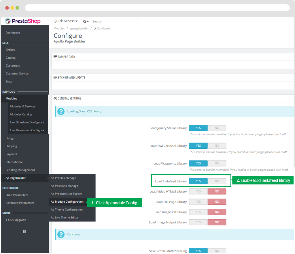
- + Load Instafeed Library: Enable or disable loading library feature of Instafeed.
- + Load Video HTML5 Library: Enable or disable loading library feature of Video Html.
- + Load Full Page Library: Enable or disable loading library feature of Full Page.
- + Load Image360 Library: Enable or disable loading library feature of Images 360.
- + Load Image Hotpot Library: Enable or disable loading library feature of Image Hotpot.
- - Functions
- + Save Profile Multithrearing: Yes - use AJAX SUBMIT, not load page again, keep your data safe
- + Save Profile Submit: Yes - use Normal SUBMIT and load page again. No - use AJAX SUBMIT, not load page again.
- + Save profile and postion id to cookie: That is only for demo, please turn off it in live site
- + Random Product: Number of time create random product when using Prestashop_CACHED and showing product carousel has order by RANDOM
- - AJAX SETTINGS
- AJAX Show Category Qty - Enable: Enable or disable the display feature.
- AJAX Show Category Qty - Code:
<span id="leo-cat-{$node.id}" style="display:none" class="leo-qty badge pull-right" data-str="{l s=' item(s)' d='Shop.Theme.Catalog'}></span> - AJAX Show More Product Image - Enable: Enable or Disable display product feature.
- AJAX Show More Product Image - Code:
<span class="product-additional" data-idproduct="{$product.id_product}"></span> - AJAX Show Multiple Product Images - Enable: Enable or Disable display product images.
- AJAX Show Multiple Product Images - Code:
<div class="leo-more-info" data-idproduct="{$product.id_product}"></div> - AJAX Show Count Down Product - Enable
- AJAX Show Count Down Product - Code
<div class="leo-more-cdown" data-idproduct="{$product.id_product}"></div>
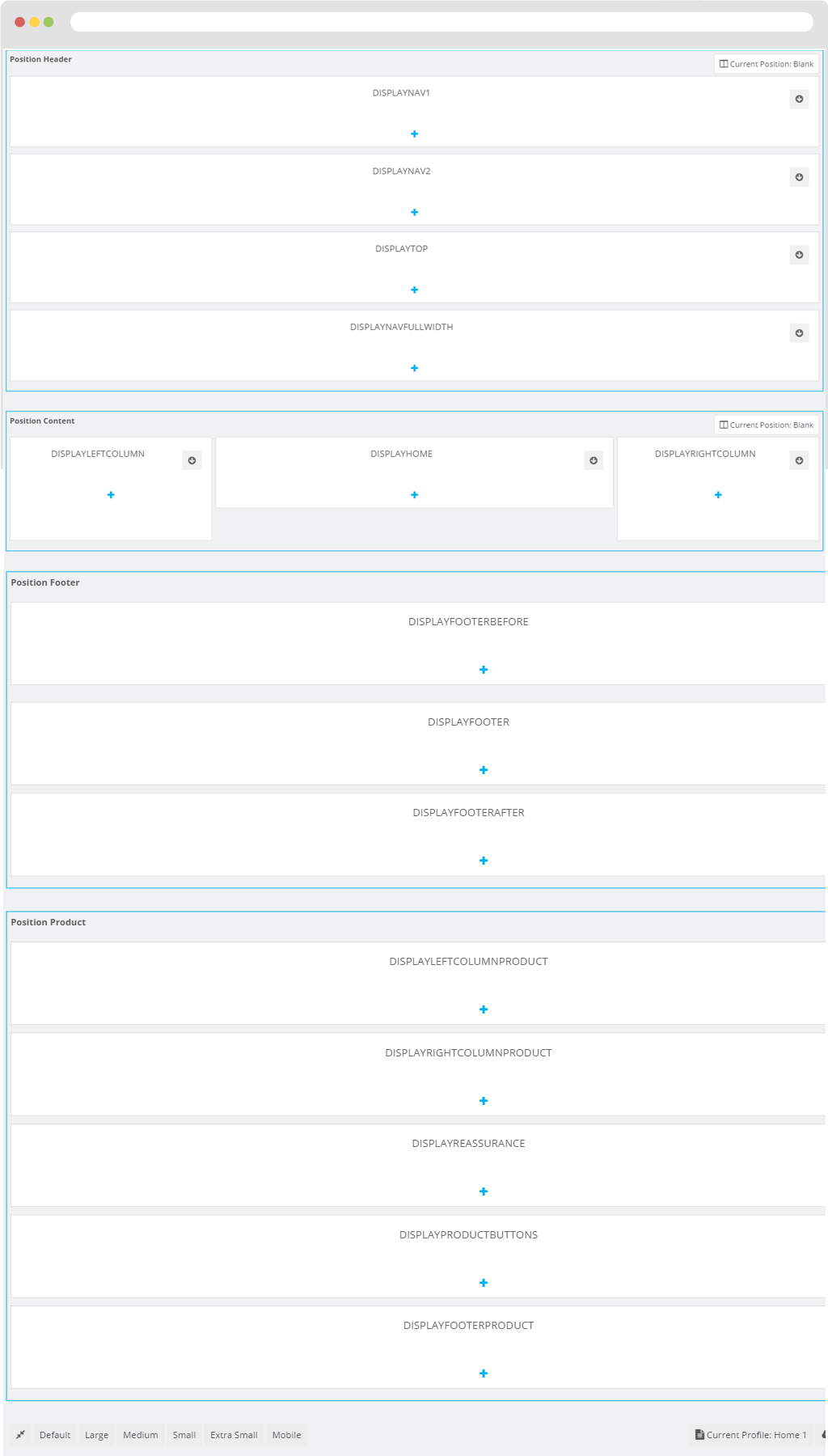
- - Setting hook in positions (This setting will apply for all profiles).
- Hooks in header
displayNav1,displayNav2,displayTop,displayNavFullWidth
- Hooks in content
displayLeftColumn,displayHome,displayRightColumn
- Hooks in footer
displayFooterBefore,displayFooter,displayFooterAfter
- Hooks in product-footer
displayLeftColumnProduct,displayRightColumnProduct,displayReassurance,displayProductButtons,displayFooterProduct
- Hooks in header
When you finish configuration click "Save" button to keep data.
Ap Theme Configuration
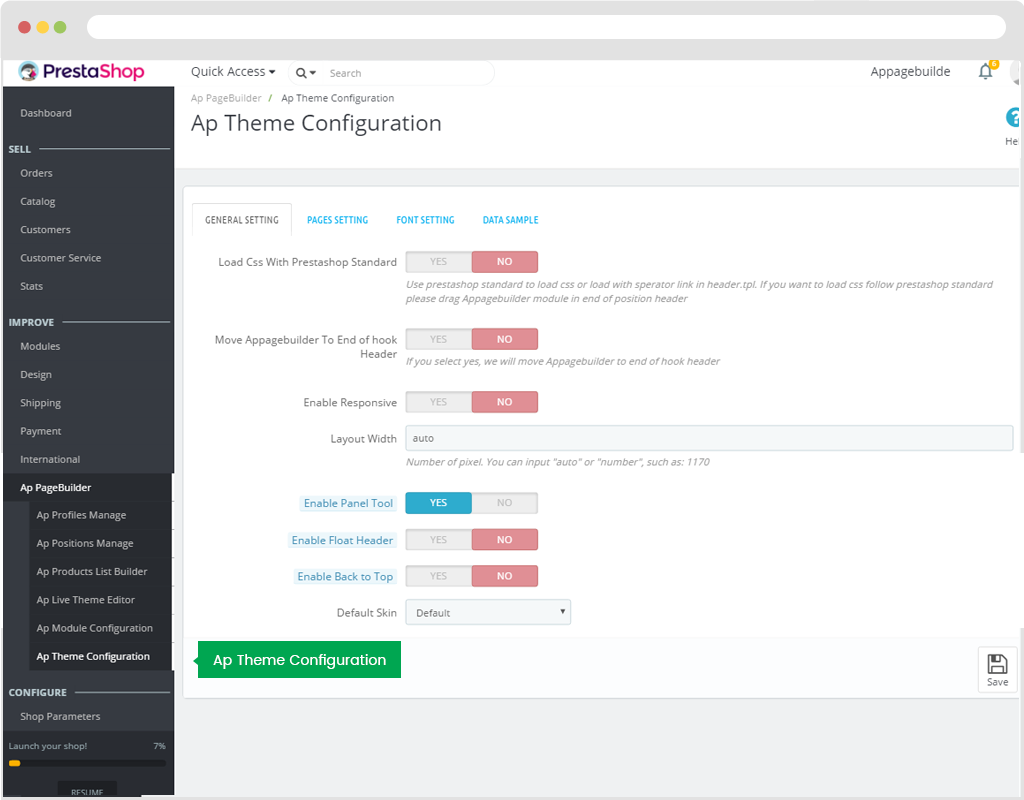
Use to configure module.
1. General Setting
- - Load Css With Prestashop Standard: Use prestashop standard to load css or load with sperator link in header.tpl. If you want to load css follow prestashop standard please drag Appagebuilder module in end of position header.
- - Move Appagebuilder To End of hook Header: If you select yes, we will move Appagebuilder to end of hook header.
- - Enable Responsive: Hide or Show responsiveness on devices as Tablet, Mobile phone...
- - Enable Panel Tool: Hide or Show Panel tool.
- - Enable Float Header: Turn On or OFF float header feature.
- - Default Skin: Default colour of Site.
- - Layout Mode: Screen display mode.
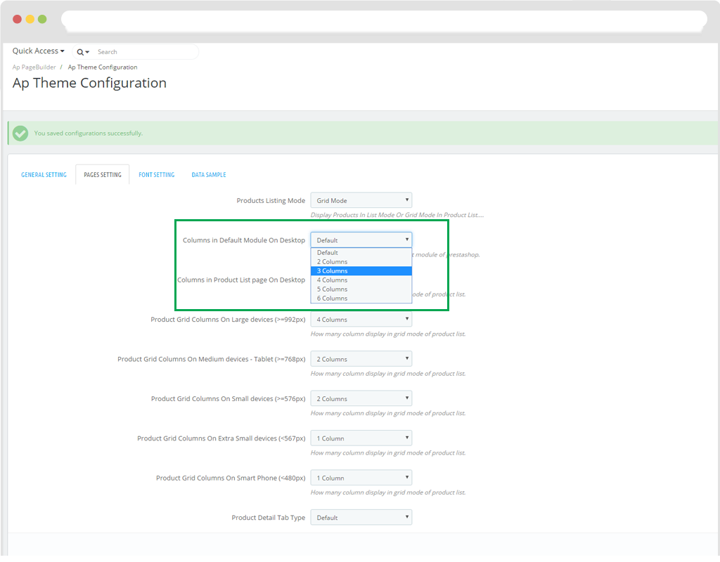
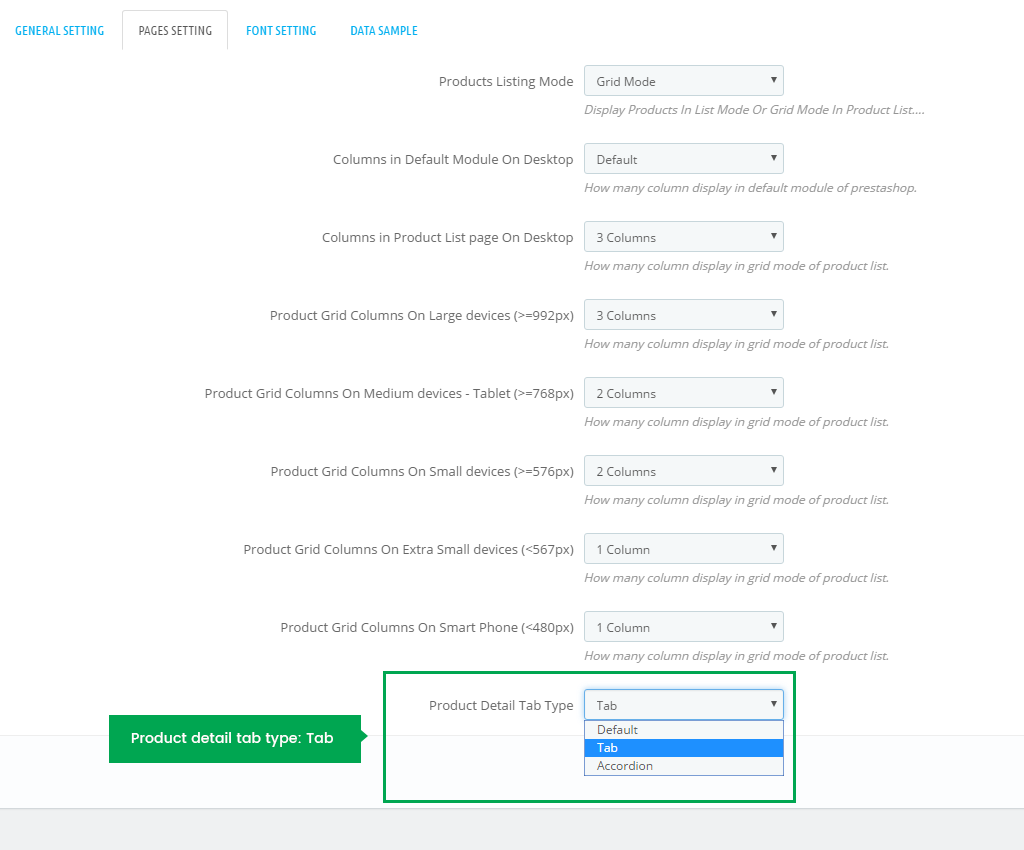
2. Pages Setting
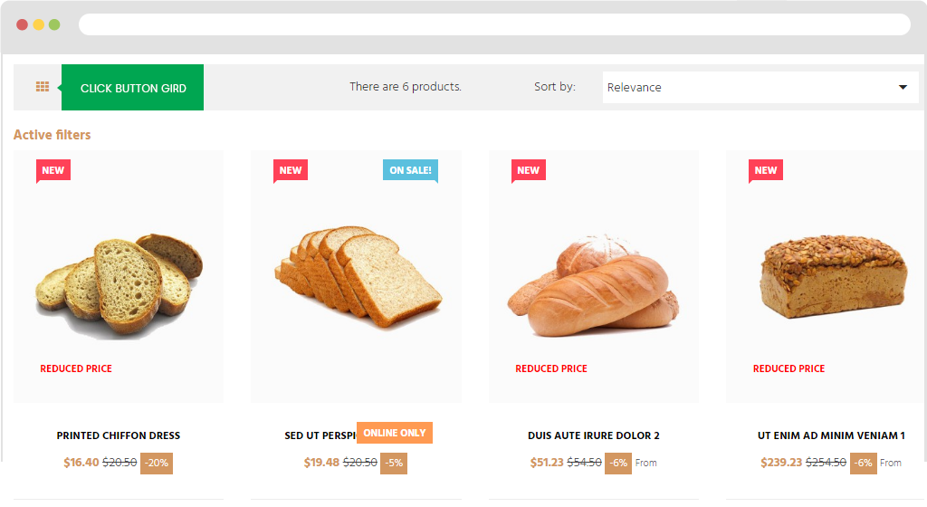
+ Gird: Display products with Grid Type.
+ Product Listing Mode: Gird . In front end will be shown as the image below:
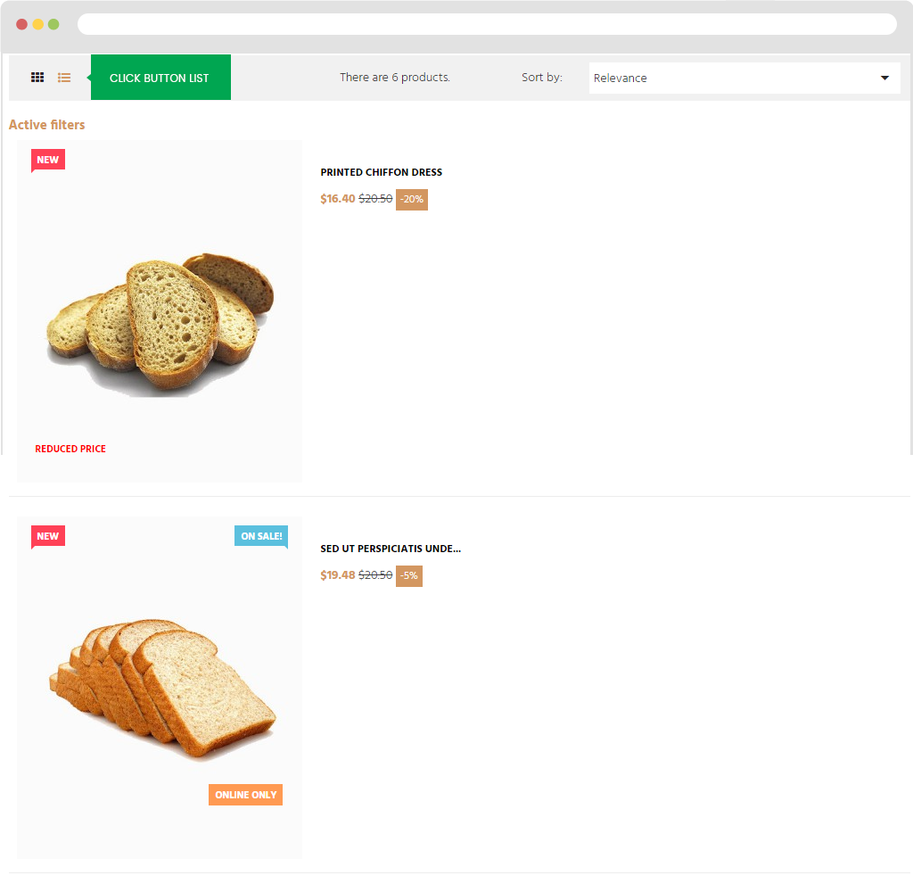
+ List: Display products with List Type. In front end will be shown as the image below:
b) Columns in Default Module On Desktop
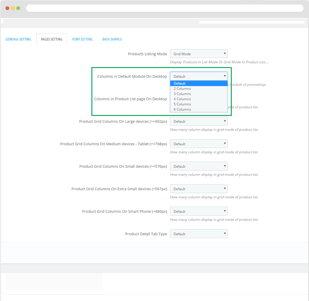
Columns in Product List page On Desktop
Displayed in BO:
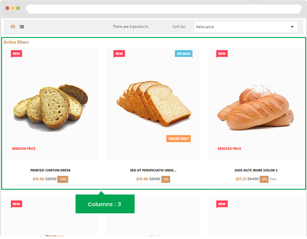
For example: If you choose Columns: Product images will be shown in different columns.
Displayed in FO:
Configuration in different screen mode:
- Product Grid Columns On Large devices (>=992px):How many column display in grid mode of product list.
- Product Grid Columns On Medium devices - Tablet (>=768px): How many column display in grid mode of product list.
- Product Grid Columns On Small devices (>=576px): How many column display in grid mode of product list.
- Product Grid Columns On Extra Small devices (<567px): How many column display in grid mode of product list.
- Product Grid Columns On Smart Phone (<480px): How many column display in grid mode of product list.
- Product Detail Tab Type
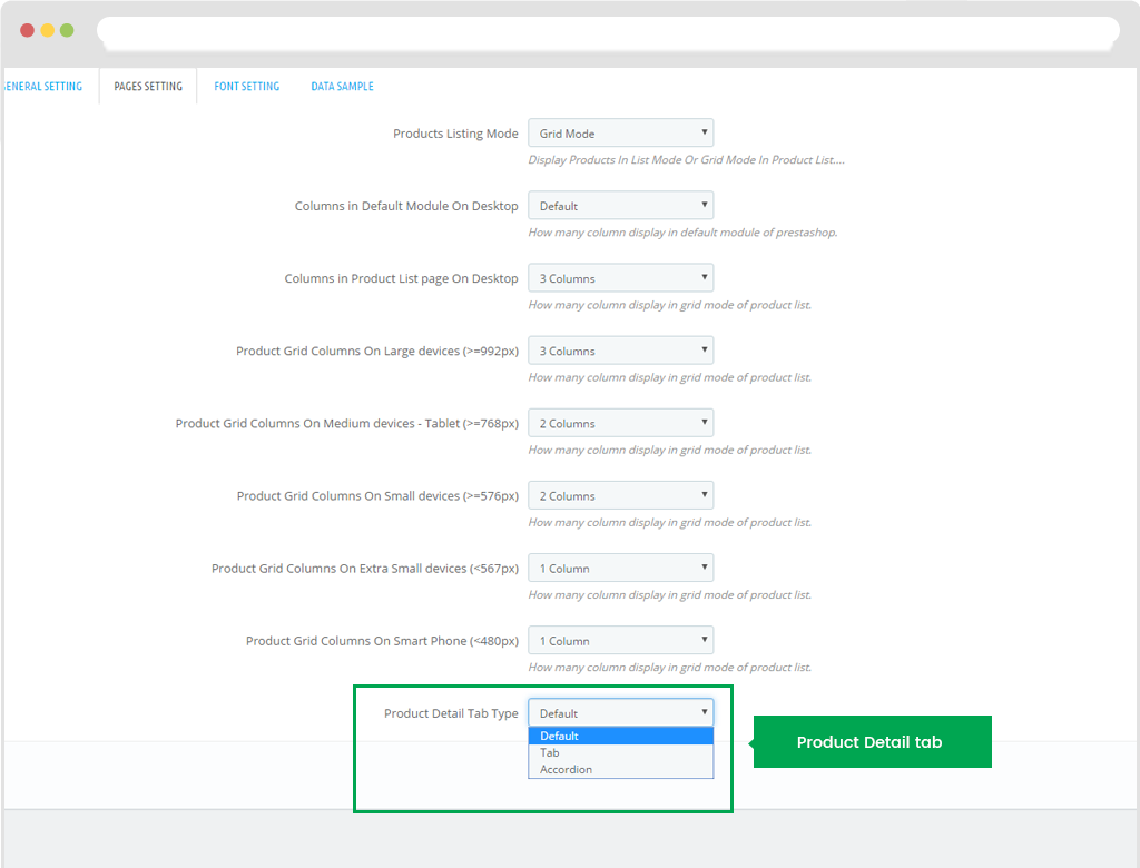
If you choose Product detail tab type: Default. Front end will display from top to bottom parts as "DESCRIPTION , PRODUCT DETAILS
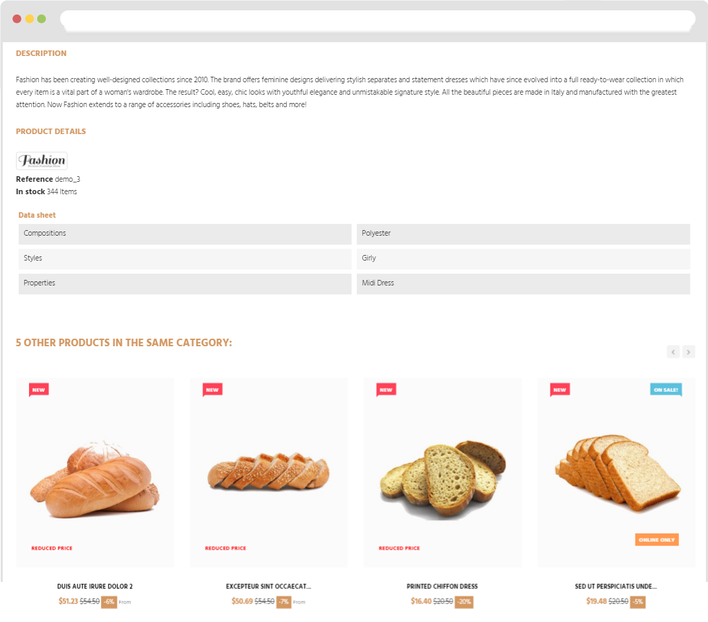
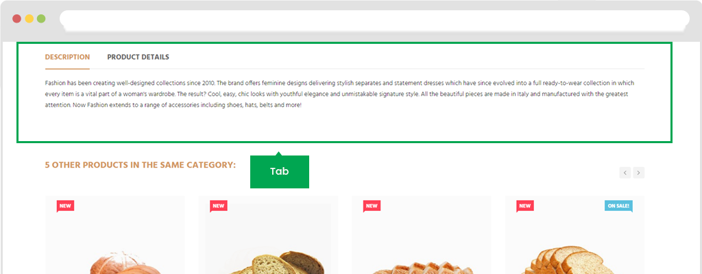
If you choose Product detail tab type: tab
Displayed in FO as "tab" style:
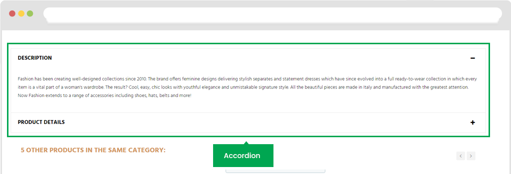
If you choose Product detail tab type: Accordion
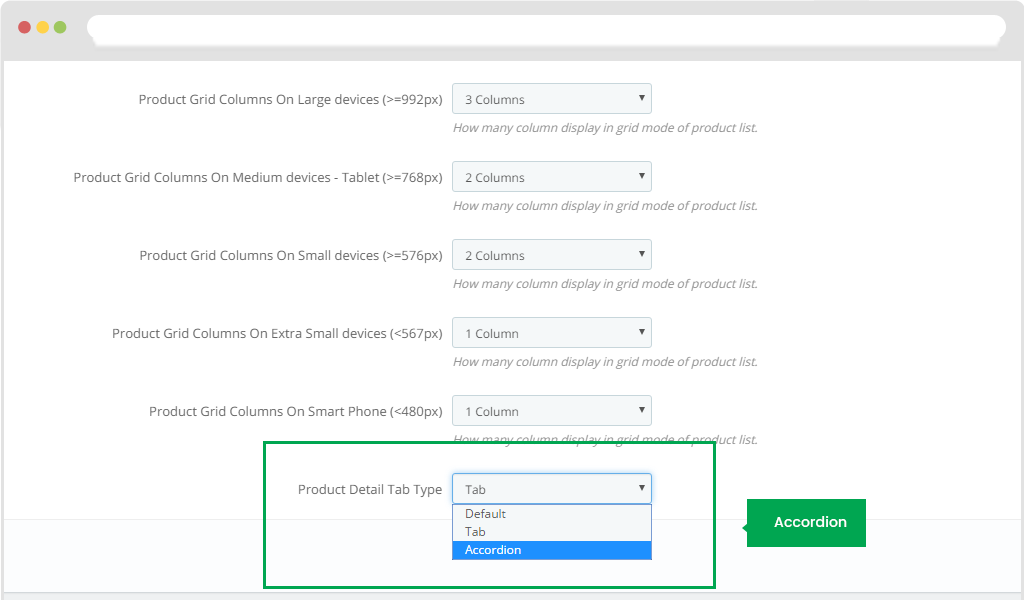
Displayed in FO
3. Google font
Google Fonts Setup
Here you can setup the Google web fonts that you want to use in your site.
Step 1: click on "Sellect" button, choose "Font"
Step 2: Choose "Add font"
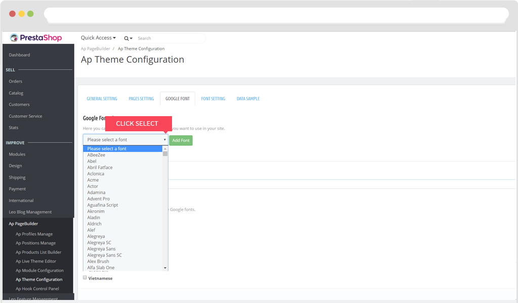
Then click on "Save"
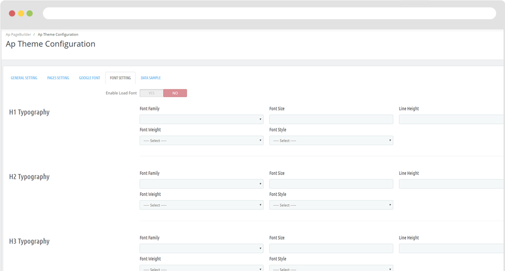
4. Font Setting
Enable load font: Enable or disable load font
In font setting, we can config such as: H1 Typography, H2 Typography, H3 Typography, H4 Typography, H5 Typography, H6 Typography, P Tag, A Tag, Span Tag
Include features of font styles
- + Font Family
- + Font Weight
- + Font Size
- + Font Style
- + Line Height
Displayed in BO.
Displayed in FO.
Data Sample
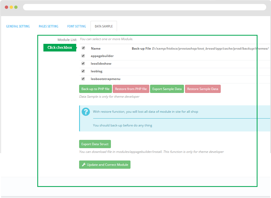
To export data of module Appagebuilder, user just check the modules you want to export.
The next step is to click the"Export Sample Data" button.
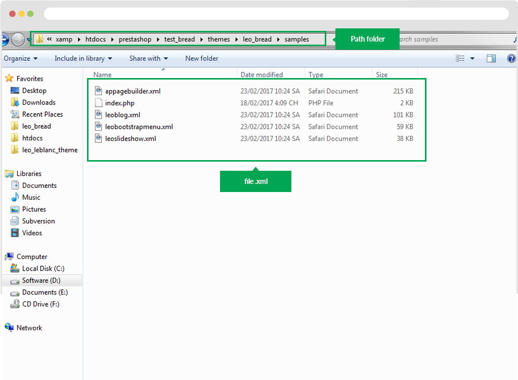
The system will automatically export file .xml" in folder at "Sample" located in theme: Example: http:\xamp\htdocs\prestashop\test_bread\themes\leo_bread\samples
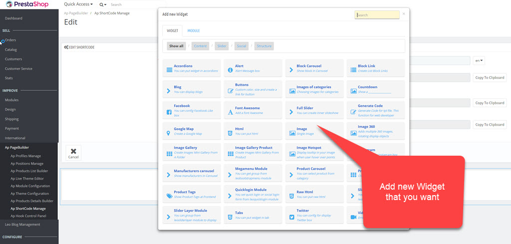
Creat Widget
Add new widgets and modules to build Web sites in a profile.
This module also supply many widgets to build features for sales, intuitive user interface flexibility. Also integrate your existing modules in this module, you only need to build a site built just here and become faster page.
How to create a new profile screen: From the menu on the left "Ap Manage Profiles" to the next screen lists Profile; click the button "View" in the list of profiles.
1.1. Add Group Widget
Use to create a group of layout. User just need to click "+" button.
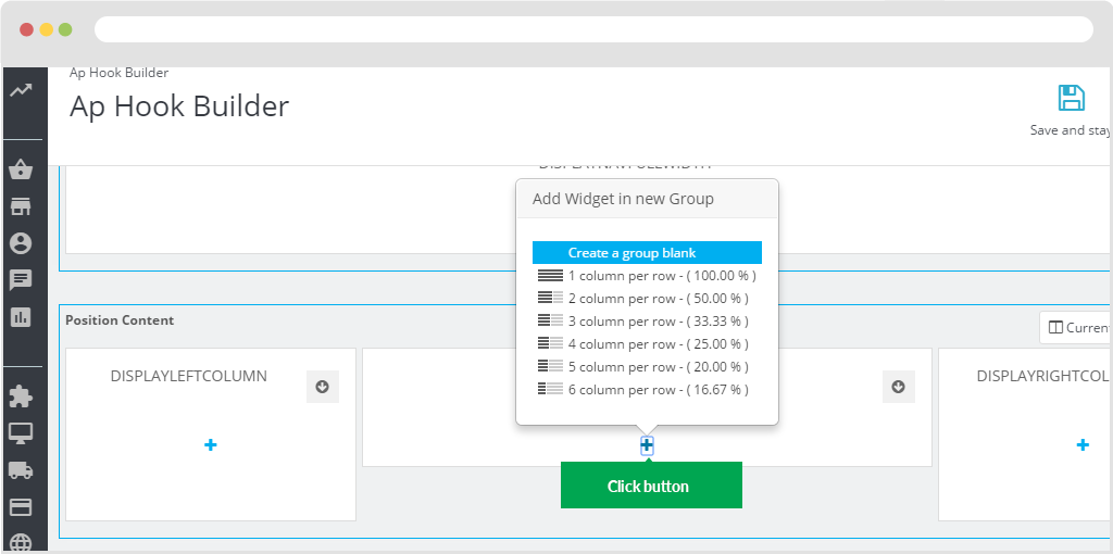
Choose "Create a group blank". A new group will be created.
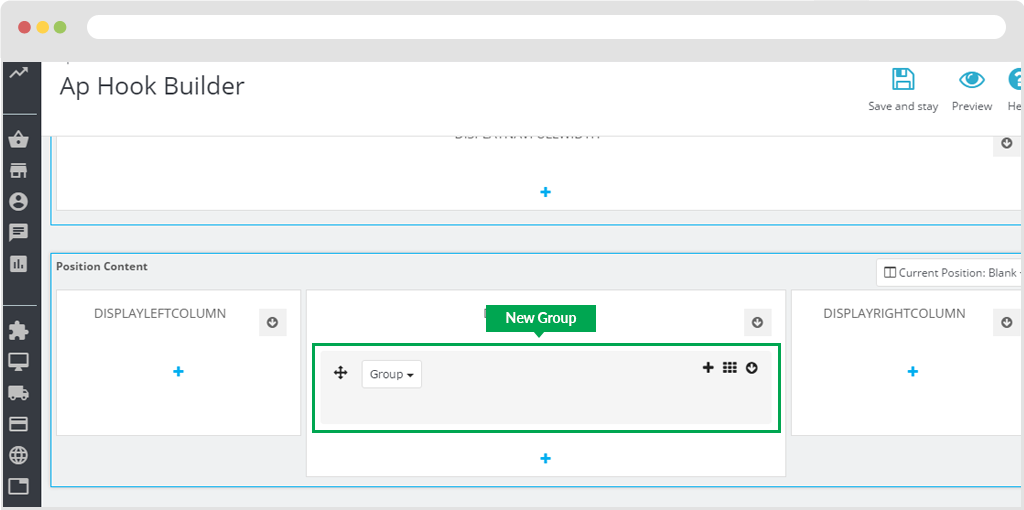
1.2 Edit group
To configure group, you just click in "Group" button.
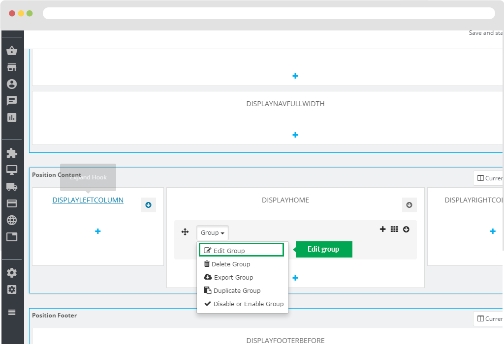
The following will display a panel to edit the information in the group.
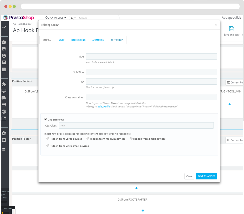
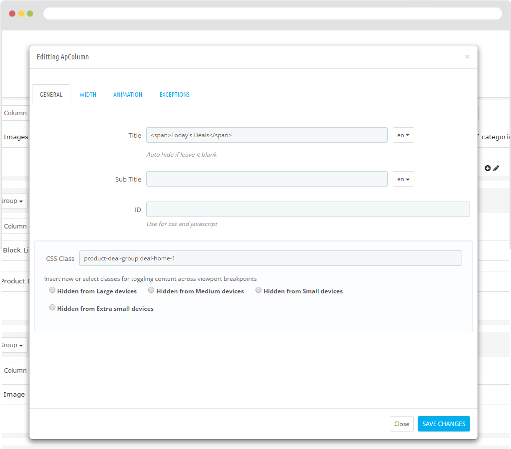
A. General
- Title: Name of Group.
- Sub Title: Name of sub title in Group.
- ID: Use for css and javascript
- Class container: Now Layout of Row is Boxed, to change to Fullwidth : - Going to edit profile check option "displayHome" hook of "Fullwidth Homepage"
CSS Class: Add class css to style.
B. Style
- Minimum height: You can use pixels : 10px or percent : 10%.
- Margin Top: The margin-top property sets the top margin of an element.
- Margin Bottom: The margin-bottom property sets the bottom margin of an element.
- Padding Bottom: The padding-bottom property sets the bottom padding (space) of an element.
- Padding top: The padding-top property sets the top padding (space) of an element.
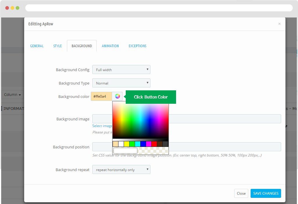
C. Background
- Background Config:
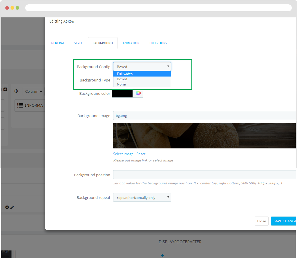
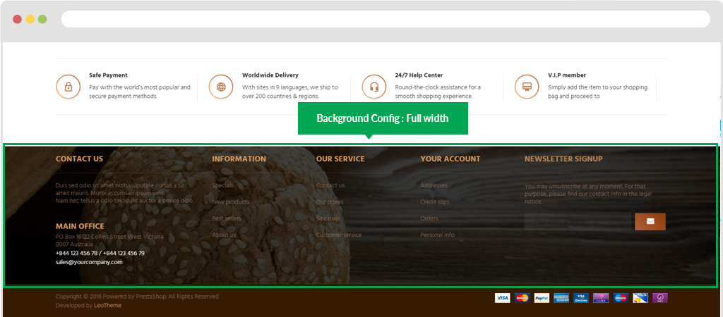
+ Background Config: Full width Background will display the screen width. Display in FO.
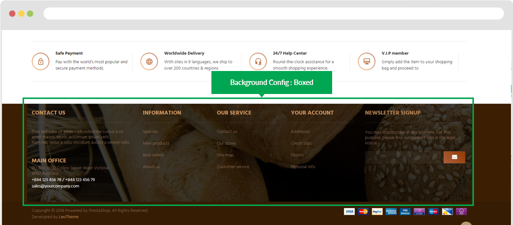
+ Background Config: Boxed The background will appear in box style. Display in FO.
+ Background Config: None Background will display as default.
+ Background Type: Normal
+ Background Type: Fixed
+ Background Type: Parallax
+ Background Type: Mouse Parallax
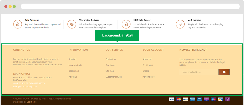
- Background colour: Depending on the colour you want. You just click the colour button and then hover over the colour palette next to the colour you want.
Display in FO.
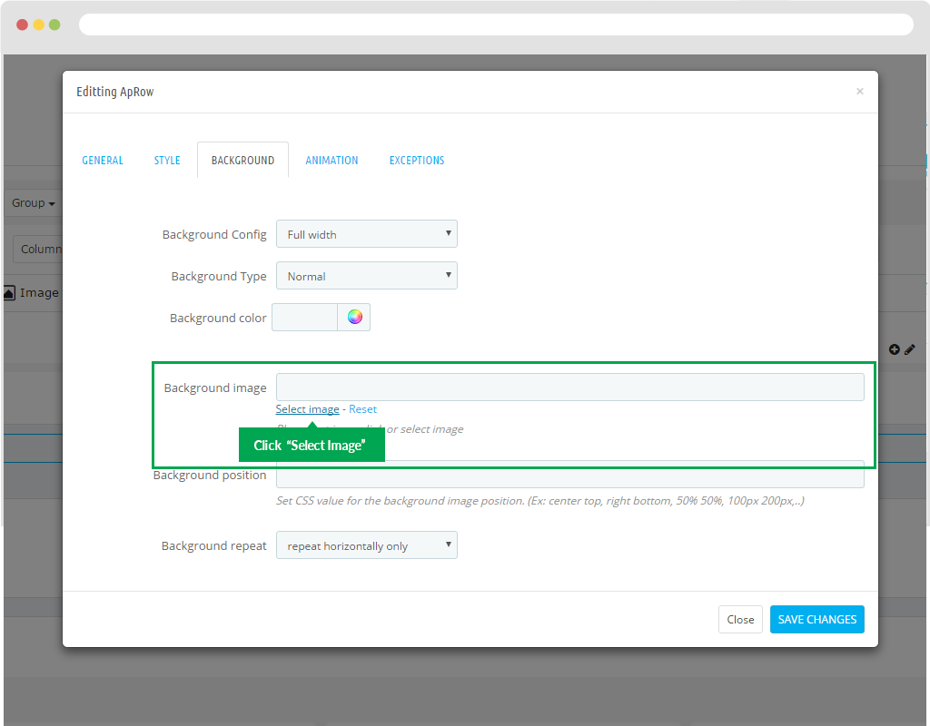
- Background image: Display background by image.
Step 1: You just click "Select images"
Step 2: You just click button "Add files".
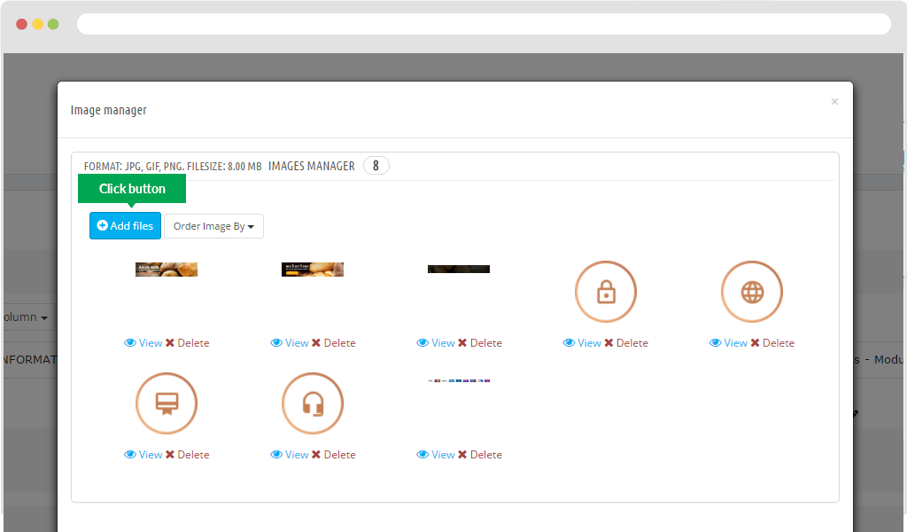
Step 3: Load to image path. Then select the background you need.
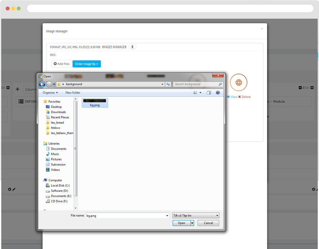
Step 4: After that you choose "Upload files" button nearly "Add files" button.
Step 5: Then you choose image.
- Background position: The background-position property sets the starting position of a background image.
- Background repeat: The background-repeat property sets if/how a background image will be repeated.
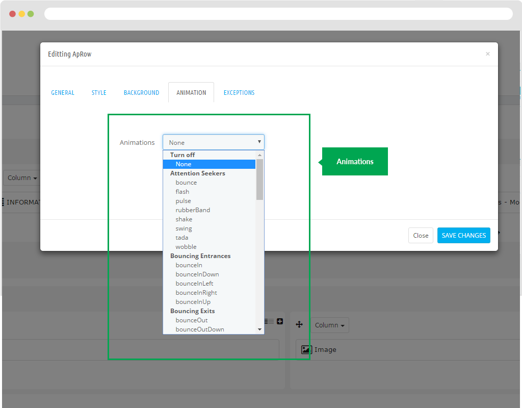
D. Animation
Motion effects of images.
G. Exceptions
H. Other Group
Delete
To delete group you simply choose "Group" and then choose delete to remove.
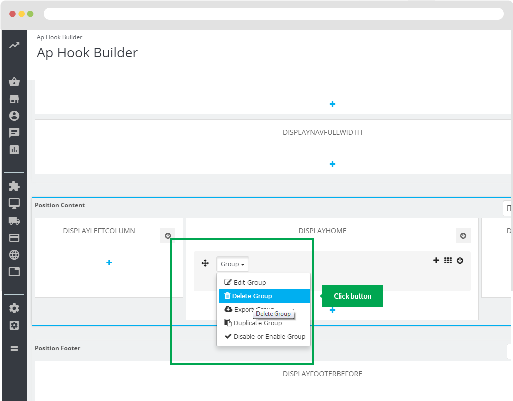
Export Group
As delete you choose "Group" and click "Export Group".
After that, our system will Export file ".xml".
Duplicate Group
Used to create a new group similar to the original group. You just click on the "Group" button. Then select "Duplicate Group".
Disable or Enable Group
Used to Hide or Show Group. You just click the "Group" button. Then select "Disable or Enable Group".
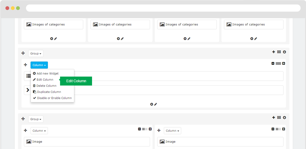
Column Widget
1.1 Add Column Widget
To create a column, just click the "+" button.
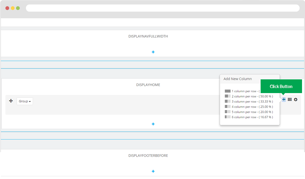
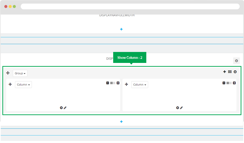
Then you need to select the number of columns you want, eg you want to display 2 columns you just select "2 column per row". Display in FO.
1.2 Add New Widget
To create widget you click in "Group" button and then choose "Add new widget".
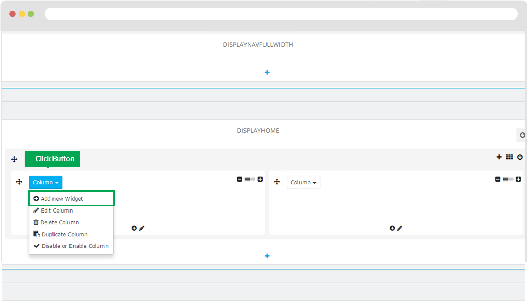
Then you will popup the module you need. Note "CLICK ON WIDGET IN THE SHEET WILL BE SHOWN BELOW"
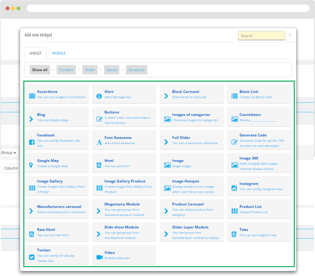
Accordions
- Title: Name.
- Sub Title: Name of sub title.
- Css ClassAdd class in Css.
- Showing Type: Type of Accordions.
+ Showing Type: Set active.
+ Showing Type : Show all
+ Showing Type : Hide all
- Active Accordion: Status.
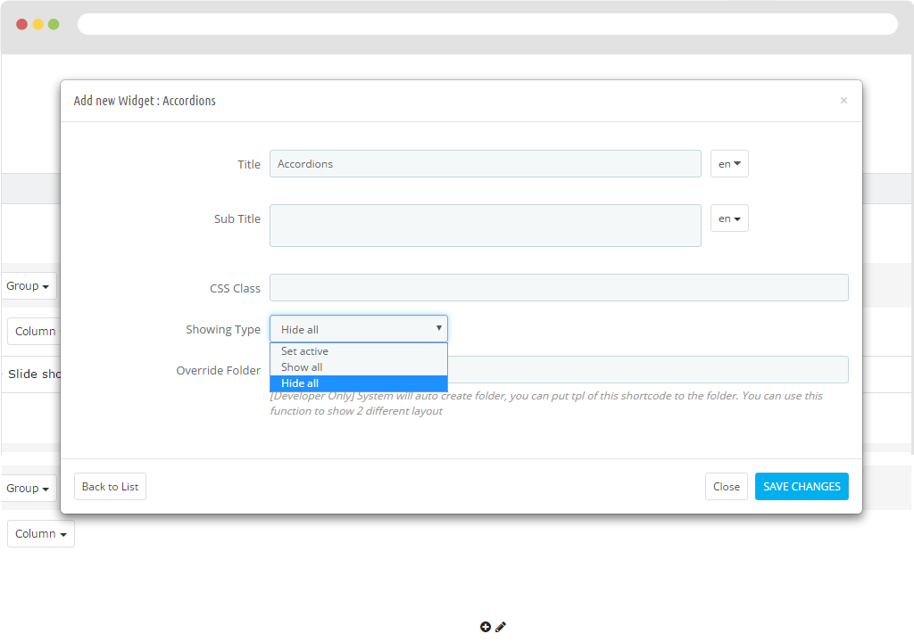
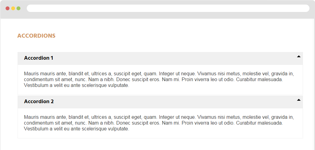
- Display in FO.
Alert
Display in BO.
- Title: Title.
- Sub Title: Display sub title.
- Content: Content of Alert.
- Alert Type Type of Alert to display.
+ Alert Type: Alert Success.
+ Alert Type: Alert Info.
+ Alert Type: Alert Warning.
- Override Folder: [Developer Only] System will auto create folder, you can put tpl of this short code to the folder. You can use this function to show 2 different layouts.
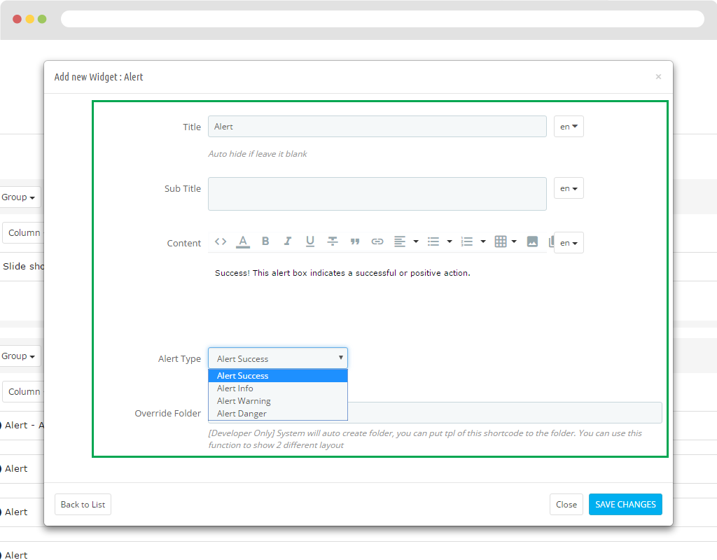
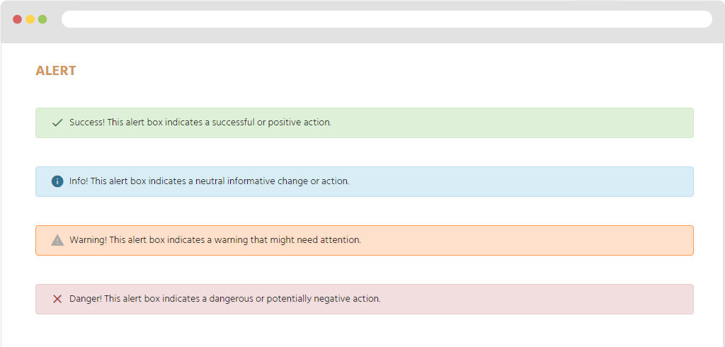
Display in FO.
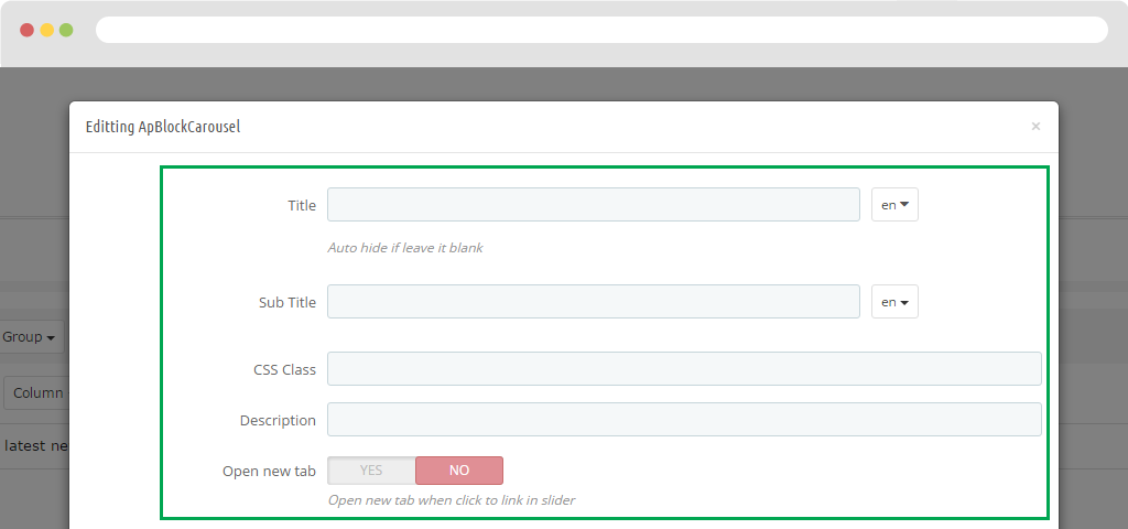
Block Carousel
Title: Fill in Title.
Sub Title: Fill in sub title.
CSS Class: Add class to style for Block Carousel.
Description: Text for description.
Open new tab: Open new tab when click to link in slider
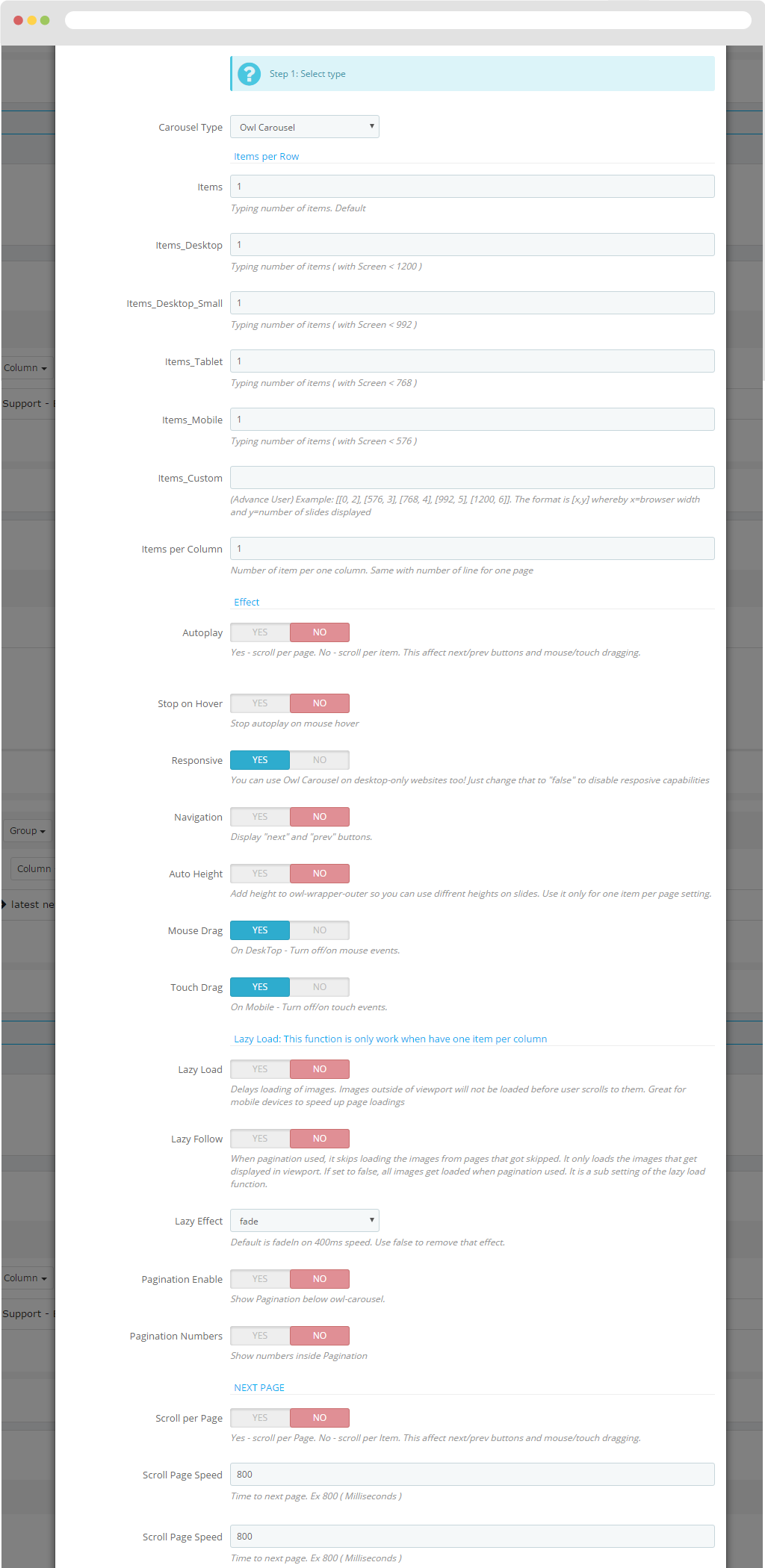
Then you need to perform the following steps:
Step 1: Select type.
- Carousel Type: Type of display.
Display on the same row.
- Items: Typing number of items. Default
- Items_Desktop: Typing number of items ( with Screen < 1200 )
- Items_Desktop_Small Typing number of items ( with Screen < 992 )
- Items_Tablet: Typing number of items ( with Screen < 768 )
- Items_Mobile: Typing number of items ( with Screen < 576 )
- Items_Custom: (Advance User) Example: [[0, 2], [576, 3], [768, 4], [992, 5], [1200, 6]]. The format is [x,y] whereby x=browser width and y=number of slides displayed
- Items per Column: Number of item per one column. Same with number of line for one page
- Auto play: Yes - scroll per page. No - scroll per item. This affect next/pre buttons and mouse/touch dragging.
- Stop on Hover: Stop auto play on mouse hover
- Responsive: You can use Owl Carousel on desktop-only websites too! Just change that to "false" to disable responsive capabilities.
- Navigation: Display "next" and "prev" buttons
- Auto Height: Add height to owl-wrapper-outer so you can use different heights on slides. Use it only for one item per page setting.
- Mouse Drag: On DeskTop - Turn off/on mouse events.
- Touch Drag: On Mobile - Turn off/on touch events.
- Lazy Follow: When pagination used, it skips loading the images from pages that got skipped. It only loads the images that get displayed in view port. If set to false, all images get loaded when pagination used. It is a sub setting of the lazy load function.
- Lazy Effect: Default is fadeIn on 400ms speed. Use false to remove that effect.
- Pagination Enable: Show Pagination below owl-carousel.
- Pagination Numbers: Show numbers inside Pagination
- Scroll per Page: Yes - scroll per Page. No - scroll per Item. This affect next/prev buttons and mouse/touch dragging.
- Scroll Page Speed: Time to next page. Ex 800 ( Milliseconds )
- Scroll Item Speed: Time to next item. Ex 200 (Milliseconds)
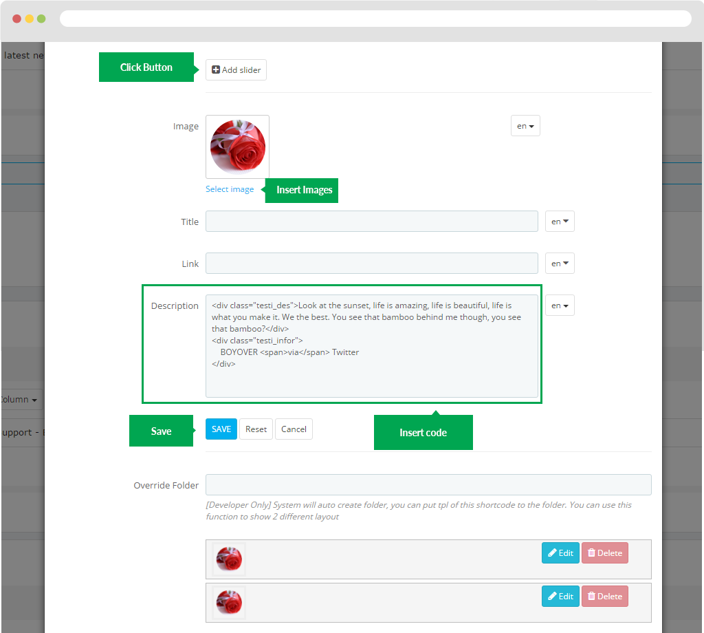
Step 2: Add content for sliders
user simply click "Add Slider" button. It will then display the frame below. You will fill in the information there.
- Image: Click "Select image" button.
- Title: Title
- Link Use to insert link.
- Description: Insert source code.
- Override Folder: [Developer Only] System will auto create folder, you can put tpl of this shortcode to the folder. You can use this function to show 2 different layouts.
Remember "Save" button.
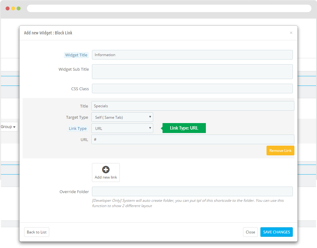
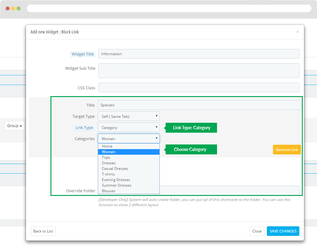
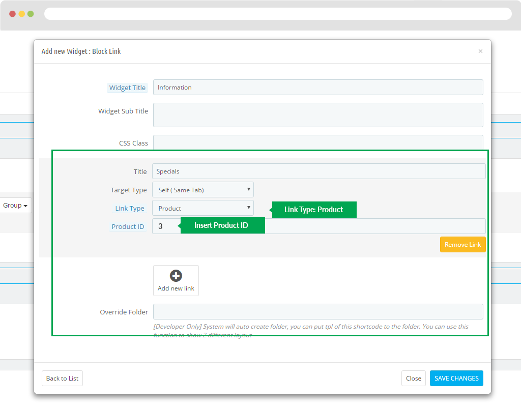
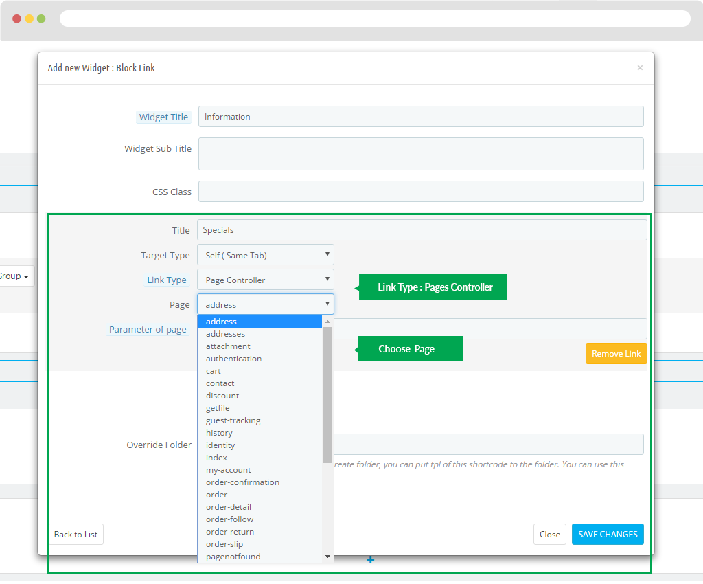
Block Links
- Widget Title: Title
- Widget Sub TitleSub title
- CSS Class: Add class css.
- Override Folder [Developer Only] System will auto create folder, you can put tpl of this shortcode to the folder. You can use this function to show 2 different layout
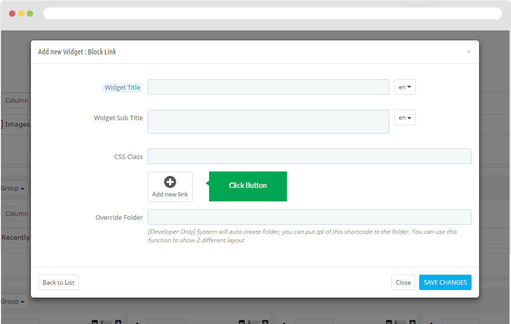
- then you click "Add new link".
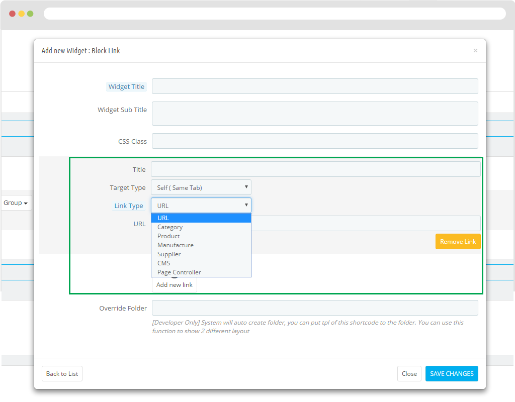
- Title: Title links
- Target Type
- Link Type
+ Link Type: URL: Can insert path URL.
+ Link Type: Category: Get path Category style.
+ Link Type: Product: Take the path to the Product.
+ Link Type: Manufacture: Take the path to the Manufacture.
+ Link Type: Supplier: Take the path to the Supplier.
+ Link Type: CMS: Take the path to the CMS.
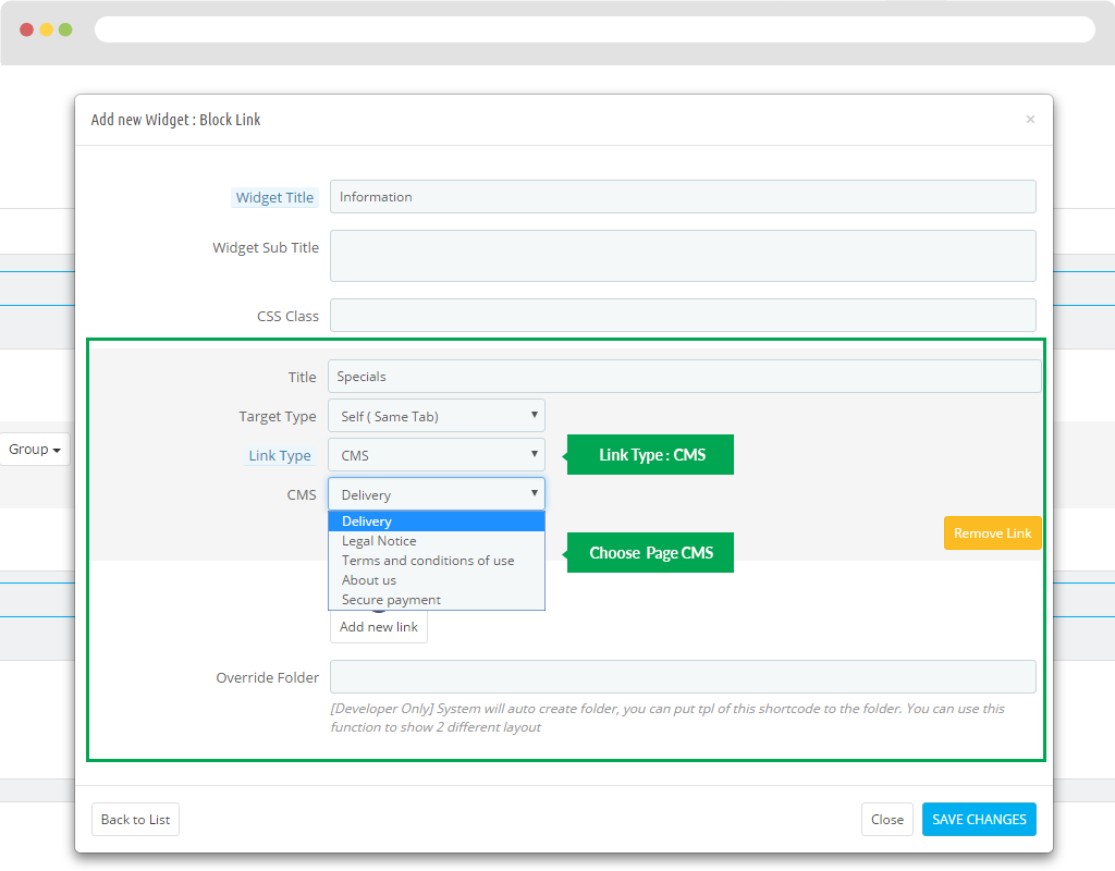
+ Link Type: Page Controller: Take the path to the CMS.
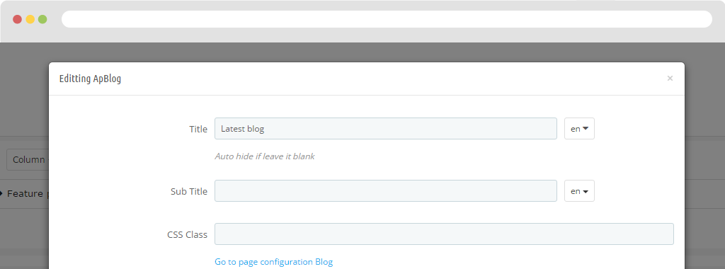
Blog
Fill in the blog information.
Title
Sub Title
CSS Class: Add class to css for Blog.
Then you need to perform the following steps:
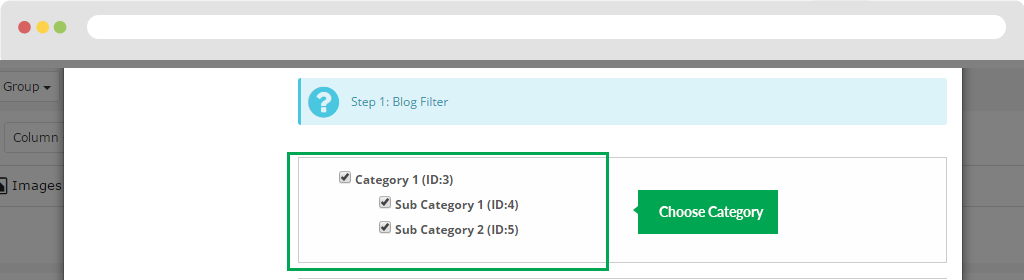
- Step 1:Blog Filter
You can choose Category blog:
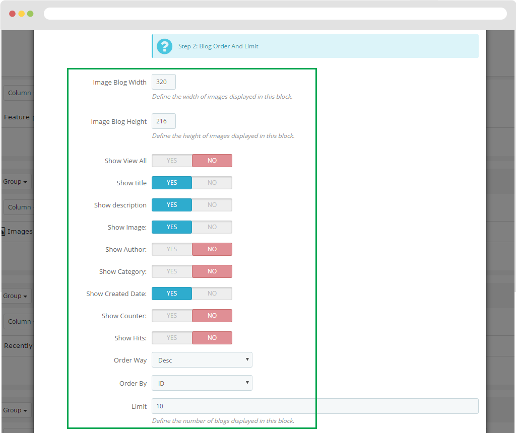
- Step 2: Blog Order And Limit
+ Image Blog Width: Width of the blog image.
+ Image Blog Height: Height of blog image.
+ Show View All: Turn on or off "View All".
+ Show title: Hide or Show Title.
+ Show description: Hide or Show short descriptions of blogs.
+ Show Image:: Hide or show pictures.
+ Show Author:: Hide or show blog posters.
+ Show Category:: Hide or show blog entries.
+ Show Created Date:: Hide or show the creation date of blog posts.
+ Show Counter: hide or show.
+ Show Hits::
+ Order Way:
+ Order By:
+ Limit
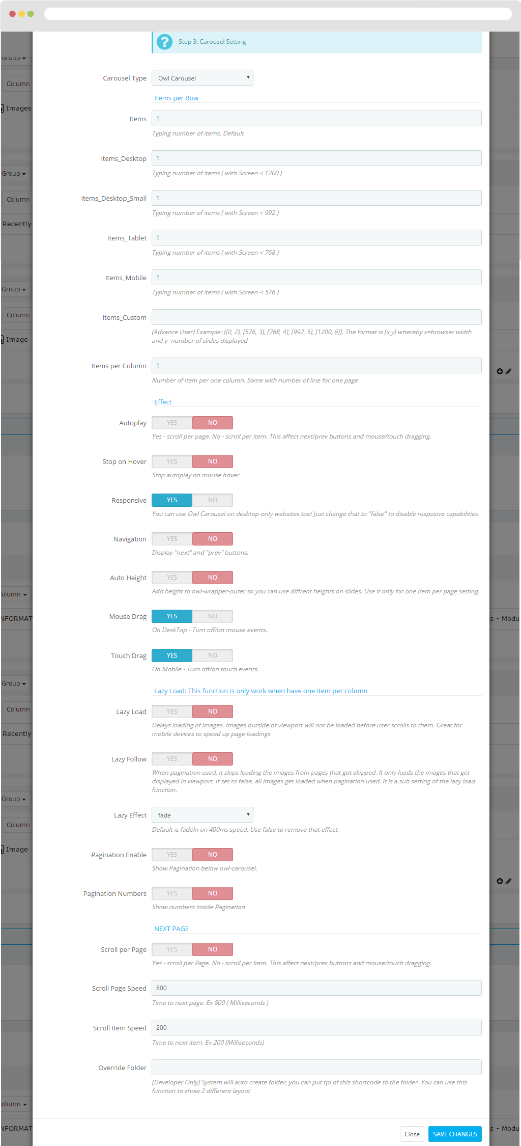
- Step 3:Carousel Setting
Carousel Type:
- Items: Typing number of items. Default
- Items_Desktop Typing number of items ( with Screen < 1200 )
- Items_Desktop_Small: Typing number of items ( with Screen < 992 )
- Items_Tablet Typing number of items ( with Screen < 768 )
- Items_Mobile Typing number of items ( with Screen < 576 )
- Items_Custom (Advance User) Example: [[0, 2], [576, 3], [768, 4], [992, 5], [1200, 6]]. The format is [x,y] whereby x=browser width and y=number of slides displayed
- Items per Column Number of item per one column. Same with number of line for one page
- Autoplay Yes - scroll per page. No - scroll per item. This affect next/prev buttons and mouse/touch dragging.
- Stop on Hover Stop autoplay on mouse hover
- Responsive You can use Owl Carousel on desktop-only websites too! Just change that to "false" to disable responsive capabilities
- Navigation Display "next" and "prev" buttons.
- Auto Height Add height to owl-wrapper-outer so you can use different heights on slides. Use it only for one item per page setting.
- Mouse Drag: On DeskTop - Turn off/on mouse events.
- Touch Drag: On Mobile - Turn off/on touch events.
- Lazy Load: Delays loading of images. Images outside of viewport will not be loaded before user scrolls to them. Great for mobile devices to speed up page loadings
- Lazy Follow: When pagination used, it skips loading the images from pages that got skipped. It only loads the images that get displayed in viewport. If set to false, all images get loaded when pagination used. It is a sub setting of the lazy load function.
- Lazy Effect: Default is fadeIn on 400ms speed. Use false to remove that effect.
- Pagination Enable: Show Pagination below owl-carousel.
- Pagination Numbers: Show numbers inside Pagination
- Scroll per Page: Yes - scroll per Page. No - scroll per Item. This affect next/prev buttons and mouse/touch dragging.
- Scroll Page Speed: Time to next page. Ex 800 ( Milliseconds )
- Scroll Item Speed: Time to next item. Ex 200 (Milliseconds)
- Override Folder: [Developer Only] System will auto create folder, you can put tpl of this shortcode to the folder. You can use this function to show 2 different layouts
Button
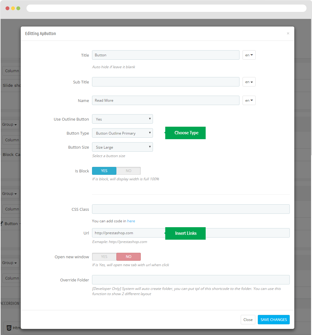
- Title: Name
- Sub Title:
- Use Outline Button
- Button Type
- Button Size
- Is Block
- CSS Class
- URL
- Open new window
- Override Folder

Images of categories
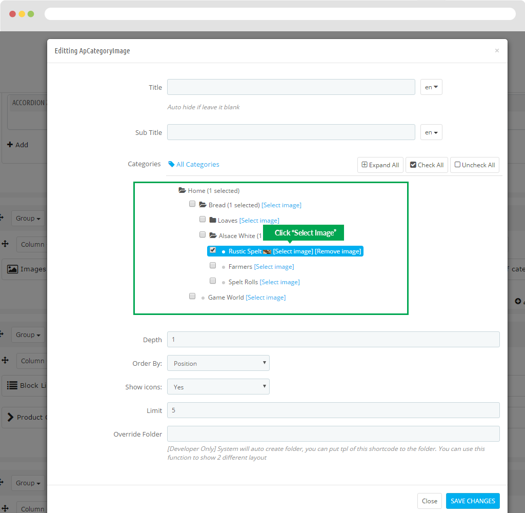
- Title:
- Sub Title:
- Categories:
- Depth:
- Order By:
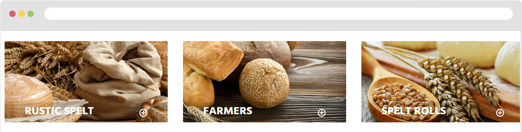
- Show icons: : Show icons of images of category
+ By the way you click on "Select images".
- Limit:
- Override Folder:
Display in FO.
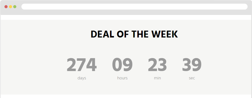
Countdown
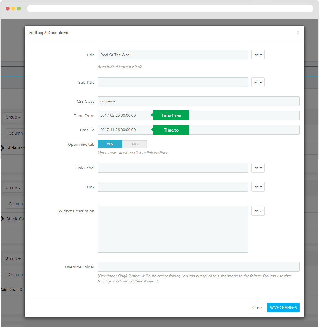
- Title:
- Sub Title:
- CSS Class:
- Time From:
- Time To
- Open new tab:
- Link Label:
- Link
- Widget Description:
- Override Folder
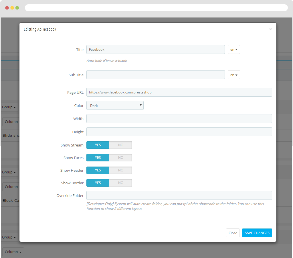
- Title
- Sub Title
- Page URL
- Color
- Width
- Height
- Show Stream
- Show Faces
- Show Header
- Show Border
- Override Folder

Font Awesome
Error module
Full Slider
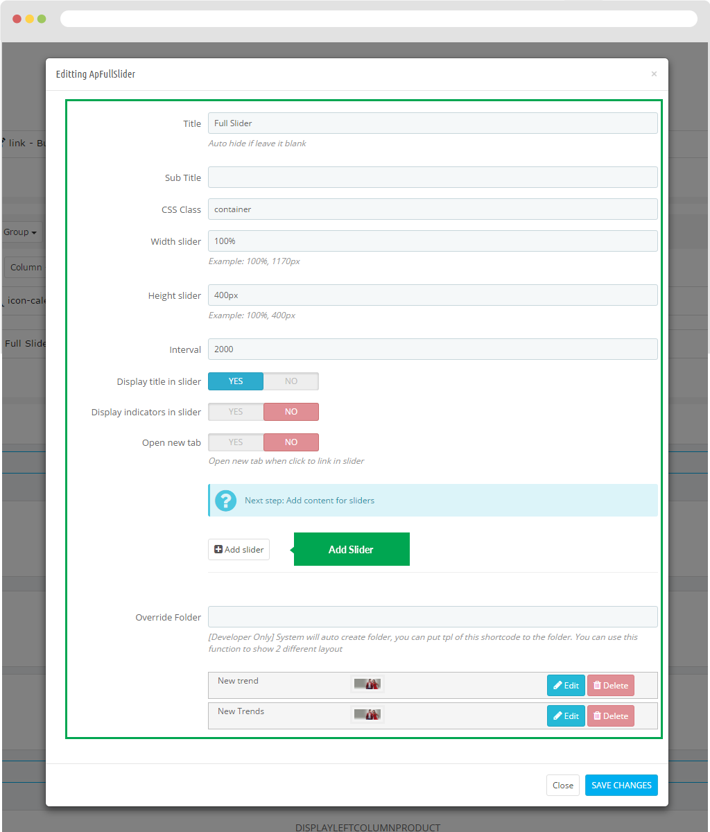
- Title
- Sub Title
- CSS Class
- Width slider
- Height slider
- Interval
- Display title in slider
- Display indicators in slider
- Open new tab
- Override Folder
Display in FO.

Generate Code
- Title
- Sub Title
- CSS Class
- Width slider
- Height slider
- Interval
- Display title in slider
- Display indicators in slider
- Open new tab
- Override Folder
For instance : General Code logo.
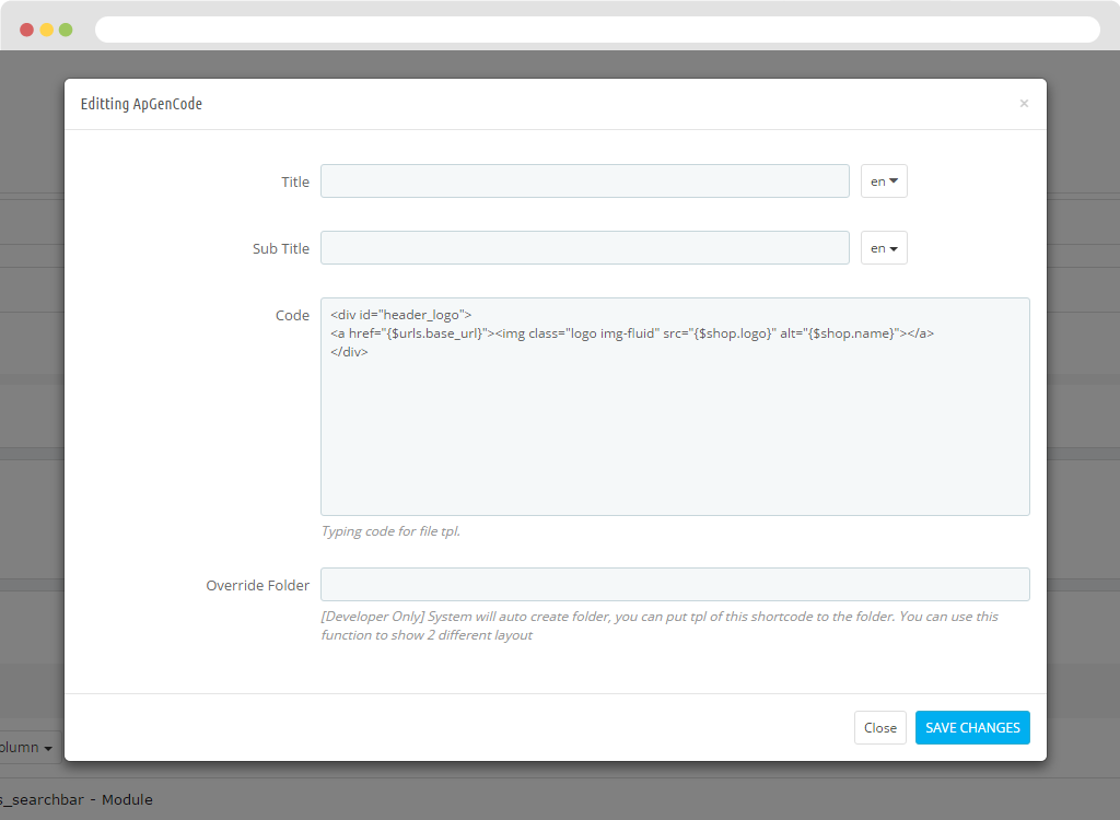
Display in FO.
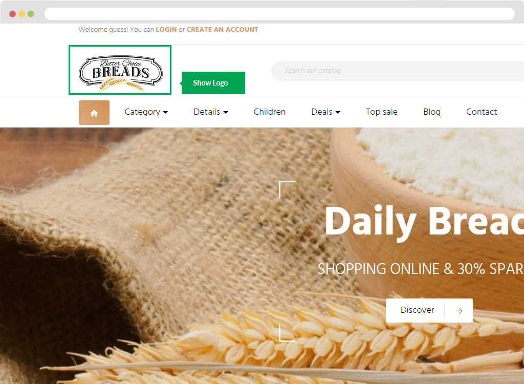
Google Map
- Title
- Sub Title
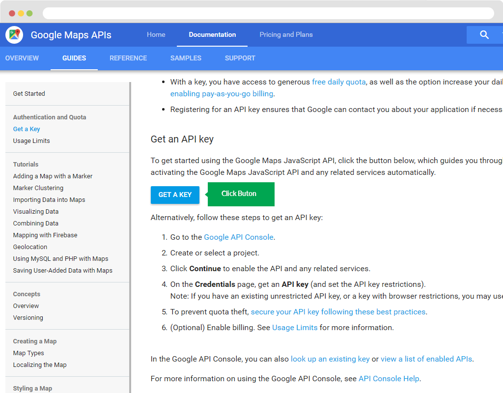
- Google Key: To have Google map you need to do the following steps:
- You need to login by email to the link below.
<https://developers.google.com/maps/documentation/javascript/get-api-key >
- Then you click "Get A Key" button.
- Please choose "Select or create project". To create Project.
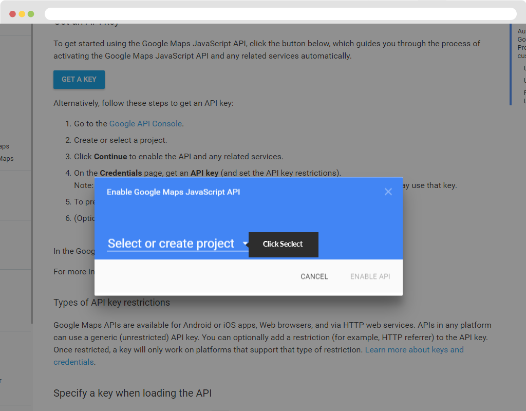
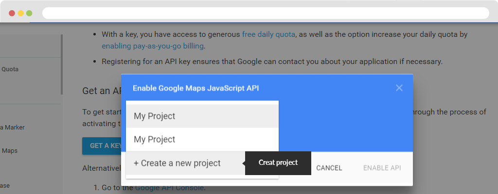
- User choose "+" to Create a new project.
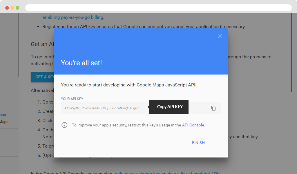
- Click button "Create and Enable API".
- You just "Copy You API KEY".
- Zoom
- Width
- Height
- Select display store on map
- List stores
- Show Store Menu
- Enable Gmap at Our_Stores page
- Enable Gmap at Sitemap page
- Override Folder
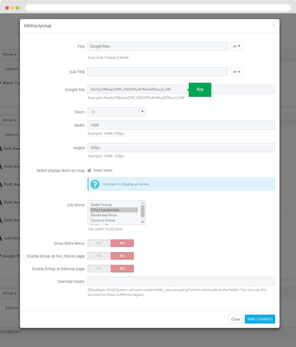
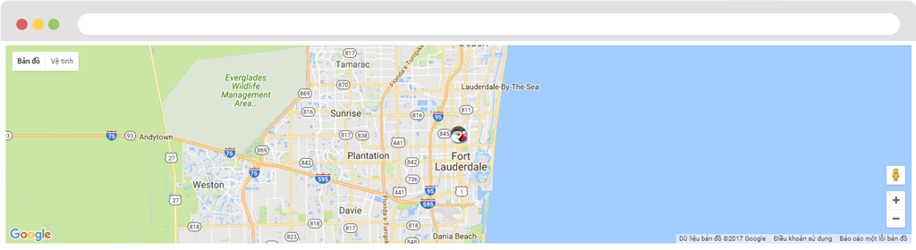
Display in FO.
Html
- Title
- Sub Title
- CSS Class
- Html
- Override Folder
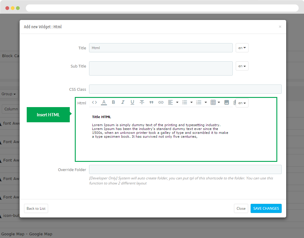
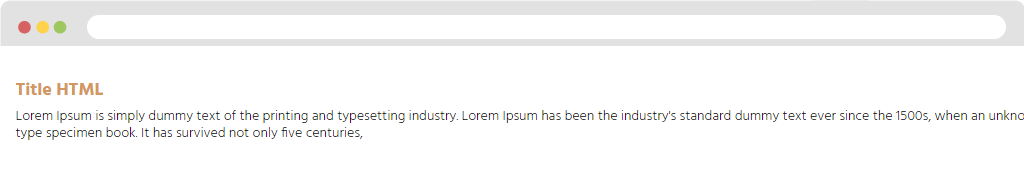
Display in FO.
Images
- Title
- Sub Title
- Animations
- Delay
- Image
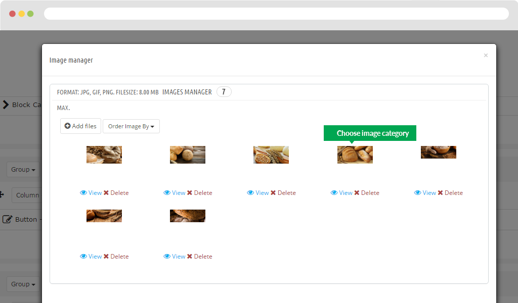
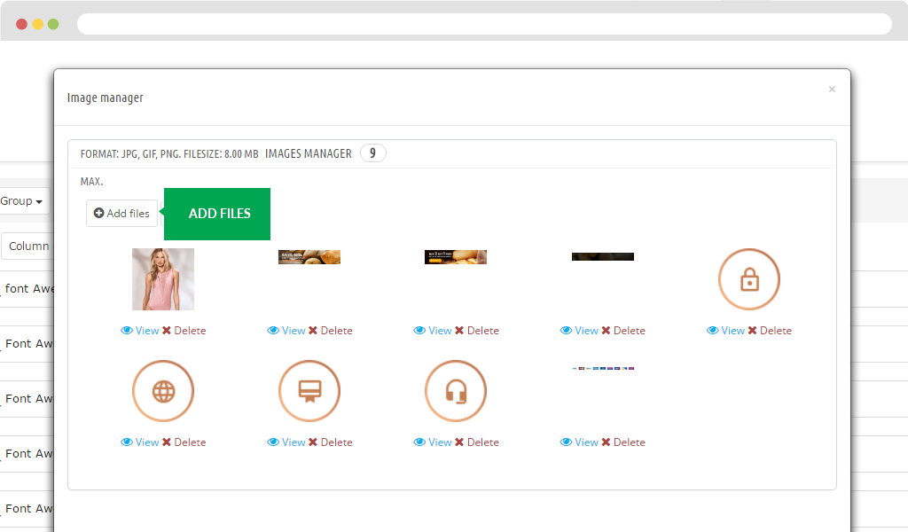
You click "Select images".
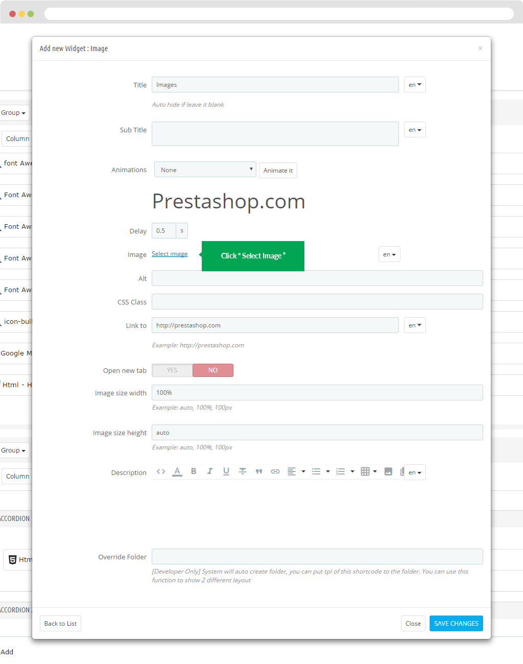
The screen will display pop-up. You will add the image you want.
- Alt
- CSS Class
- Link to
- Open new tab
- Image size width
- Image size height
- Description
- Override Folder
Display in FO.
Images 360
- Title
- Sub Title
- Spin
- Speed
- Mouse wheel Step
- Smoothing
- Initialization
- Auto-spin duration
- Auto-spin start
- Auto-spin stops
- Auto-spin Time
- Auto-spin direction
- Start Column
- Loop Column
- Reverse rotation on X-axis
- Message under image
- Show hint message
- Message Desktop Hint
- Message Mobile Hint
- Show Slider
- Image
- Override Folder
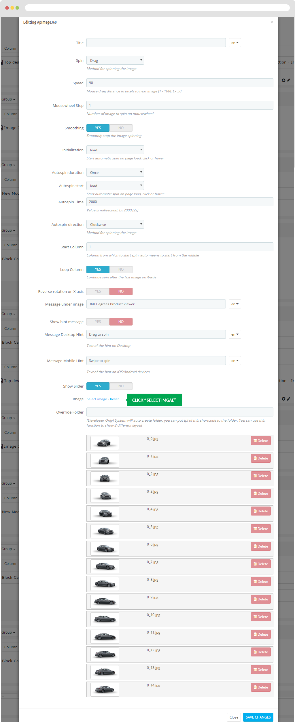
Display in FO.
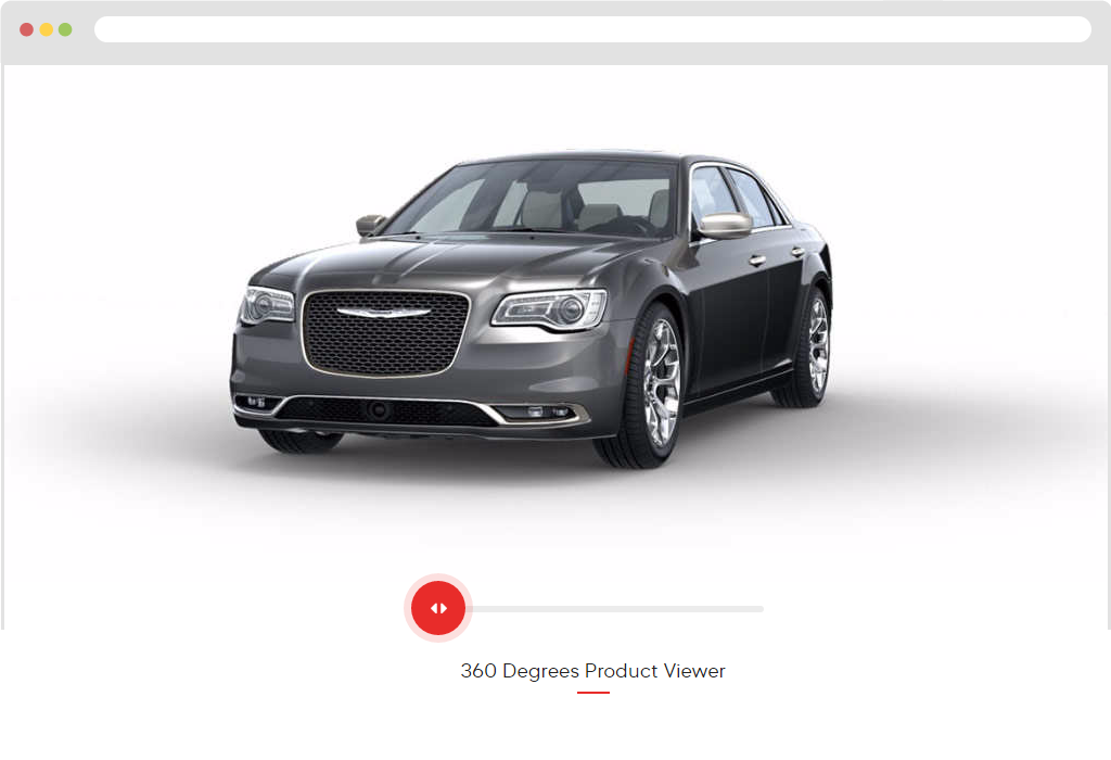
Image Gallery
- Title
- Sub Title
- Path
- Limit
- Columns
- Override Folder
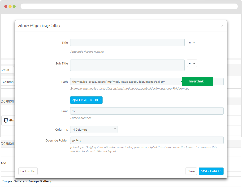
Display in FO.
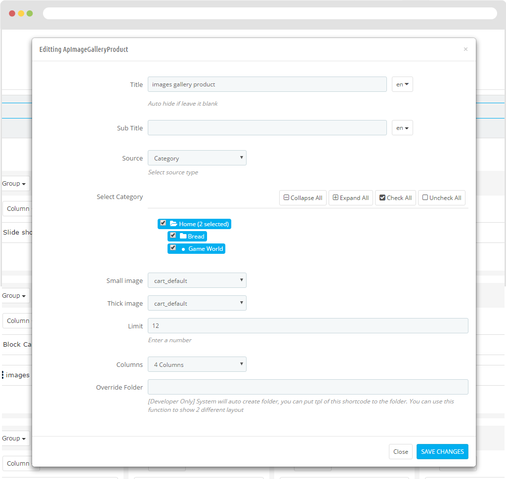
Image Gallery Product
- Title
- Sub Title
- Source
+ Source: Category
+ Select Category: Allow you to choose category.
+ Source: Product
+ Product ID: Insert Product ID
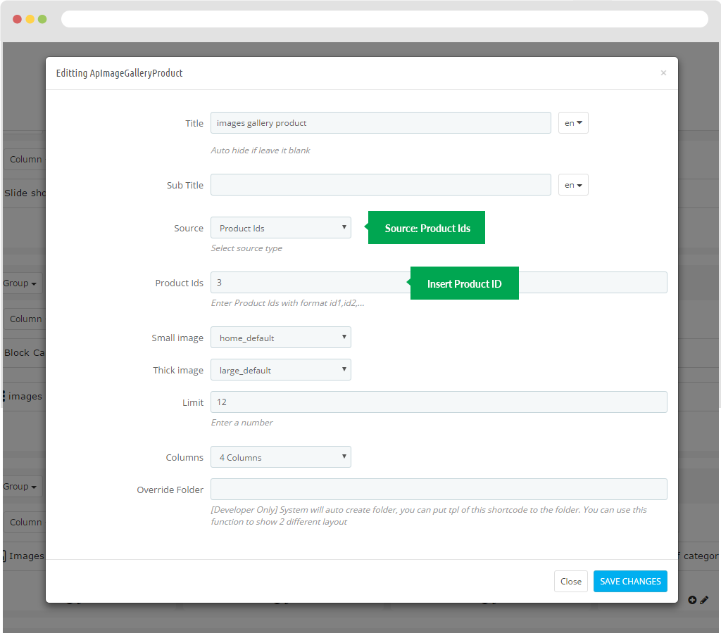
- Small image: The size of the image displayed outside the product.
- Thick image: The size of the current image size on the popup.
- Limit: Used to limit products.
- Columns: Show the column number of the product.
- Override Folder: [Developer Only] System will auto create folder, you can put tpl of this shortcode to the folder. You can use this function to show 2 different layouts
Display in FO
Image Hotspot
To configure Instagram, access our module Ap Pagebuilder > Ap module configuration.
Then you see "Load Instafeed Library"
Then user create new widget instagram.
- Title
- Sub Title
- Accordion Type
- Client ID
- Access Token
- User ID: User ID of Instagram Account. Type Number
- Sort By: Sort the images in a set order. Available options are
- Links:
- Limit: Number of Images want to get. Max is 20 images, this is rule of Instagram.
- Resolution: Size of the images to show.
- Profile Link: Create link in footer link to profile
- Carousel Type:
- Items: Typing number of items. Default
- Items_Desktop: Typing number of items ( with Screen < 1200 )
- Items_Desktop_Small: Typing number of items ( with Screen < 992 )
- Items_Tablet: Typing number of items ( with Screen < 768 )
- Items_Mobile: Typing number of items ( with Screen < 576 )
- Items_Custom: (Advance User) Example: [[0, 2], [576, 3], [768, 4], [992, 5], [1200, 6]]. The format is [x,y] whereby x=browser width and y=number of slides displayed
- Items per Column: Number of item per one column. Same with number of line for one page
- Autoplay: Yes - scroll per page. No - scroll per item. This affect next/prev buttons and mouse/touch dragging.
- Stop on Hover: Stop autoplay on mouse hover
- Responsive: You can use Owl Carousel on desktop-only websites too! Just change that to "false" to disable responsive capabilities
- Navigation: Display "next" and "prev" buttons.
- Auto Height: Add height to owl-wrapper-outer so you can use different heights on slides. Use it only for one item per page setting.
- Mouse Drag: On DeskTop - Turn off/on mouse events.
- Touch Drag: On Mobile - Turn off/on touch events.
- Lazy Load: Delays loading of images. Images outside of viewport will not be loaded before user scrolls to them. Great for mobile devices to speed up page loadings
- Lazy Follow: When pagination used, it skips loading the images from pages that got skipped. It only loads the images that get displayed in viewport. If set to false, all images get loaded when pagination used. It is a sub setting of the lazy load function.
- Lazy Effect: Default is fadeIn on 400ms speed. Use false to remove that effect.
- Pagination Enable: Show Pagination below owl-carousel.
- Pagination Numbers: Show numbers inside Pagination
- Scroll per Page: Yes - scroll per Page. No - scroll per Item. This affect next/prev buttons and mouse/touch dragging.
- Scroll Page Speed: Time to next page. Ex 800 ( Milliseconds )
- Scroll Item Speed: Time to next item. Ex 200 (Milliseconds)
- Override Folder
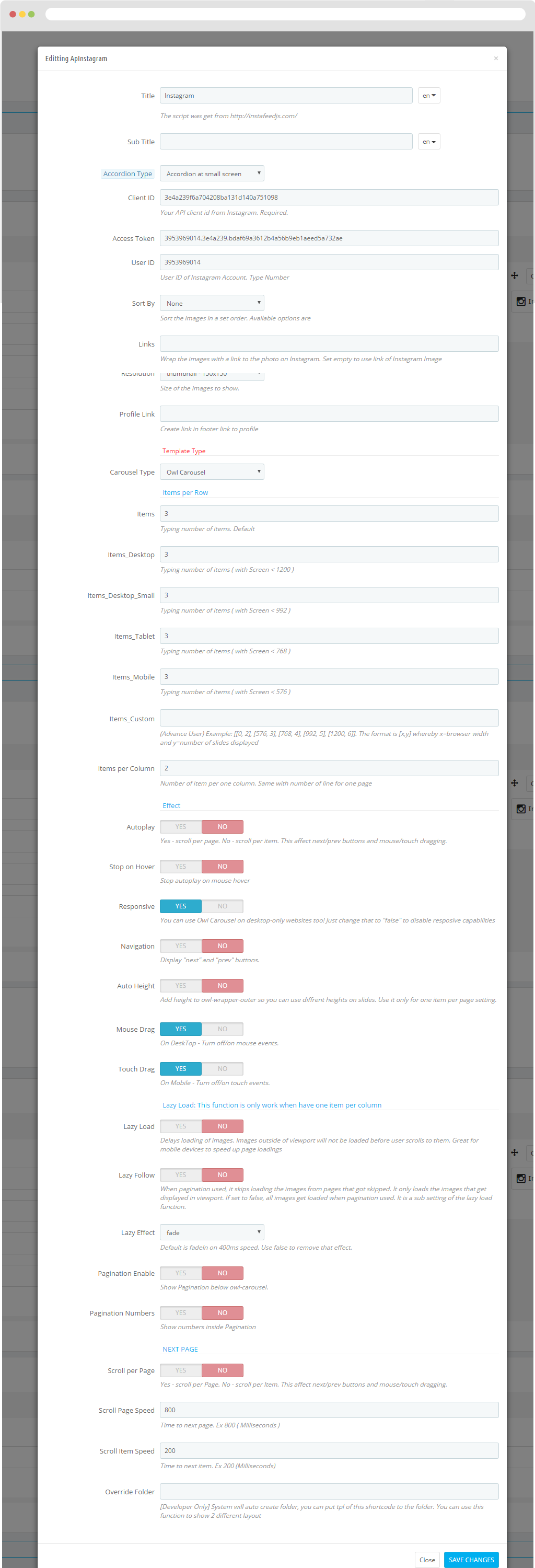
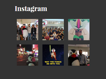
Display in FO.
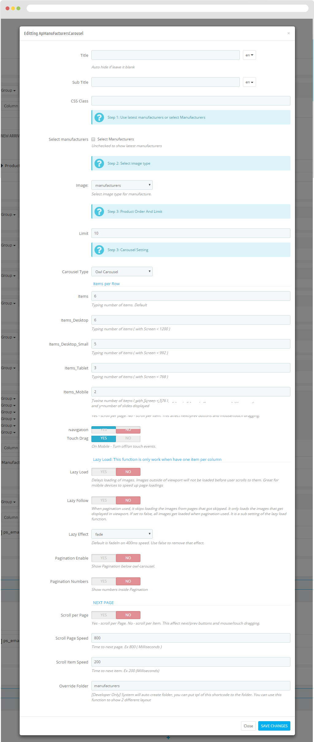
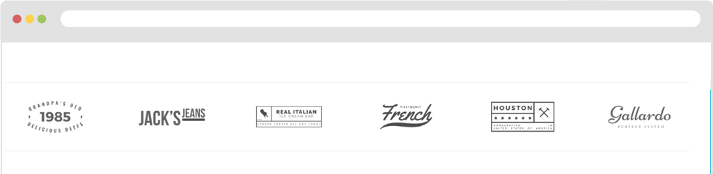
Manufacturers Carousel
Step 1: You need to add manufacture.
You look to the left hand side and choose Catalog > Brands & Suppliers.
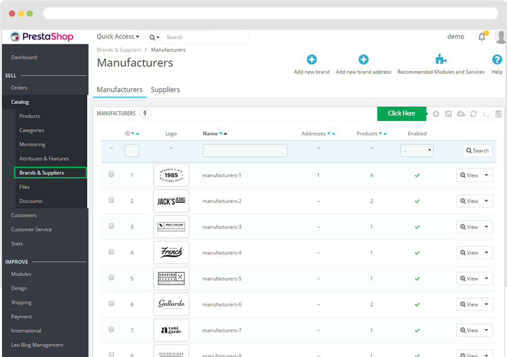
Then Click Add New "+" button.
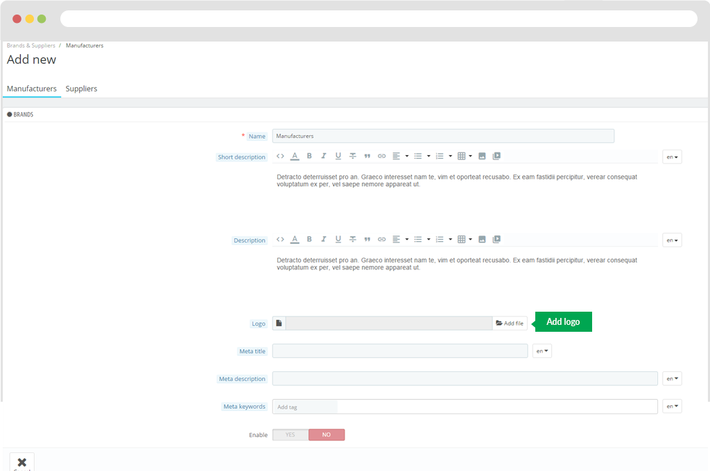
You need to fill out the information.
- Name
- Short description
- Description
- Logo
- Meta title
- Meta description
- Meta keywords
- Enable
Click "Save" to keep your configuration.
Step 2: You come back to create widget manufacture.
- Title
- Sub Title
- CSS Class
- Select manufacturers
- Image:
- Limit
- Carousel Type
- Items: Typing number of items. Default
- Items_Desktop: Typing number of items ( with Screen < 1200 )
- Items_Desktop_Small: Typing number of items ( with Screen < 992 )
- Items_Tablet: Typing number of items ( with Screen < 768 )
- Items_Mobile: Typing number of items ( with Screen < 576 )
- Items_Custom: (Advance User) Example: [[0, 2], [576, 3], [768, 4], [992, 5], [1200, 6]]. The format is [x,y] whereby x=browser width and y=number of slides displayed
- Items per Column: Number of item per one column. Same with number of line for one page
- Autoplay: Yes - scroll per page. No - scroll per item. This affect next/prev buttons and mouse/touch dragging.
- Stop on Hover: Stop autoplay on mouse hover
- Responsive: You can use Owl Carousel on desktop-only websites too! Just change that to "false" to disable responsive capabilities
- Navigation: Display "next" and "prev" buttons.
- Auto Height: Add height to owl-wrapper-outer so you can use different heights on slides. Use it only for one item per page setting.
- Mouse Drag: On DeskTop - Turn off/on mouse events.
- Touch Drag: On Mobile - Turn off/on touch events.
- Lazy Load: When pagination used, it skips loading the images from pages that got skipped. It only loads the images that get displayed in viewport. If set to false, all images get loaded when pagination used. It is a sub setting of the lazy load function.
- Lazy Follow: Default is fadeIn on 400ms speed. Use false to remove that effect.
- Lazy Effect: Show Pagination below owl-carousel.
- Pagination EnableShow numbers inside Pagination
- Pagination Numbers: Yes - scroll per Page. No - scroll per Item. This affect next/prev buttons and mouse/touch dragging.
- Scroll per Page: Time to next page. Ex 800 ( Milliseconds )
- Scroll Page Speed: Time to next item. Ex 200 (Milliseconds)
- Override Folder: [Developer Only] System will auto create folder, you can put tpl of this shortcode to the folder. You can use this function to show 2 different layouts.
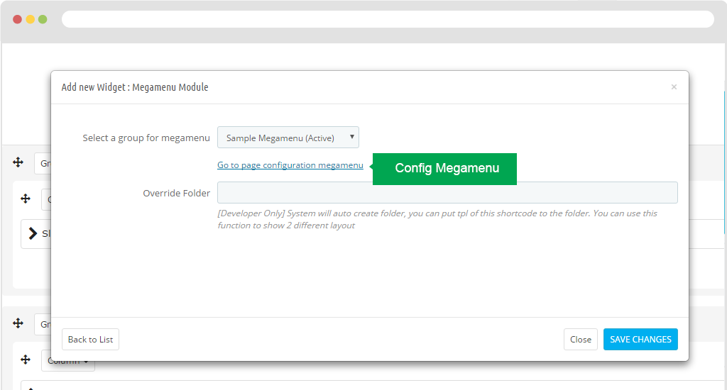
Megamenu Module
Select a group for megamenu: Lets you choose group Menu.
Go to page configuration megamenu
Override Folder: [Developer Only] System will auto create folder, you can put tpl of this shortcode to the folder. You can use this function to show 2 different layouts.
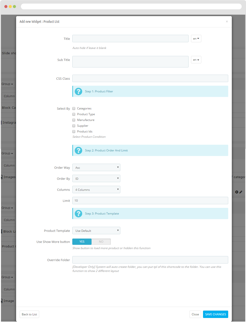
Product Carousel
- Title
- Sub Title
- CSS Class
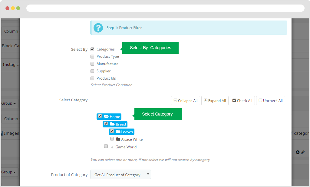
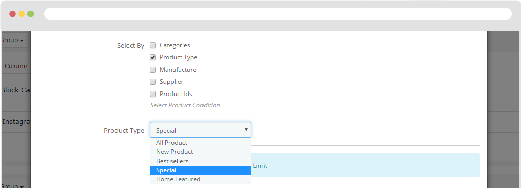
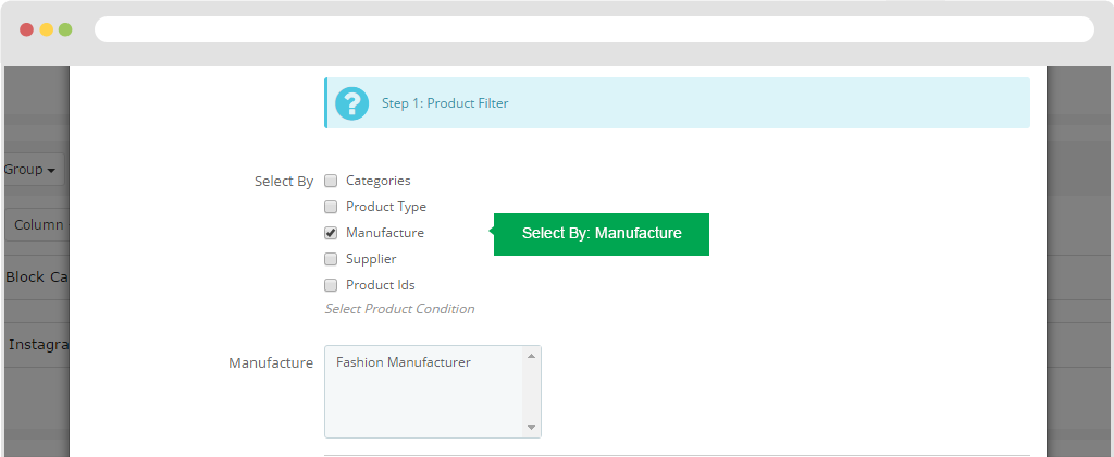
Step 1: Product Filter
+ Select By: Categories
+ Select Category: You need to check the category to display products in that category.
+ Product of Category: Get all product of categories.
+ Select By: Product Type
+ Product Type: All product: Show all products.
+ Product Type: New product: Show latest products.
+ Product Type: Best seller: Show the best seller products.
+ Product Type: Special: Show special products.
+ Product Type: Home Featured Display products home page.
+ Select By: Manufacture
+ Manufacture: You will select Manufacture in the right pane of the Manufacture you need to display.
+ Select By: SupplierShow manufacture.
+ Supplier: You will select Supplier in the right pane from the supplier.
+ Select By: Product

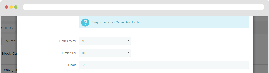
Step 2: Product Order And Limit
Order Way
Order By
Limit
Step 3: Carousel Settingt
- Carousel Type
- Items: Typing number of items. Default
- Items_Desktop: Typing number of items ( with Screen < 1200 )
- Items_Desktop_Small: Typing number of items ( with Screen < 992 )
- Items_Tablet: Typing number of items ( with Screen < 768 )
- Items_Mobile: Typing number of items ( with Screen < 576 )
- Items_Custom: (Advance User) Example: [[0, 2], [576, 3], [768, 4], [992, 5], [1200, 6]]. The format is [x,y] whereby x=browser width and y=number of slides displayed
- Items per Column: Number of item per one column. Same with number of line for one page
- Autoplay: Yes - scroll per page. No - scroll per item. This affect next/prev buttons and mouse/touch dragging.
- Stop on Hover: Stop autoplay on mouse hover
- Responsive: You can use Owl Carousel on desktop-only websites too! Just change that to "false" to disable responsive capabilities
- Navigation: Display "next" and "prev" buttons.
- Auto Height: Add height to owl-wrapper-outer so you can use different heights on slides. Use it only for one item per page setting.
- Mouse Drag: On DeskTop - Turn off/on mouse events.
- Touch Drag: On DeskTop - Turn off/on mouse events.
- Lazy Load: On Mobile - Turn off/on touch events.
- Lazy Follow: Delays loading of images. Images outside of viewport will not be loaded before user scrolls to them. Great for mobile devices to speed up page loadings
- Lazy Effect: When pagination used, it skips loading the images from pages that got skipped. It only loads the images that get displayed in viewport. If set to false, all images get loaded when pagination used. It is a sub setting of the lazy load function.
- Pagination Enable: Default is fadeIn on 400ms speed. Use false to remove that effect.
- Pagination Numbers: Show Pagination below owl-carousel.
- Scroll per Page: Show numbers inside Pagination
- Scroll Page Speed: Yes - scroll per Page. No - scroll per Item. This affect next/prev buttons and mouse/touch dragging.
- Scroll Item Speed: Time to next page. Ex 800 ( Milliseconds )
- Scroll Item Speed: Time to next item. Ex 200 (Milliseconds)
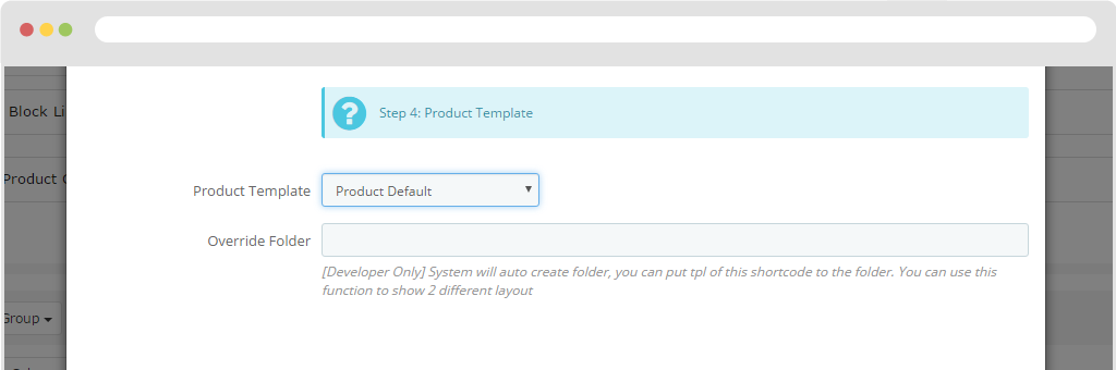
Step 4: Product Template
- Product Template: Allows you to use the Product item option configured in Ap Products List Builder.
- Override Folder: [Developer Only] System will auto create folder, you can put tpl of this shortcode to the folder. You can use this function to show 2 different layouts.
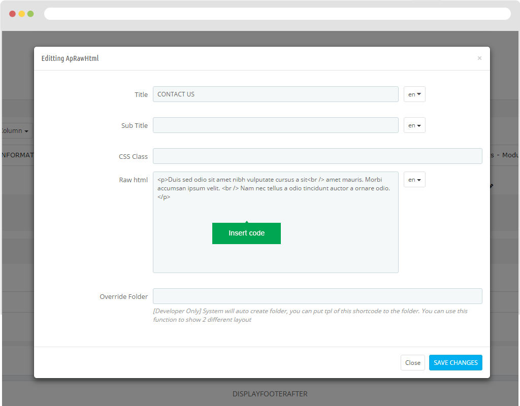
Raw Html
- Title: Name of Raw Html.
- Sub Title
- CSS Class
- Raw html: You can insert code into that frame.
- Override Folder
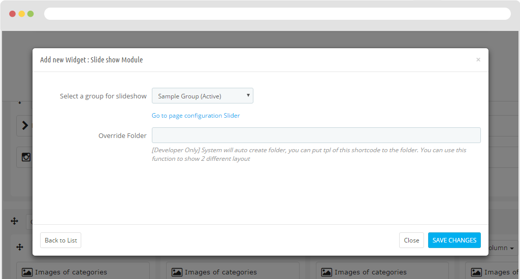
Slide Show Module
Select a group for slideshow:
Override Folder
Slide Layer Module
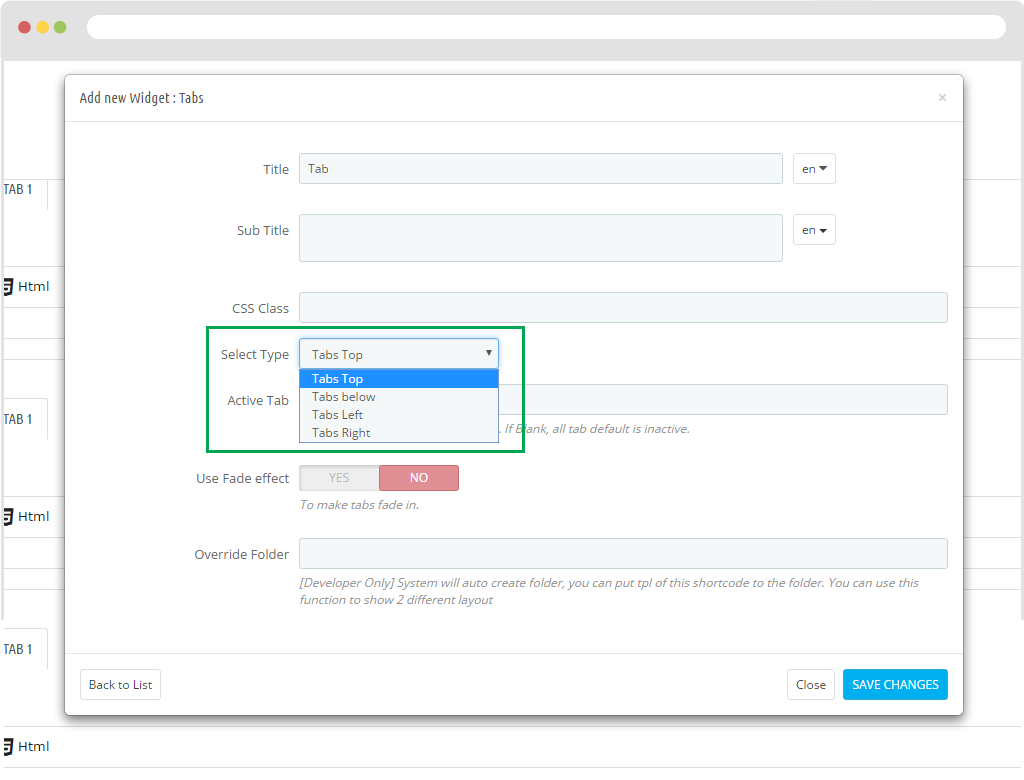
Tabs
- Title
- Sub Title
- CSS Class
- Select Type
+ Select Type: Tab Top
+ Select Type: Tab bottom
+ Select Type: Tab left
+ Select Type: Tab right
- Active Tab
- Use Fade effect
- Override Folder
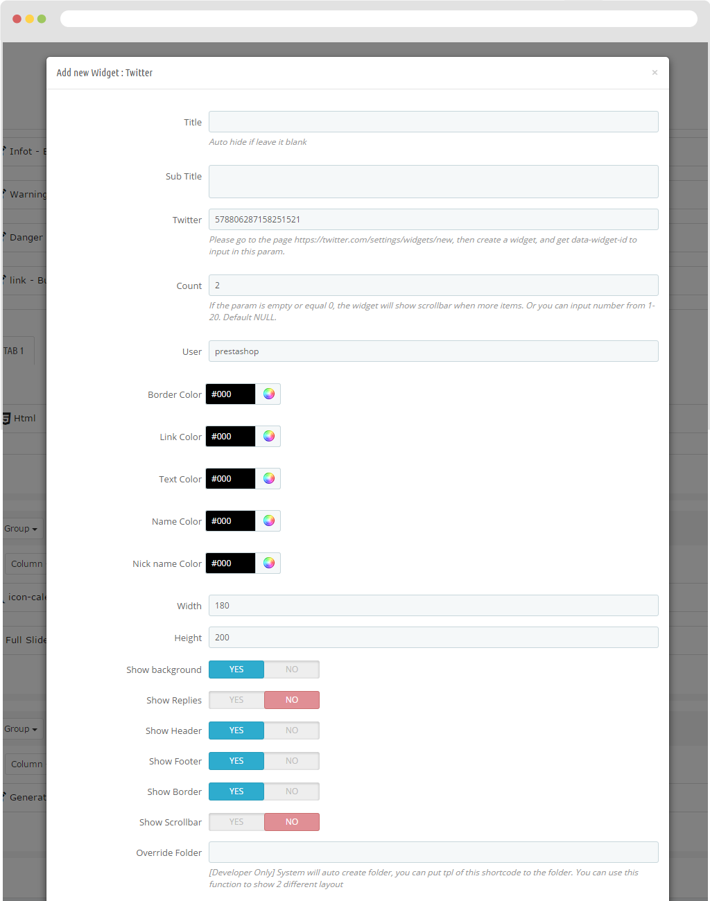
- Title: Show title name.
- Sub Title: Name of submenu.
- Twitter: Please go to the page https://twitter.com/settings/widgets/new, then create a widget, and get data-widget-id to input in this param.
- Count: If the param is empty or equal 0, the widget will show scrollbar when more items. Or you can input number from 1-20. Default NULL.
- User: Tab Top
- Border Color: Display border color.
- Link Color: Display color path.
- Text Color: Present color of the text.
- Name Color: Display the color of the name.
- Nick name Color: Display the color of the nick name.
- Width: Width of twitter.
- Height: The height of twitter.
- Show background: Turn background image of twitter on or off.
- Show Replies: Enable or disable the reply feature.
- Show Header: Turn headers on or off.
- Show Footer: Turn footer on or off.
- Show Border: Turn border on or off
- Show Scrollbar: Enable or disable the Scrollbar feature.
- Override Folder
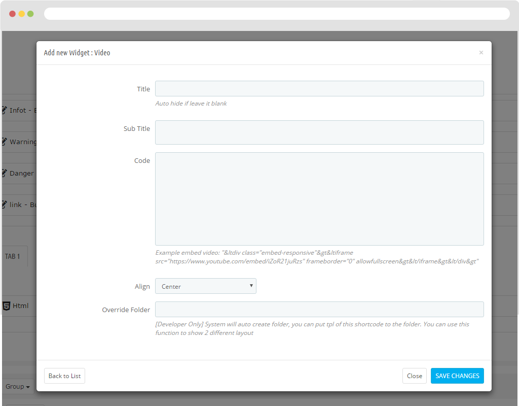
Video
- Title: Name of title.
- Sub Title: Name of submenu.
- Code: To insert source code(Example embed video: "<div class="embed-responsive"><iframe src="https://www.youtube.com/embed/iZoR21juRzs" frameborder="0" allowfullscreen></iframe></div>")
- Align: Used to align.
- Override Folder: [Developer Only] System will auto create folder, you can put tpl of this shortcode to the folder. You can use this function to show 2 different layouts.
Edit Column
To Edit column, you click button "Column". To Edit Column
General
- Title: Display the title of the column.
- Sub Title: Display Sub menu name.
- ID:
- CSS Class: To add class to style for column.
- Insert new or select classes for toggling content across viewport breakpoints
+ Hidden from Large devices
+ Hidden from Medium devices
+ Hidden from Small devices
+ Hidden from Extra small devices
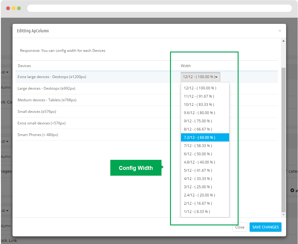
Width
You can configure on devices by clicking the button on the right, which will scale out by device.
- Extra large devices - Desktops (≥1200px)
- Large devices - Desktops (≥992px)
- Medium devices - Tablets (≥768px)
- Small devices (≥576px)
- Extra small devices (<576px)
- Smart Phones (< 480px)
Animation
Used to create the effect for the column.
Animation
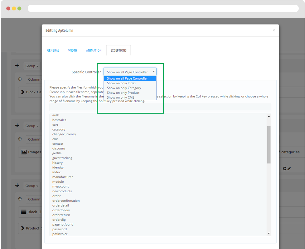
Allows users to display on pages as index, category, product, cms.
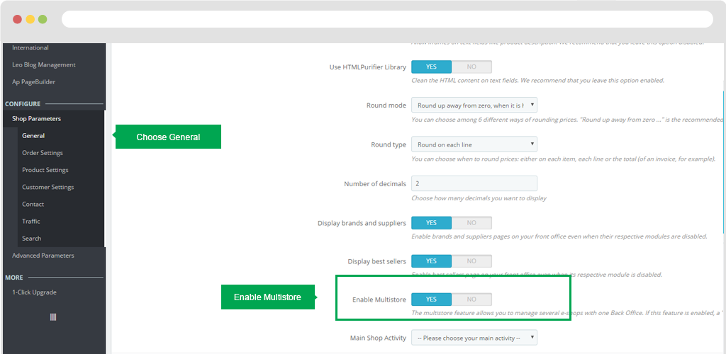
Multishop
Step 1: Access in Config > Shop Parameters > General
Then select "Save" in the right corner of the screen to save the data.
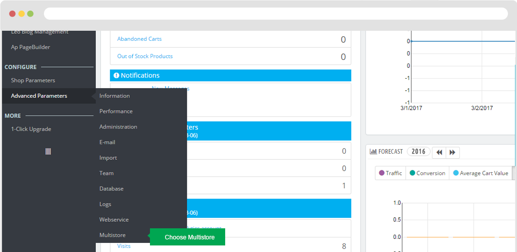
Step 2: Access in Advanced Parameters > Multistore
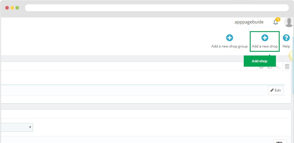
Step 3: You should "Add a new shop"
Then you need to enter the name shop name. And click "Save" to save the information.
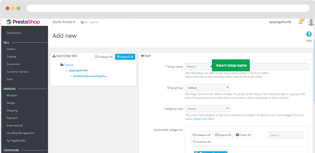
Then you need to enter the name shop name. And click "Save" to save the information.
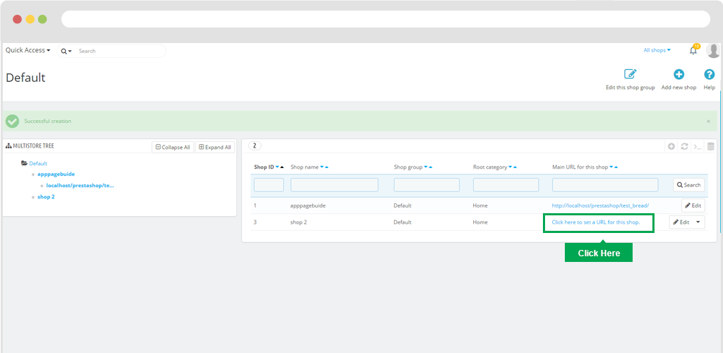
Then click on the URL link and enter the Virtual Url as the shop name.
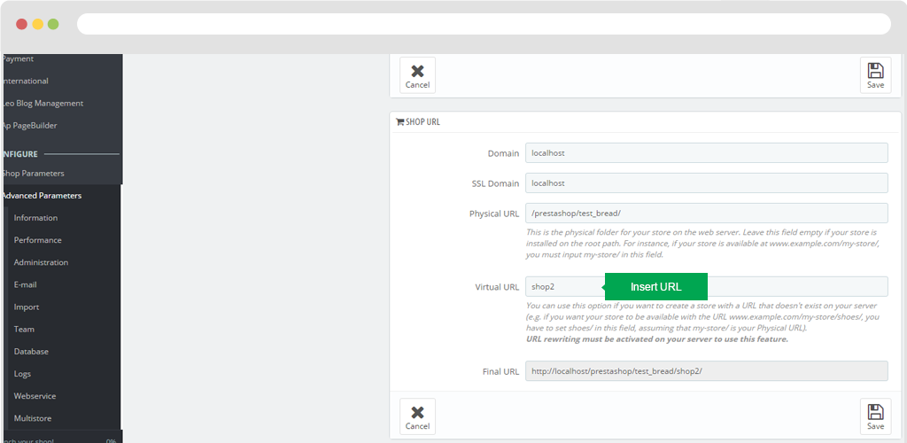
Then "Save" to save the data.
Choose product display type for category
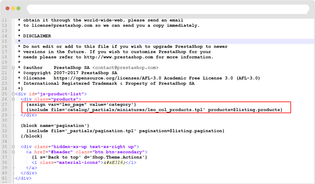
To display "Layout Type" in Category you have to copy the code below :
{assign var="leo_page" value='category'}
    {include file='catalog/_partials/miniatures/leo_col_products.tpl' products=$listing.products}
Sthen Paste into file Product.tpl as the path "...\themes\classic\templates\catalog\_partials\product.tpl"
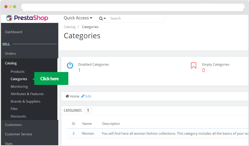
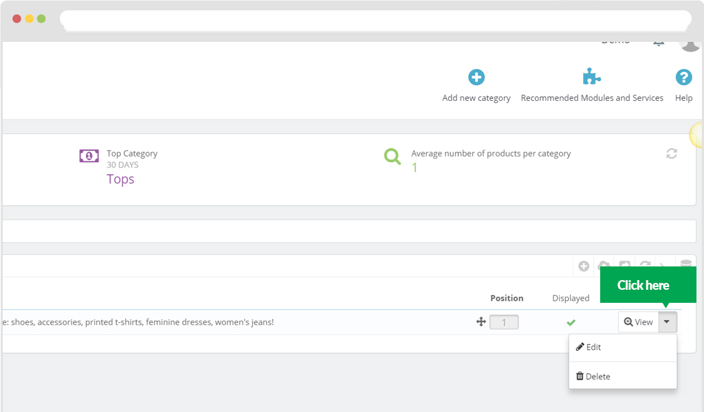
You can choose product display types for each category. Some steps below will guide you how to do that
Step 1: Click on "Category"
Step 2: Choose "Edit category", scroll down then you will see "Layout Type"
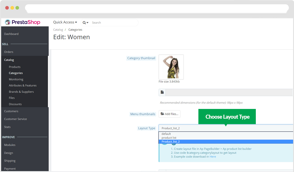
Step 3: Click "Save" and back to Frontend to see how your product display
Update multiple product layout
Prepare before update:
- - the latest version of Ap Pagebuilder module
- - folder for update. Download here.
Note: you should backup a copy befor update this function to avoid unwanted risk
Step 1: Update content of files from the folder that has just been downloaded to update:
Case 1: If you use theme from Leo Theme
- Replace files:
- + templates/catalog/product.tpl
- + templates/catalog/_partials/product-cover-thumbnails.tpl
- + templates/catalog/_partials/product-images-modal.tpl
- + templates/catalog/_partials/quickview.tpl
- + templates/catalog/_partials/miniatures/leo_col_products.tpl
- + templates/sub/product_info/accordions.tpl
- + templates/sub/product_info/default.tpl
- + templates/sub/product_info/tab.tpl
- Add content of files below to the end of file in the old theme folder:
Case 2: You only use our Ap Pagebuilder module
- Replace content of files:
- + templates/catalog/product.tpl
- + templates/catalog/_partials/product-cover-thumbnails.tpl
- + templates/catalog/_partials/product-images-modal.tpl
- + templates/catalog/_partials/quickview.tpl
- Create file (if not available ):
- + templates/catalog/_partials/miniatures/leo_col_products.tpl
- + templates/catalog/_partials/products.tpl
- + templates/sub/product_info/accordions.tpl
- + templates/sub/product_info/default.tpl
- + templates/sub/product_info/tab.tpl
- Add content of the file below to the end of file in the old theme folder:
- + accets/js/custom.js (or you can add content of the file below to the end of file accets/js/theme.js if not exist file accets/js/custom.js)
Step 2: Correct Module (Update database for new module)
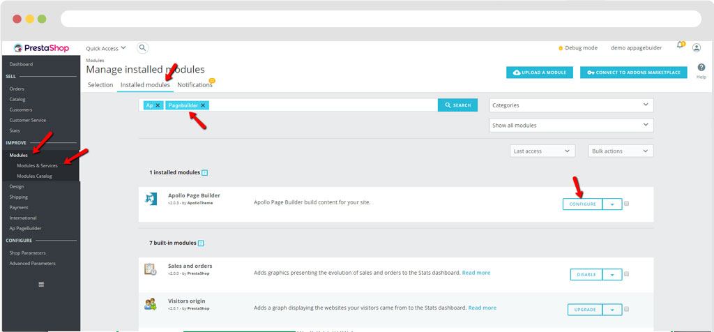
- Enter Installed Modules then search module Ap Pagebuilder > Sellect Configure
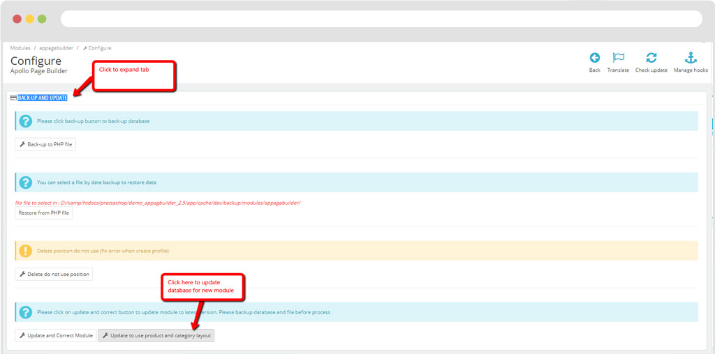
- Click on tab BACK-UP AND UPDATE > click Update to use product and category layout
Step 3: Ap Products Details Builder
a, Add new
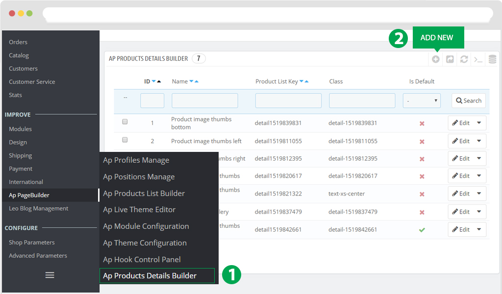
- Click on "Ap product detail builder"
- Then click on button "add new" to create Profile Product detail builder
when create Profile details builder, there are two points that you need to pay attention to
1. You can on your own drag or drop features that are suitable for your design at the product details page.
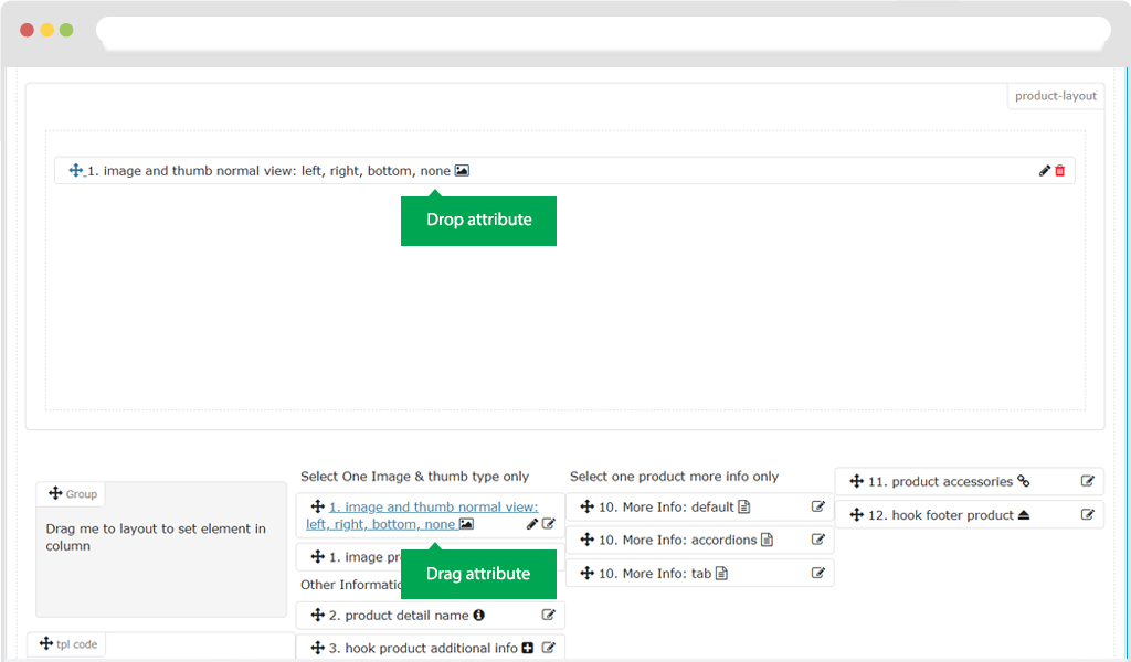
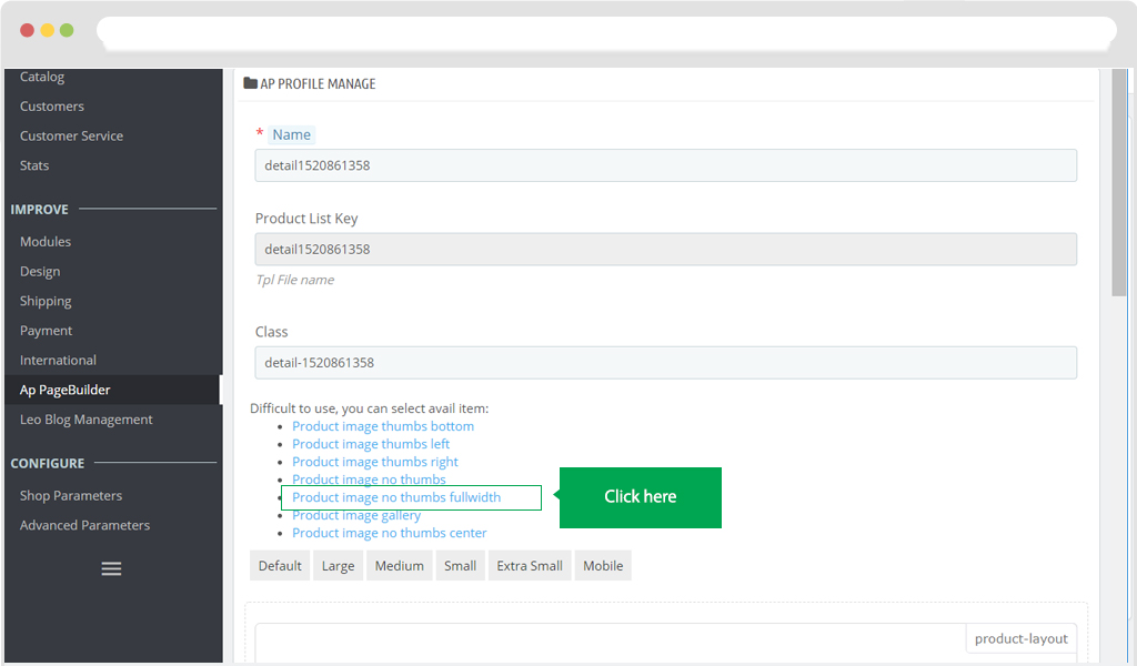
2. You can use the availble default samples of Ap pagebuilder module. By Click on link as image below, you can create 1 out of 7 layout styles of ours
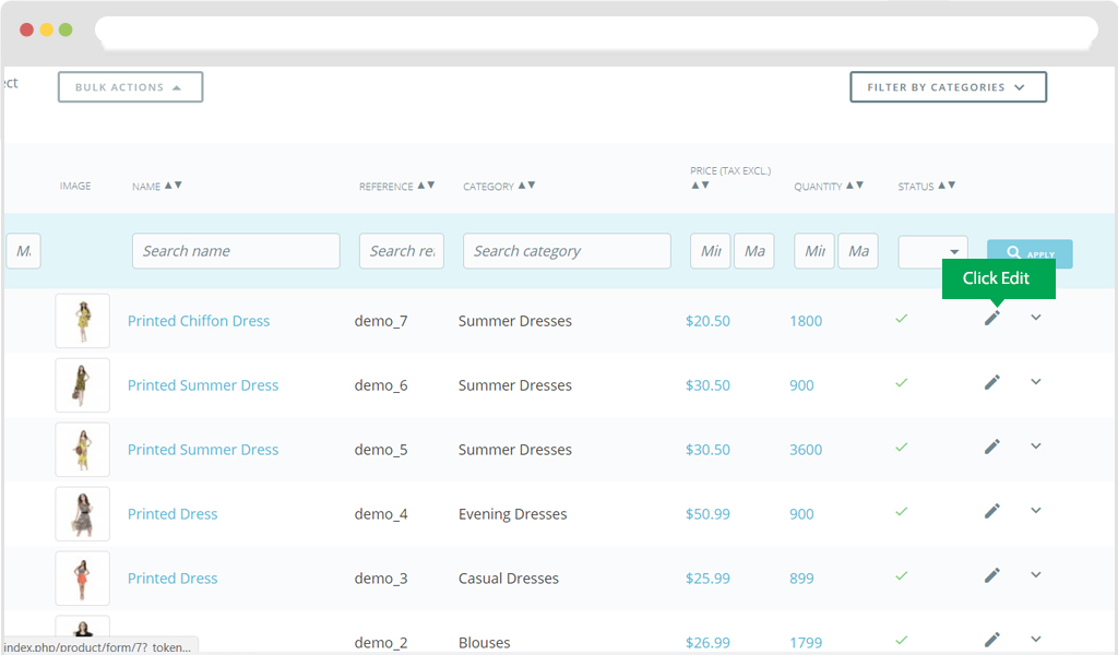
After finish creating in profile product details , what you need to do next is to access Product and sellect Profile product details that you want.
For instance: Choose any product. Catolog > Product > Edit.
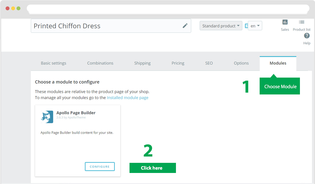
Then choose tab "Module" and Click Configure as the image below
After that, you sellect Profile you need to display for your product
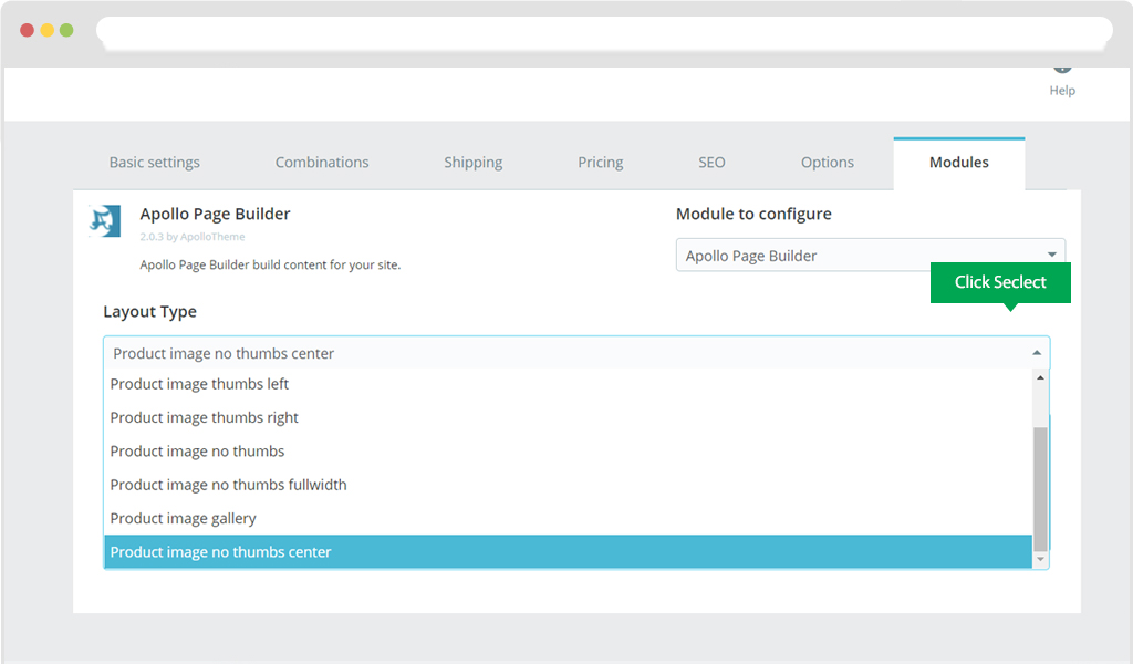
Then choose "Save" to save data
Display in Frontend
Default Classic theme with Module Ap Page builder
To configure Ap Page builder module with Prestashop default Classic theme, you need to download 2 files, which are head.tpl and footer.tpl then copy as the path below
- classic/templates/_partials/footer.tpl
- classic/templates/_partials/head.tpl
- classic/templates/layouts/layout-both-columns.tpl
Now you can get started with our Ap Page builder module.
Shortcode Manage
Shortcode is a special code replacing a content that you indicate while creating shortcode.
You can create shortcode in shortcode manage part in menu list of Ap Pagebuilder module
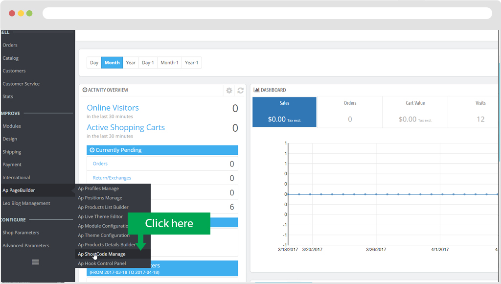
In shortcode management, user can add new, edit, duplicate or delete a shortcode
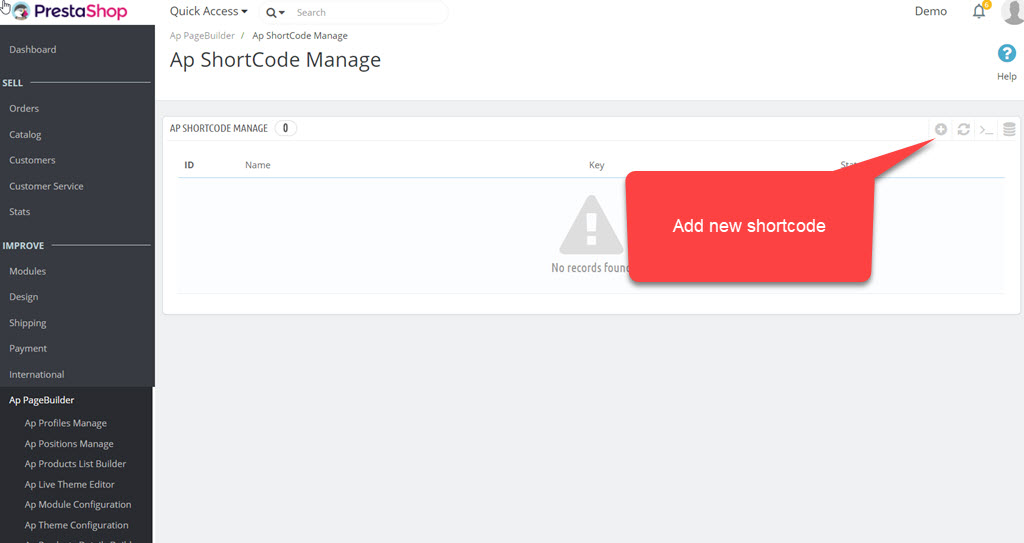
a. Add new
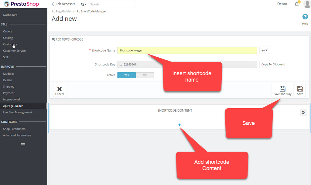
After you finish creating a shortcode, what you need to do is "Add Shortcode Content"
Module supports to show shortcode in all content parts on site
For the following pages we supported available shortcode in content. You just need to select content to add to page
- - Product Description
- - Product Short Description
- - Category Description
- - CMS Content
There are 2 ways to Add shortcode Content
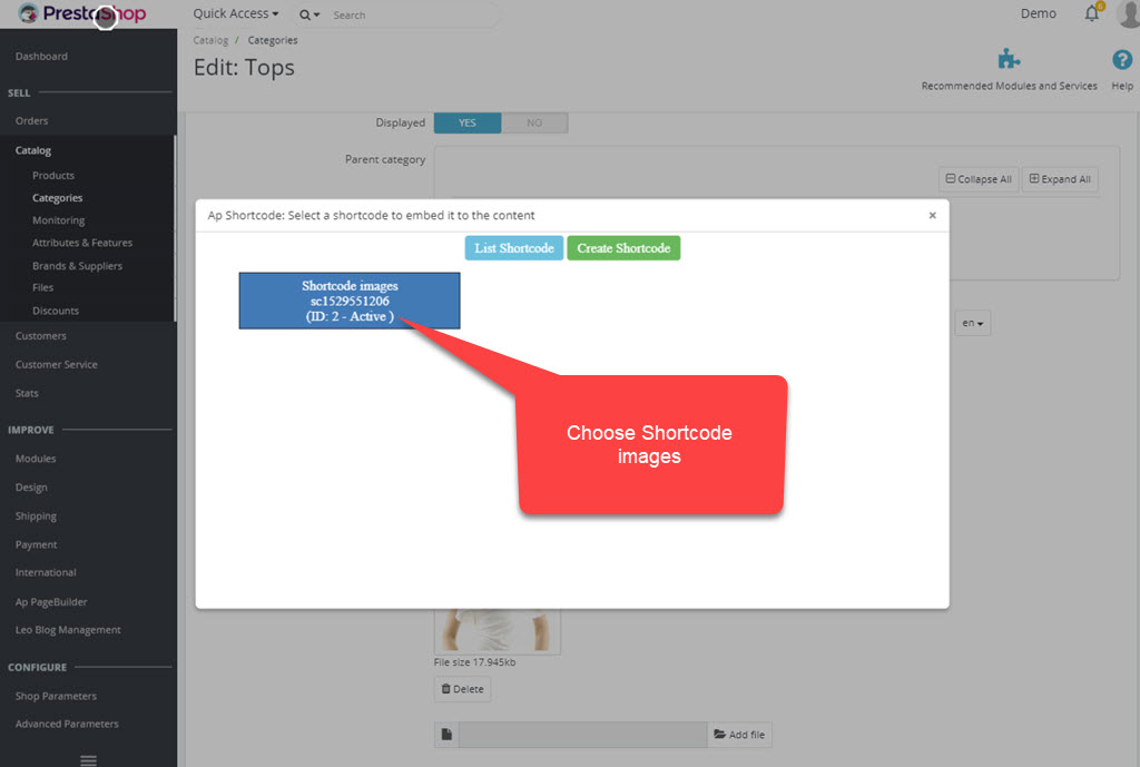
Way 1: Use via content of a field by "Click Shortcode Content"
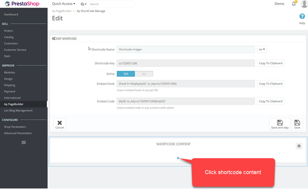
After that you Copy Embed Code like the image below
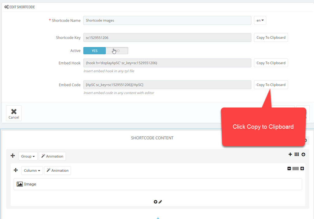
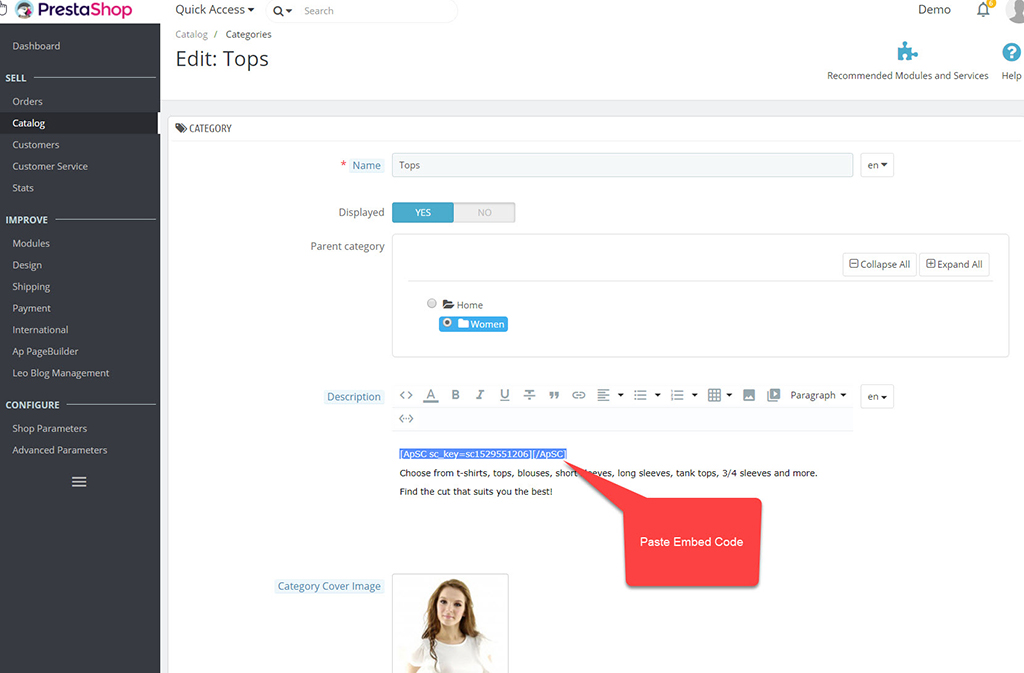
What you need to do is insert the shortcode in the position you want.
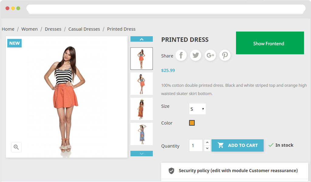
For instance, insert shortcode to category description field.
Or you can click directly on Icon in Description frame
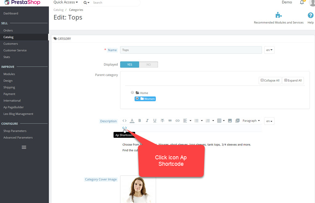
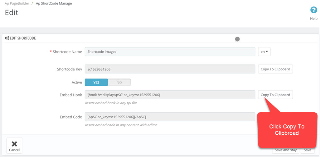
Way 2: Use via Hook: Click Copy To Clipbroad with Embed Hook field.
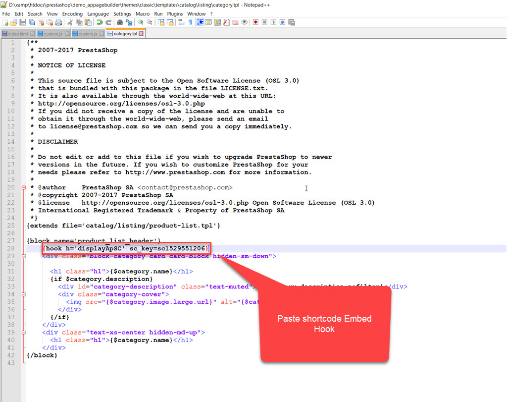
Then access any tpl file that you want to add shortcode and paste to there
For instance: you want to insert shortcode to the upper content part of category page, open file [project_name]\themes\[theme_name]\templates\catalog\listing\category.tpl and paste shortcode to the disired position to show in file
 Note
NoteThis case is only for developers. For other cases that want to use shortcode to show with content, you need one more code which is similar as below to add to controller part before showing data in the Front-end
<if ((bool)Module::isEnabled('appagebuilder')) {
            $appagebuilder = Module::getInstanceByName('appagebuilder');
            $product['description'] = $appagebuilder->buildShortCode($product['description']);
		>
This feature will override 3 files.
- override/controllers/front/CmsController.php with function initContent()
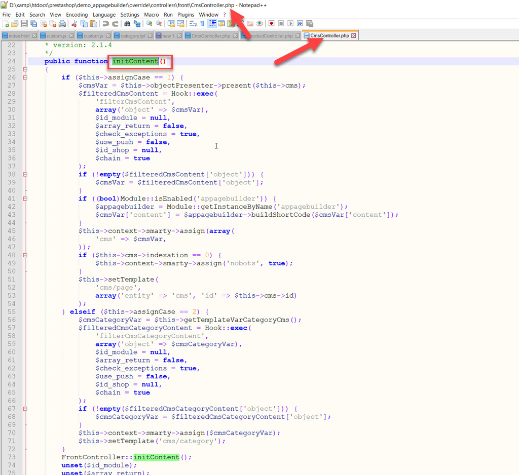
- override/controllers/front/ProductController.php with function getTemplateVarProduct()
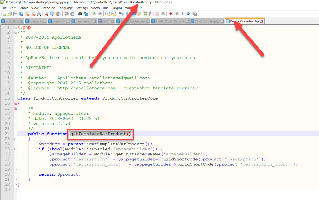
- override/controllers/front/listing/CategoryController.php

Please make sure that these files and functions are override correctly in the folder “override” of your project to activate the feature.
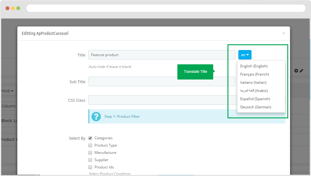
Translate
To translate, you just only access in widget of module Ap Page Builder.
Then click the "En" button to display other languages
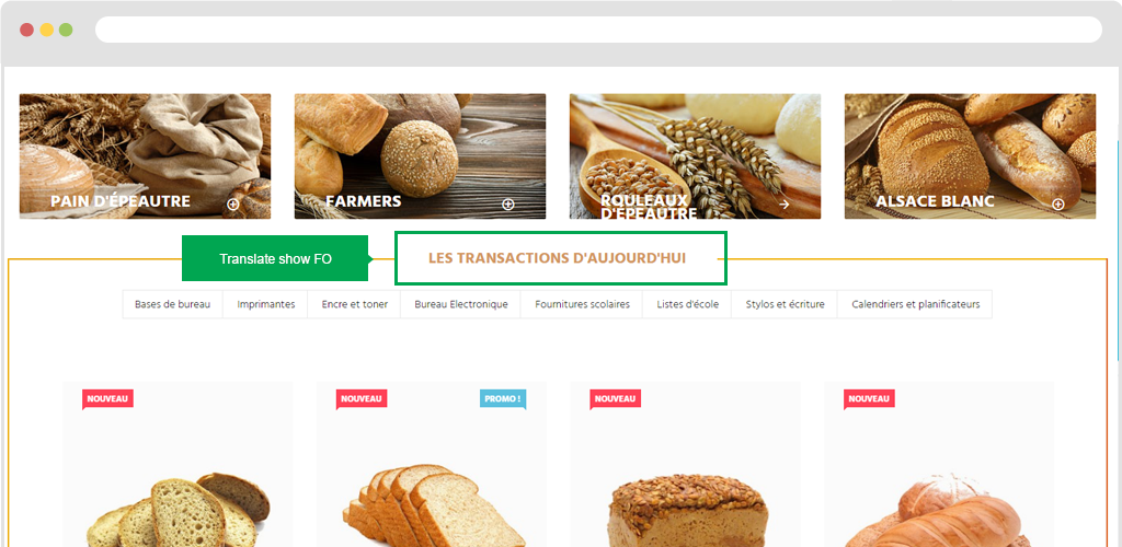
Display in FO.
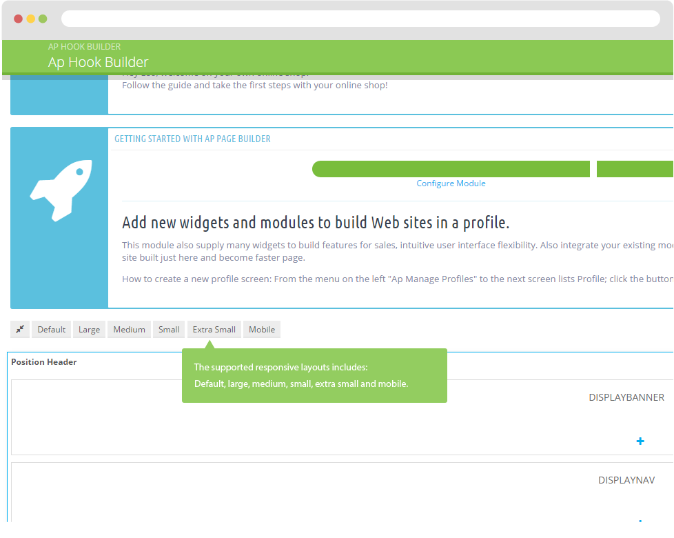
Supported responsive layouts
The supported responsive layouts includes: default, large, medium, small, extra small and mobile. The configuration of Page Builder on those responsive layouts can be the same or different. Select the layout you want to configure.
Default Screen, Medium Screen, Mobile Screen